The network for creativity
Join 1.25M professional creatives like you
Connect with clients, get discovered, and run your business 100% commission-free
Creatives on Contra have earned over $150M and we are just getting started
Back to feedPost

Recently, I worked on a logo refresh for Kellers Beer.
A little background: Kellers is brewed at the Sevan Brewery in Armenia, so one of the key goals was to preserve the connection between the brand and its origin.
The client wanted the identity to reflect Sevan itself. Instead of simply adding the lake as a separate graphic element, I looked for a way to merge two existing logos into a single visual mark. The outline of Lake Sevan became part of the logo composition, helping tell the brand’s story while maintaining a refined, premium feel.
The result is a design with subtle old-money aesthetics that celebrates both the heritage of the brewery and its Armenian roots.
What do you think of this approach? 🍺


The network for creativity
Join 1.25M professional creatives like you
Connect with clients, get discovered, and run your business 100% commission-free
Creatives on Contra have earned over $150M and we are just getting started



Related posts

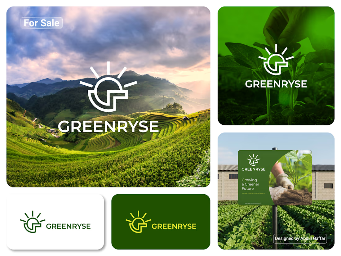
GREENRYSE – G Lettermark, Sun Logo Design, Sustainable Agriculture.
Introducing GREENRYSE, a modern logo concept inspired by nature, agriculture, and the power of growth. The symbol combines a geometric letter G with a rising sun, representing new beginnings, natural energy, and a brighter future for agriculture.
The presentation explores how the logo works across different backgrounds and applications, including agricultural landscapes, product imagery, and outdoor signage. Its clean geometric structure and fresh green color direction create a natural yet professional look.
Designed for agricultural companies, organic farming businesses, crop production, sustainable agriculture, and modern agritech ventures.


Stunning!

LOGO vs. BRANDING — What's your take? 🍵
I'm curious...
Which one makes a stronger first impression?
Do you prefer the simplicity of the logo or the personality of the complete branding?
I'd love to hear your thoughts! 💚
0 voted
0%
7 voted
100%
7 votes
Closed

makes me want a matcha haha, cool

A green logo is easy to design.
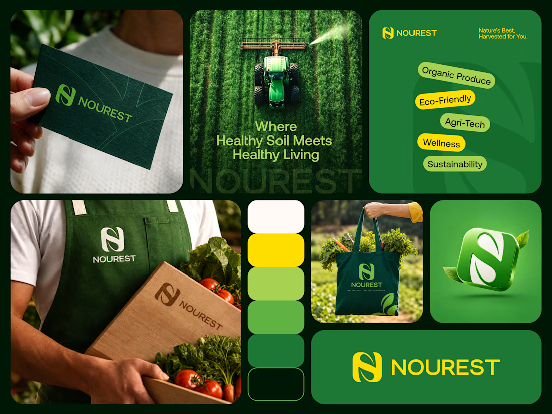
Building a recognizable brand around nature, sustainability, and better living takes more thought.
NOUREST explores that balance through its monogram, color system, and brand applications.
NOUREST — Nature-Led Branding & Packaging

Love this . well done