The network for creativity
Join 1.25M professional creatives like you
Connect with clients, get discovered, and run your business 100% commission-free
Creatives on Contra have earned over $150M and we are just getting started
Back to feedPost

569 real patients. 30 tumor measurements. Two outcomes.
I wanted to know what cancer actually looks like in data.
The answer is brutal.
Concavity rises 249% in malignant tumors. Concave Points by 242%. The tumor doesn't hide. The data screams. Most people just aren't looking at the right signals.
So I built a Tableau story that makes it impossible to miss.
A scatter plot separating 357 benign from 212 malignant patients in one view. A lollipop chart showing exactly which features predict danger. Bubble cells that look like tumors under a microscope. And a dot matrix where every single dot is a real human being.
357 white. 212 pink.
https://lnkd.in/dZs-ydsK
Every dot is a real person.

The network for creativity
Join 1.25M professional creatives like you
Connect with clients, get discovered, and run your business 100% commission-free
Creatives on Contra have earned over $150M and we are just getting started





Related posts


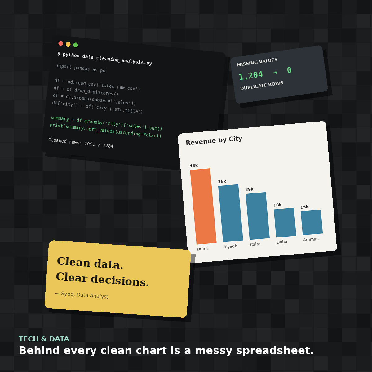
Behind every clean chart is a messy spreadsheet 🧹
This is what a real data cleaning job looks like before it becomes an elegant bar chart — duplicate rows, missing values, inconsistent formatting, all sorted out with Python and Pandas.
#collage attempt: a look inside the data analyst's actual desk, not just the pretty output.


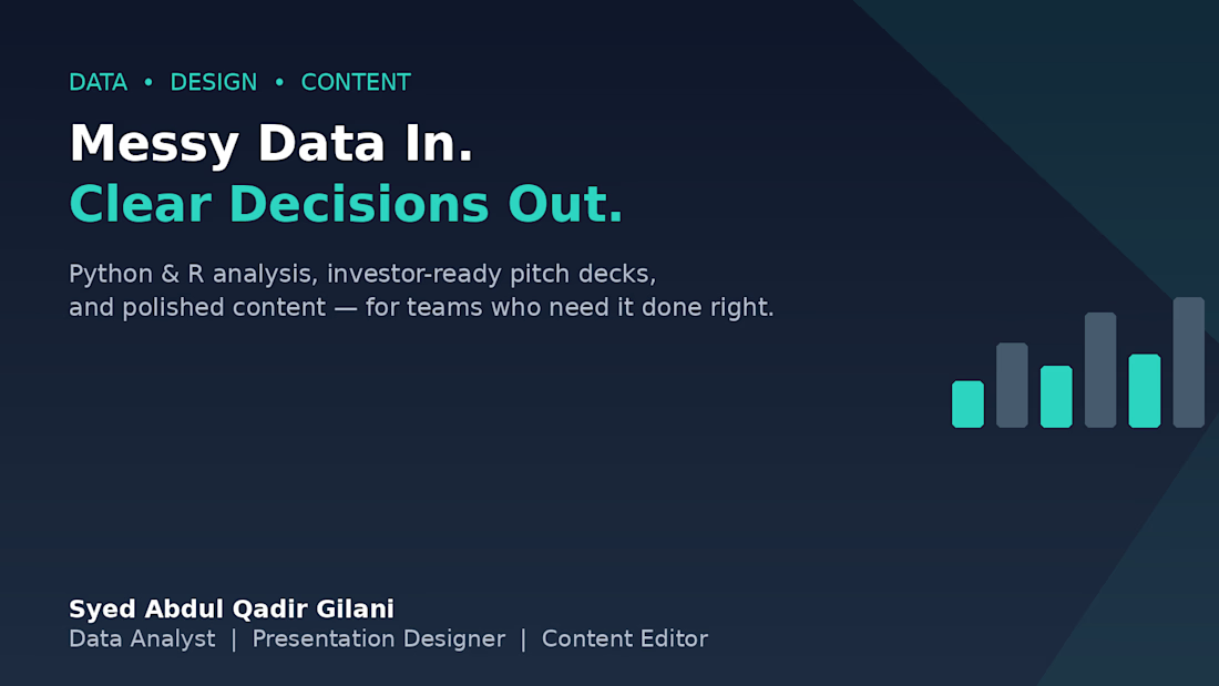
Messy Data In. Clearer Decisions Out. 📊
Over the past year, I've noticed most businesses don't struggle because they lack data — they struggle because that data never turns into a decision.
That's the gap I work in:
→ Cleaning and analyze data with Python & R
→ Turning findings into investor-ready pitch decks
→ Polishing the final write-up so nothing gets lost in translation
If your team has data sitting in spreadsheets with no story attached, or a pitch deck that needs to actually land — that's exactly where I can help.
Open to projects. Let's talk 👇



Ninety percent of voters chose the website concept I refused to ship. Twenty-one votes, a clean result, and I went the other way anyway.
⚠️ 𝐓𝐡𝐞 𝐩𝐫𝐨𝐛𝐥𝐞𝐦 wasn't the sample. The 95% Wilson interval ran 71 to 97 percent, so the number held. The defect was who answered.
A poll on a professional network reaches designers and developers. The site had to convince a cautious property buyer. Right arithmetic, wrong population.
🔍 𝐖𝐡𝐚𝐭 𝐈 𝐬𝐡𝐢𝐩𝐩𝐞𝐝 was the quieter direction for Elpida Solutions. It inherited the existing dove-and-house identity and had to hold five locales
https://www.duskolicanin.com/blog/popular-design-concept-can-be-wrong


Thank you to everyone who voted on these two directions.
Although Option 1 was visually more striking, we ultimately chose Option 2. It felt more aligned with Elpida Solutions’ existing logo, brand identity, and the impression the company should create from the very first screen.
...

elpidasolutions.rs
Elpida Solutions — agencija za nekretnine u Srbiji
Licencirana agencija za promet nekretnina. Kupovina, prodaja i izdavanje, podrška pri preseljenju i saradnja sa kompanijama u centralnoj i južnoj Srbiji.
