The network for creativity
Join 1.25M professional creatives like you
Connect with clients, get discovered, and run your business 100% commission-free
Creatives on Contra have earned over $150M and we are just getting started
Back to feedPost

UndaTech - Shopify store / AI Development


The network for creativity
Join 1.25M professional creatives like you
Connect with clients, get discovered, and run your business 100% commission-free
Creatives on Contra have earned over $150M and we are just getting started







Related posts

A Shopify store might look great on a computer but feel completely different on a phone.
That's why mobile optimization matters.
When reviewing a store's mobile experience, I pay attention to things like:
→ Easy to use navigation
→ Readable product descriptions
→ Clear product images
→ Buttons that are easy to tap
→ Proper spacing between sections
→ Product pages that fit the screen
→ A smooth path from browsing to checkout
The goal isn't just to make the desktop design smaller.
It's to make the store comfortable and easy to use on a mobile device.
Because customers should be able to browse products, understand what they're buying, and take the next step without unnecessary frustration.
A good mobile experience is an important part of good Shopify design.
Have you ever left an online store because it was difficult to use on your phone?
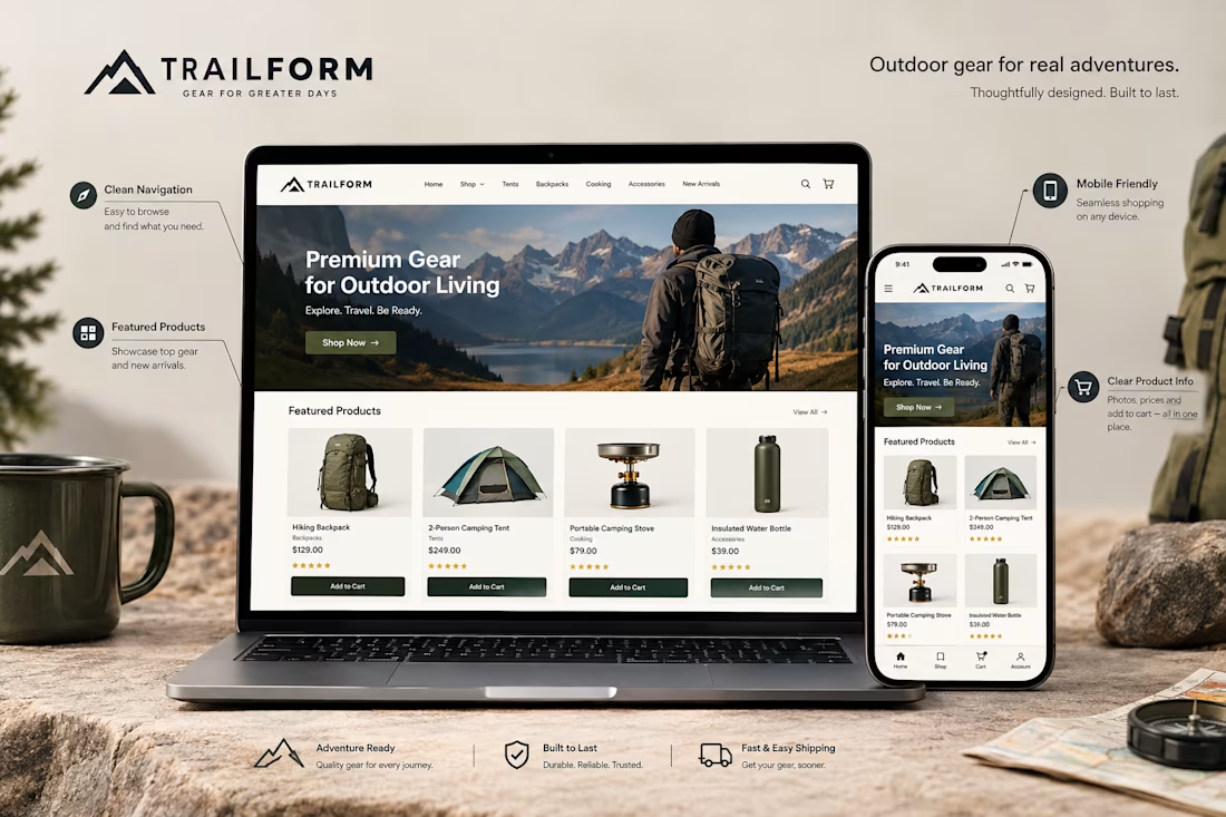

Absolutely. A smooth mobile experience can make the difference between a customer buying and leaving.

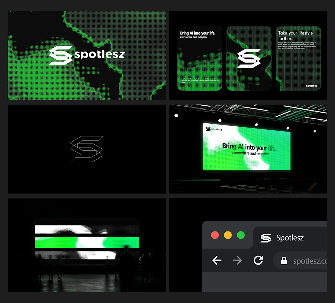
Branding identity completed for Spotlesz in just few days!




Little late to announce but, Construct Computer ranked 1st on Product Hunt as the Product of the Day, Thank you everyone for your support. Welp here's the launch video I made, hope you have a good day!


That's stunning incredible job 🔥🔥🔥🔥