The network for creativity
Join 1.25M professional creatives like you
Connect with clients, get discovered, and run your business 100% commission-free
Creatives on Contra have earned over $150M and we are just getting started
Back to feedPost


The network for creativity
Join 1.25M professional creatives like you
Connect with clients, get discovered, and run your business 100% commission-free
Creatives on Contra have earned over $150M and we are just getting started



Related posts

Brand work for HauntChain
I'm loving building this brand and the results so far
A deFi platform with some gamification


That's cute ❤️


Is text on album covers really tacky?
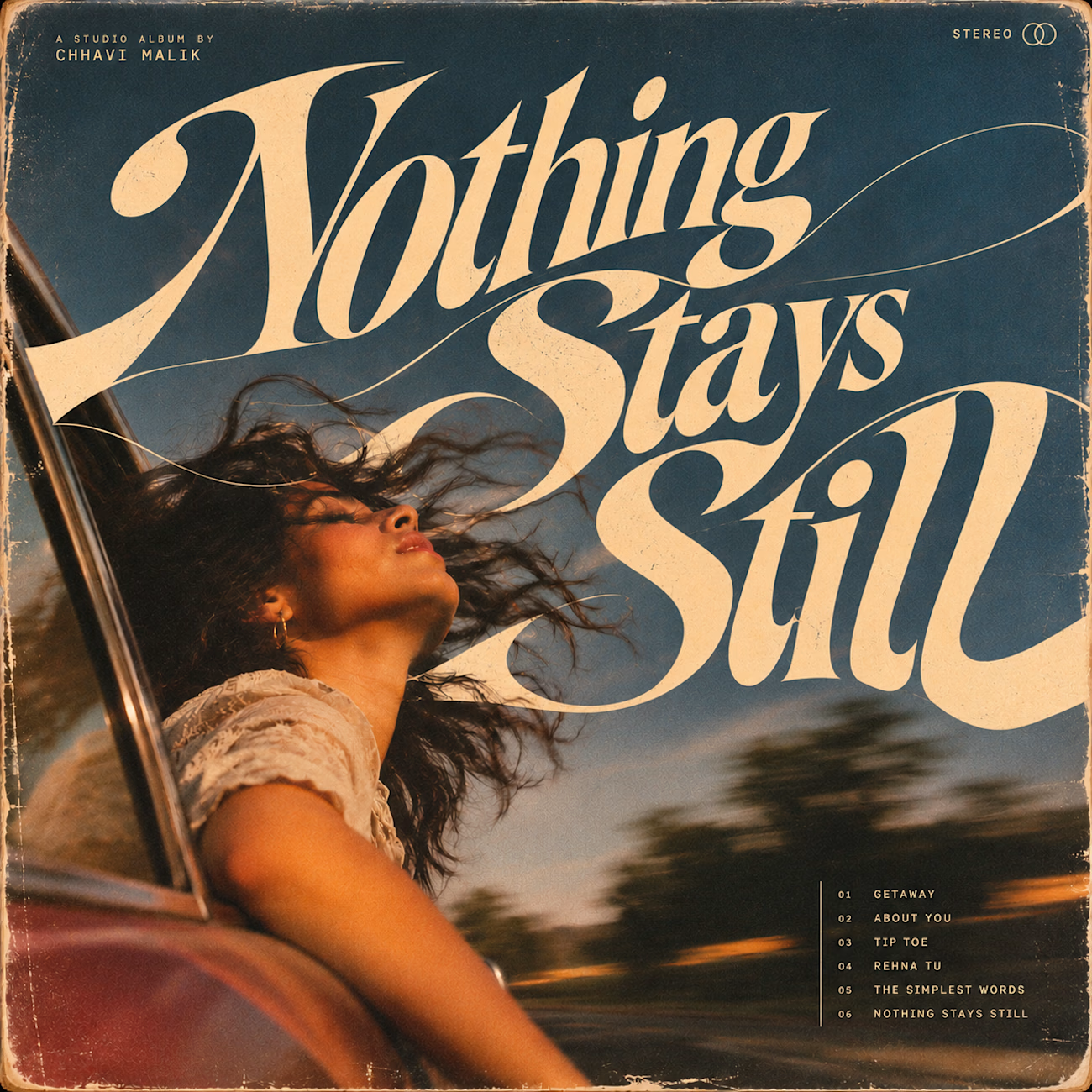
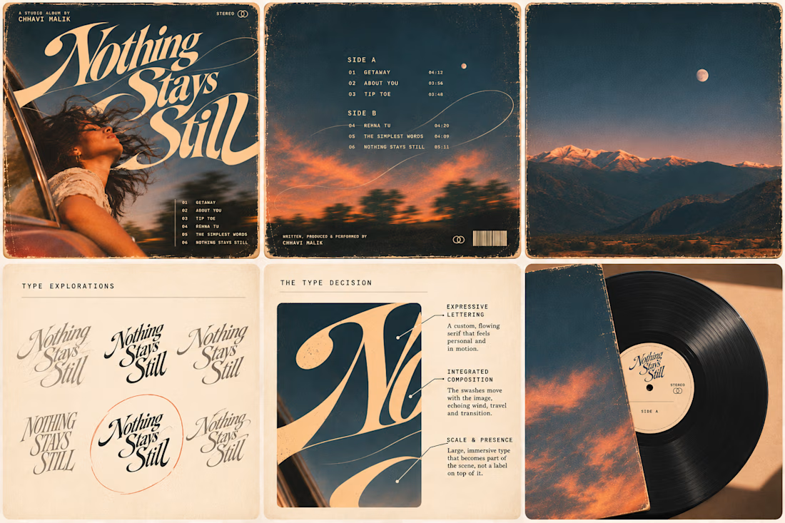
This question has been doing the rounds on X and I have to say, I'm firmly on the other side of that argument. I've always loved seeing typography become part of the artwork rather than just a title sitting on top of it.
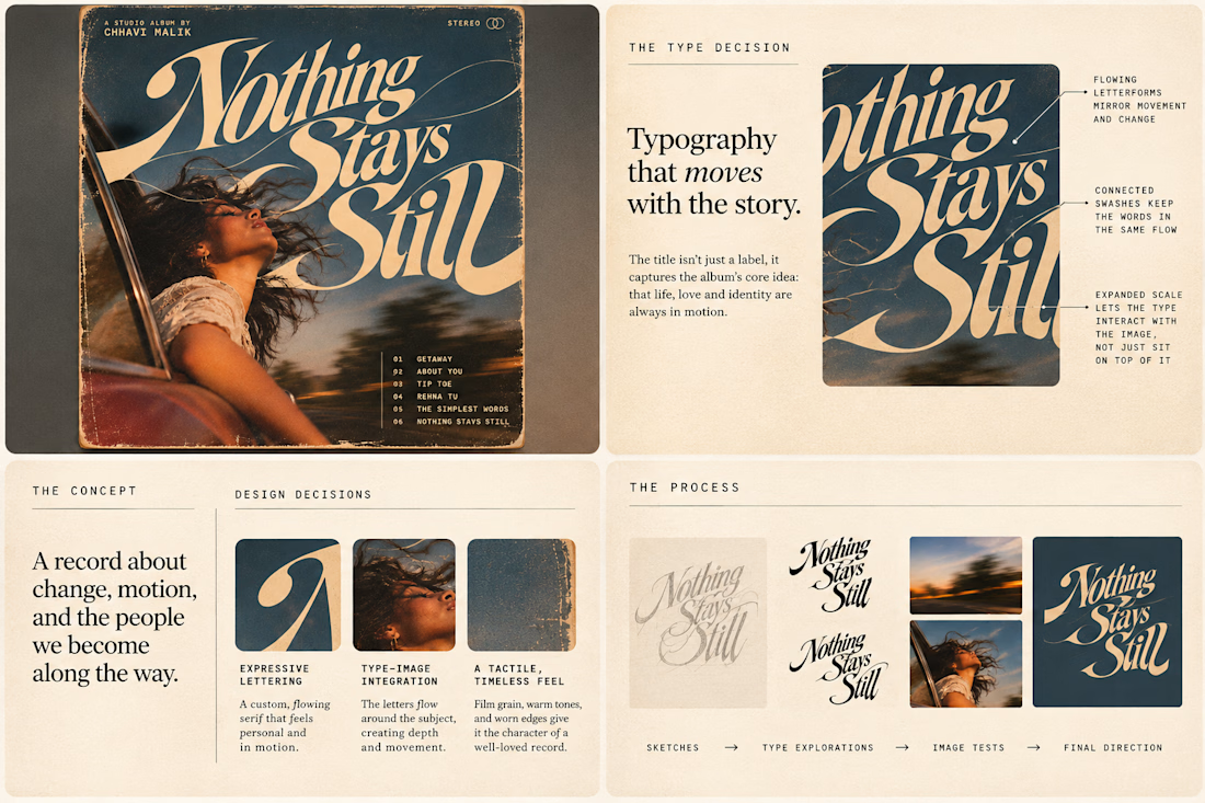
So I wanted to put that idea to the test with an imagined album called Nothing Stays Still, inspired by change, fleeting moments and everything in between:)
I played around with the lettering until it felt expressive, a little restless, and inseparable from the photograph.
Because I think badly considered typography is tacky. Typography itself? Give it a chance :)
What's an album cover where the type really makes it for you?


Half Off Mattress Outlet — E-commerce Website Design & Development
What if luxury sleep didn't have to come with a luxury price tag?
That was the idea behind this project.
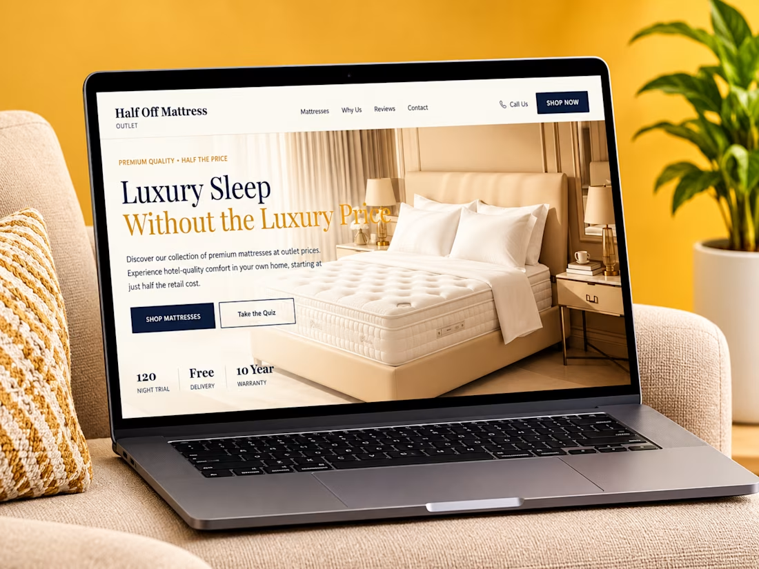
Proud to showcase my website design and development project for Half Off Mattress Outlet, an e-commerce experience built around making quality sleep more accessible.
The goal was to create a clean, modern, and conversion-focused website that makes product discovery easier, communicates value clearly, and gives customers the confidence to make a purchase.
A few things I focused on:
✦ Clean, modern e-commerce UI
✦ Strategic product presentation
✦ Clear pricing and savings communication
✦ Intuitive navigation and user experience
✦ Trust-building sections and customer benefits
✦ Responsive design across devices
The bigger idea was simple: don't just showcase mattresses — sell the experience of better sleep.
I'd love your feedback!
If you were shopping for a mattress online, what would influence your decision most: the product design, price, customer reviews, or delivery and warranty benefits?
Drop your thoughts below. Let's talk design! 👇
Designed & Developed with Webflow.
#WebDesign #Webflow #EcommerceDesign #UIDesign #UXDesign #WebsiteDesign #WebDevelopment #ProductDesign #EcommerceWebsite #LandingPageDesign #ResponsiveDesign #UserInterface #UserExperience #WebDesigner #DigitalDesign #Behance #CreativePortfolio #VisualDesign #OnlineStore #ConversionDesign


lovely design