The network for creativity
Join 1.25M professional creatives like you
Connect with clients, get discovered, and run your business 100% commission-free
Creatives on Contra have earned over $150M and we are just getting started
Back to feedPost
Taste Test


New design looks good!

The new design is cleaner for sure. The neutral tone makes the work pop without competing with it
Yeah you can see your design evolve with time, at the beginning you tend to dump a lot of colour to make it stand out but as time goes on you realise neutral colours are more effective

Nice work

New design, clean ❤️

I will prefer the new design

Nice and creative idea with excellent execution.
Thank you! Really appreciate it!
The network for creativity
Join 1.25M professional creatives like you
Connect with clients, get discovered, and run your business 100% commission-free
Creatives on Contra have earned over $150M and we are just getting started
Related posts


Too cool 🙌


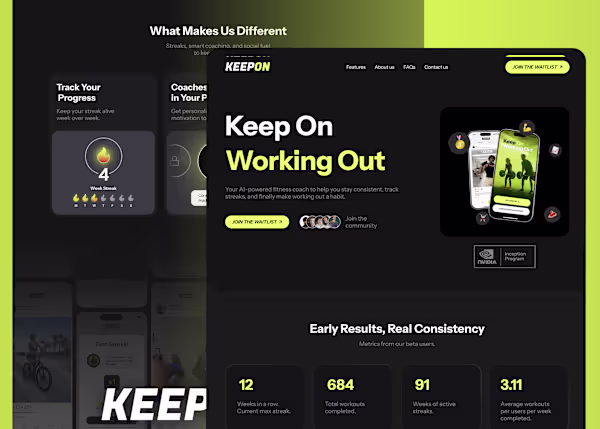
Case study: KEEPON
KEEPON is an AI-powered fitness platform designed to help users stay consistent through streaks, progress tracking, and personalized coaching.
We designed the brand, product experience, and website to create a system that feels structured, motivating, and easy to follow. The focus was on making progress visible, reducing friction, and turning workouts into a habit users can actually maintain.


Excellent work👏

“Don’t niche down too early.”
@Kuba Gawlik spent years as a design generalist across supplements, agencies, and startups, now he can “do it all” and charge for it.
If you want to learn how to do that, without going through the years of trying, this is for you
Full episode:


Trending


Figma Make
Go from idea to prototype in minutes. What are you designing?
brandguidelines
Brand guidelines are becoming living systems, not static documents. What are you building for your clients?
aivideo
AI video tools are moving at warp speed. Which ones are you experimenting with?
illustration
Handcrafted illustration is bubbling up across the web. What are you drawing lately?
freelancerlife
Freelancer life is wins, pivots, and everything in between. What’s yours right now?