The network for creativity
Join 1.25M professional creatives like you
Connect with clients, get discovered, and run your business 100% commission-free
Creatives on Contra have earned over $150M and we are just getting started
Back to feedPost

Structured Webflow architecture designed to support growing agency teams.
Built for Agencies — Structured to Scale
Webflow build engineered for team collaboration and long-term scalability.
Focus areas:
• Clean Navigator hierarchy
• Predictable class architecture
• Scalable design token system
• CMS structured for expansion
No rushed sections.
No messy stacking.
No technical debt.
Designed for smooth handoffs and efficient iteration inside agency workflows.
Available for agency partnerships and white-label Webflow builds.


The network for creativity
Join 1.25M professional creatives like you
Connect with clients, get discovered, and run your business 100% commission-free
Creatives on Contra have earned over $150M and we are just getting started


Related posts


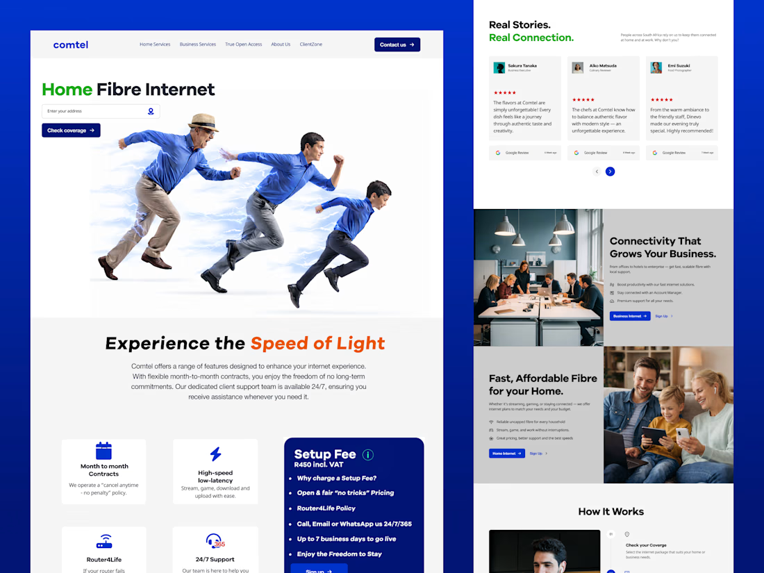
Comtel: a Figma design and Webflow build for a South African fibre ISP.
The coverage checker sits right in the hero.
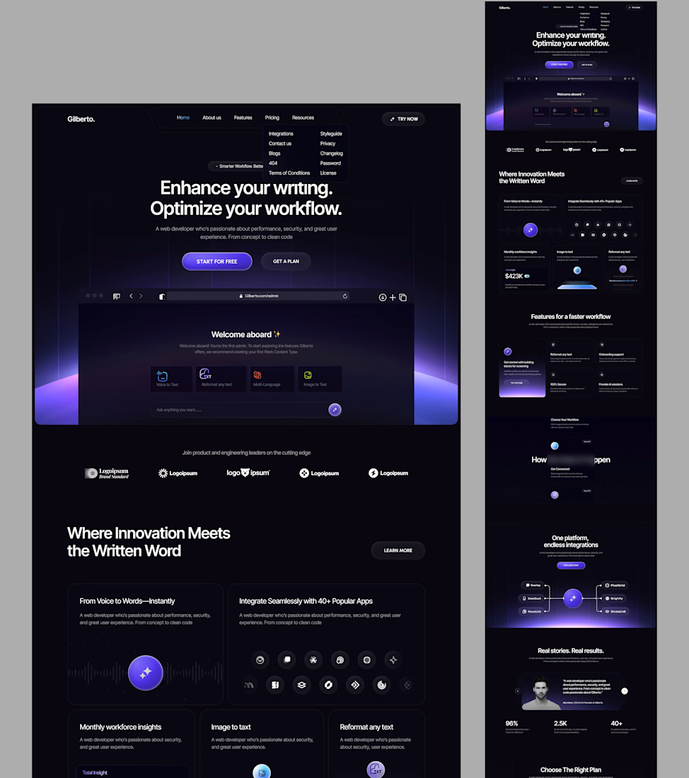
Gilberto: a website template for AI writing tools.
The hero puts the real app in a browser frame, so visitors see the product first.


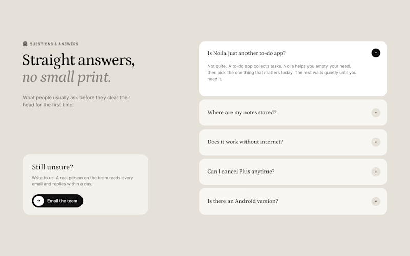
Nobody gets excited about designing an FAQ section. But it's often the last thing people read before they sign up.
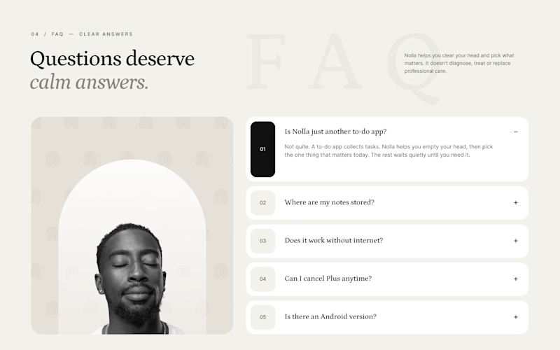
Two takes for Nolla.
A is a calm split. Questions on the right, and on the left a small card saying a real person replies to every email. When someone's unsure, that's what they're looking for.
B numbers every question and brings back the arch portrait and logo pattern from the hero, so it still feels like the same site.
Designed in Figma for a Webflow build.
Which one would you trust more?


4 votes
Ends in 9h