The network for creativity
Join 1.25M professional creatives like you
Connect with clients, get discovered, and run your business 100% commission-free
Creatives on Contra have earned over $150M and we are just getting started
Back to feedPost
I'm currently updating my profile and tried this showreel-like cover image.
What do you think of it? Should we go with something simpler? 🤔
Looking for some input 😅

it looks good but i say if you did show after that one work after another in full screen for 1 or 2 seconds would make it even better so the potential client can see the work in a good vision

I think it looks really good, but it doesn't really showcase your work. It would be better if one or two of your designs were shown clearly for a few seconds before transitioning into a fast montage of everything else. Overall, though, it looks great.


Thank you @Diego Sánchez ! That's exactly the kind of feedback I was looking for!

I thinks that's too much happening in very short time.

I'd keep it, the showreel format actually shows range instead of just telling people you do motion work. Only thing I'd change is maybe trimming it a beat shorter so it loops faster on a profile visit, ten seconds can feel long when someone's just skimming.
Yes, exactly. I’d reduce the number of elements appearing within those 10 seconds and let each key moment breathe a little longer. That should make the motion feel cleaner, easier to follow, and more premium without losing the variety.


Hey Dennis, so I've been following your work for a while and I totally see why you would try this but to be honest your projects are so rich and deep in themselves I wouldn't drown them in this kind of a template I would advise you yo try to find a way where you can show at...
@Aavirash Mitra Man - thank you so much for your feedback and for the kind words
I'm trying to fix this and make it clearer
Thank you!

The design looks awesome. Great project!
Thank you @Md Abdur Rouf

This looks really great, Dennis! Love the motion and how it flexes your range right away.
Thank you @Infinity | Pitch Decks & Presentations !

Honestly it’s good enough but feels uncomfortable to watch. My recommendation: Try this animation on complete white background. Start animation with you profile card something like appears from centre then the others cards with same animation loop
The network for creativity
Join 1.25M professional creatives like you
Connect with clients, get discovered, and run your business 100% commission-free
Creatives on Contra have earned over $150M and we are just getting started

Challenges
View all


Related posts


Trying out two cover designs for a project.
Which one looks better to you? Would love to hear your thoughts! 👀
5 voted
20%
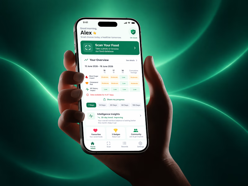
20 voted
80%
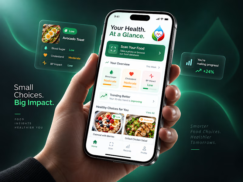
25 votes
Closed

New Direction, no question. Your Health At a Glance plus those cleaner cards actually invite you in, the original feels more like a dashboard you have to decode. Small choices, big impact, very fitting given the copy.

Created this for a clients product launch.
what do you think?


Pick up the Starbooks~
A card animation.Focused mainly on syncing the parallax for the motion animation.That little star on the card turned out so nice! 🌟


The parallax gives the card a satisfying sense of depth.