The network for creativity
Join 1.25M professional creatives like you
Connect with clients, get discovered, and run your business 100% commission-free
Creatives on Contra have earned over $150M and we are just getting started
Back to feedPost

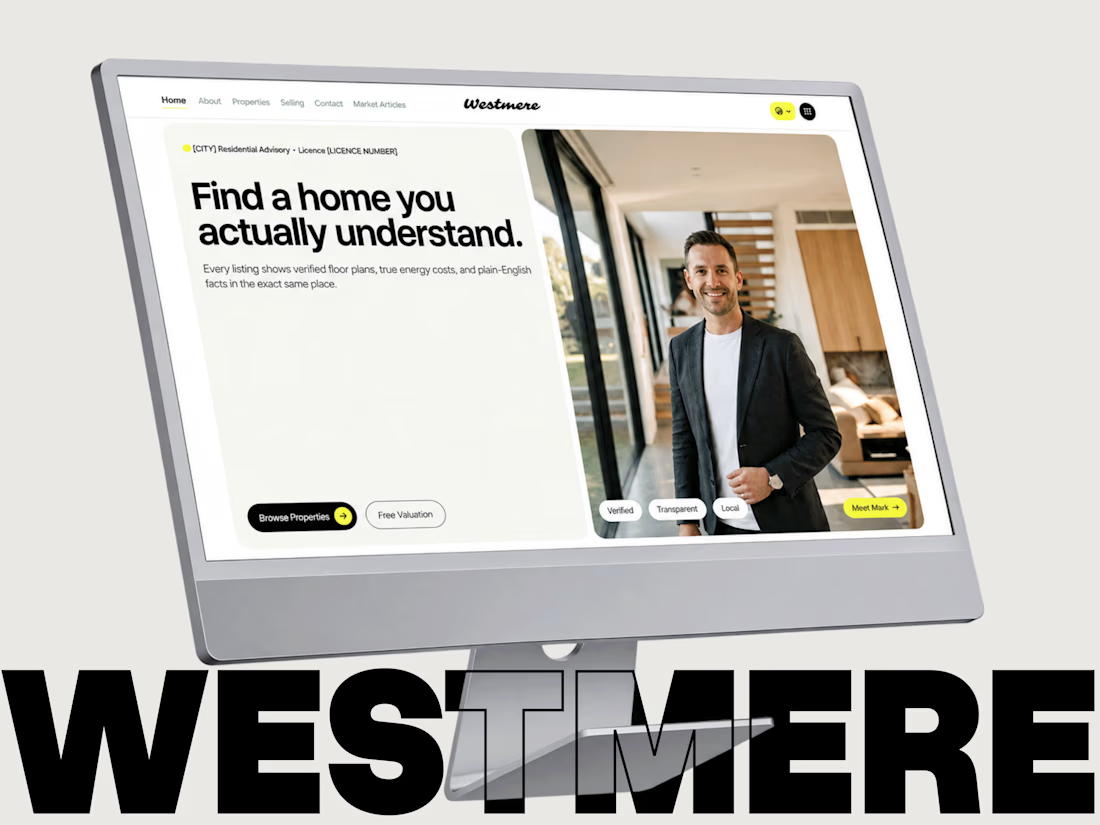
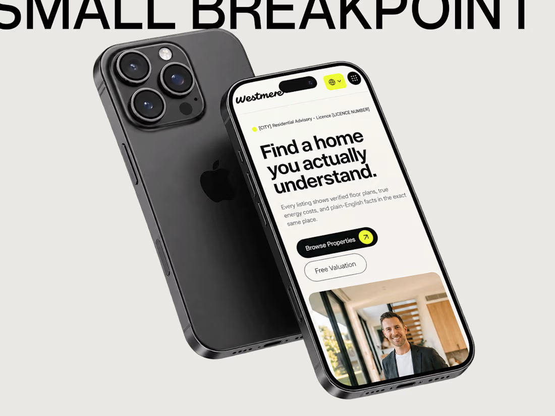
Published a new Framer template: Westmere, a personal website for independent real estate agents.
It's built around a Properties CMS (status filters, gallery pages, viewing form), plus a valuation form and an article blog. No MLS feed or map search, on purpose, so it stays quick to set up and quick to load.
I'm also open to custom Framer builds and template customisation for agents and small real estate teams. Happy to share the live preview.
The network for creativity
Join 1.25M professional creatives like you
Connect with clients, get discovered, and run your business 100% commission-free
Creatives on Contra have earned over $150M and we are just getting started



Related posts

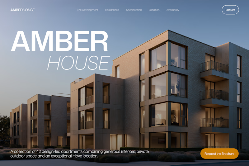
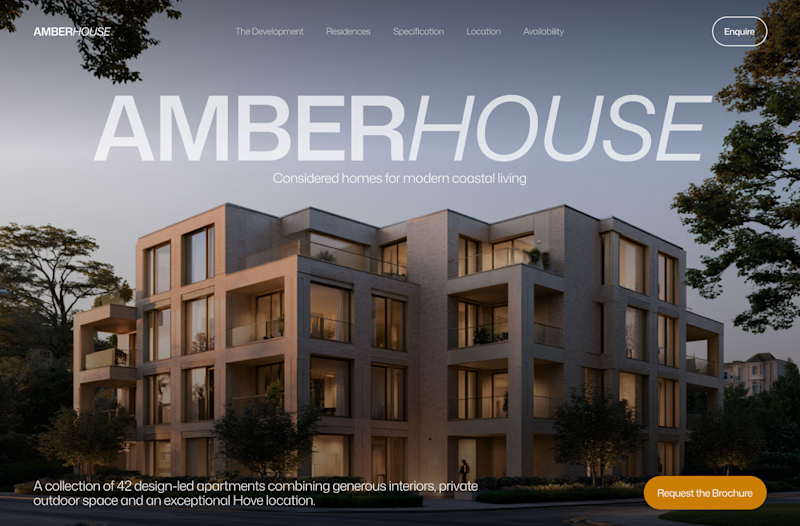
Which hero would you choose — 1 or 2?
Two directions for Amber House, my real estate website template. The first pairs a closer architectural crop with an asymmetric layout. The second gives the building more breathing room, with a wide view and a centered headline.
Same template, two different first impressions. Which feels stronger to you, and why?
24 voted
59%
17 voted
41%
41 votes
Closed

I will go with Bold & Asymmetric!

Portfolio update: I couldn't decide on a look, so I built both.
A or B? manucabezas.com

11 voted
69%
5 voted
31%
16 votes
Closed

dev mode on dark looks 👌🏻✨

Exploring Framer's new Agent Templates workflow.
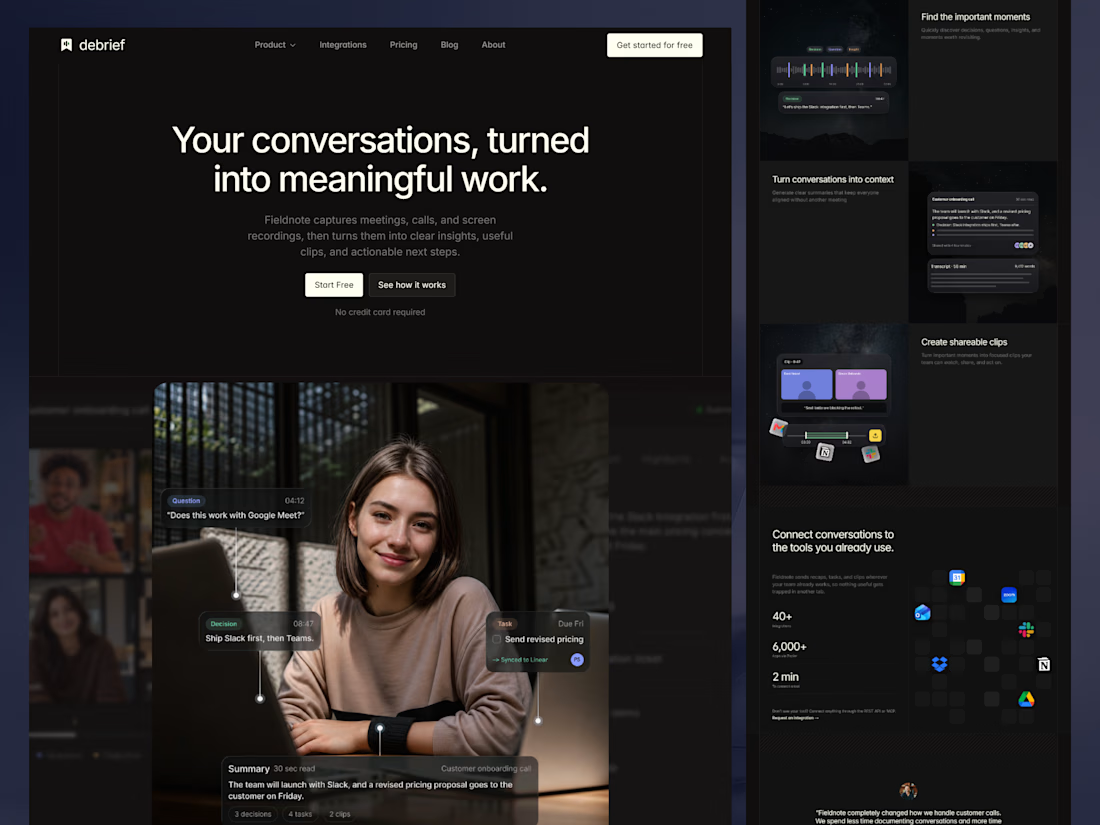
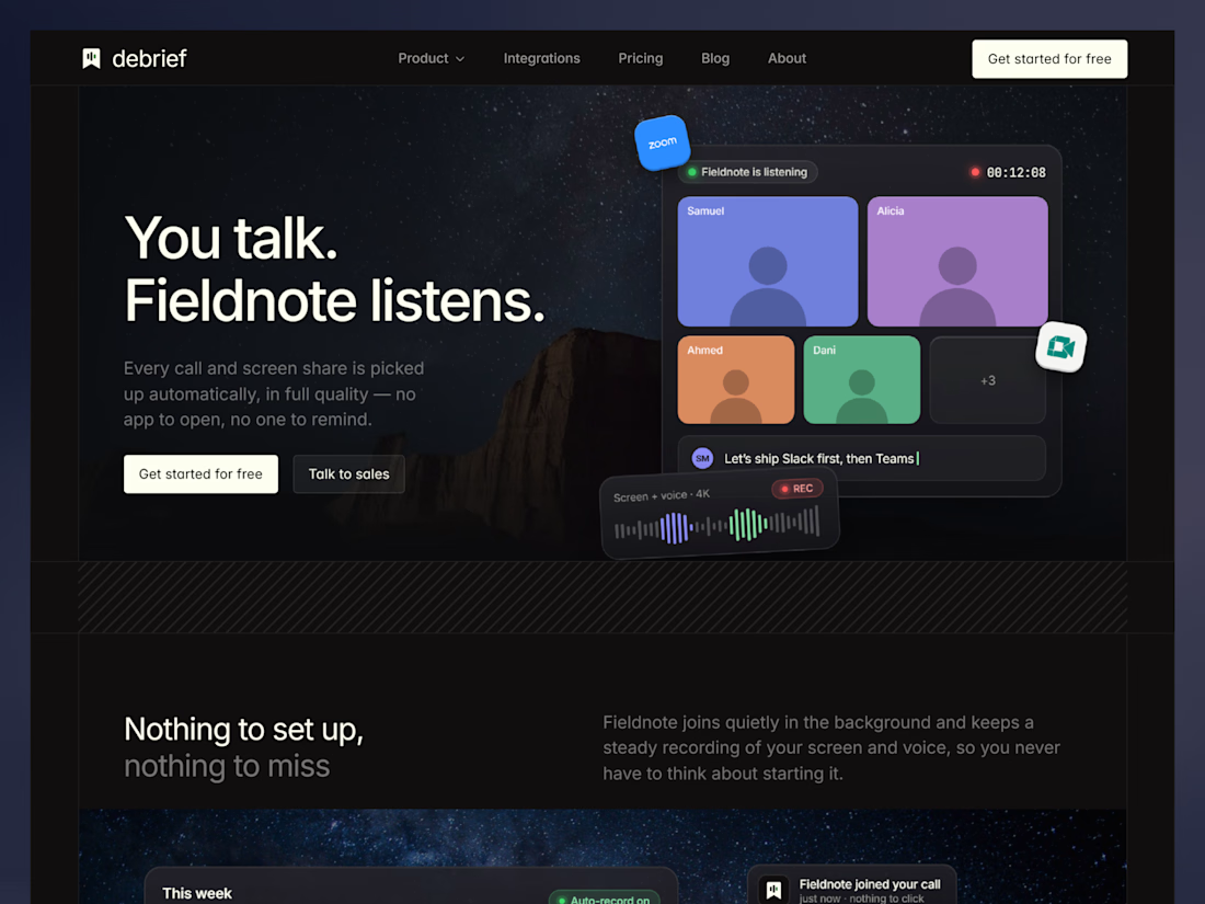
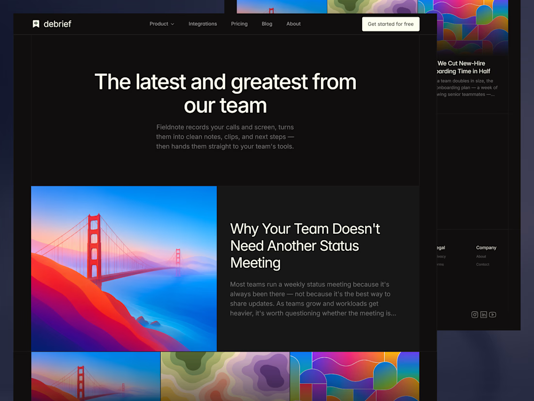
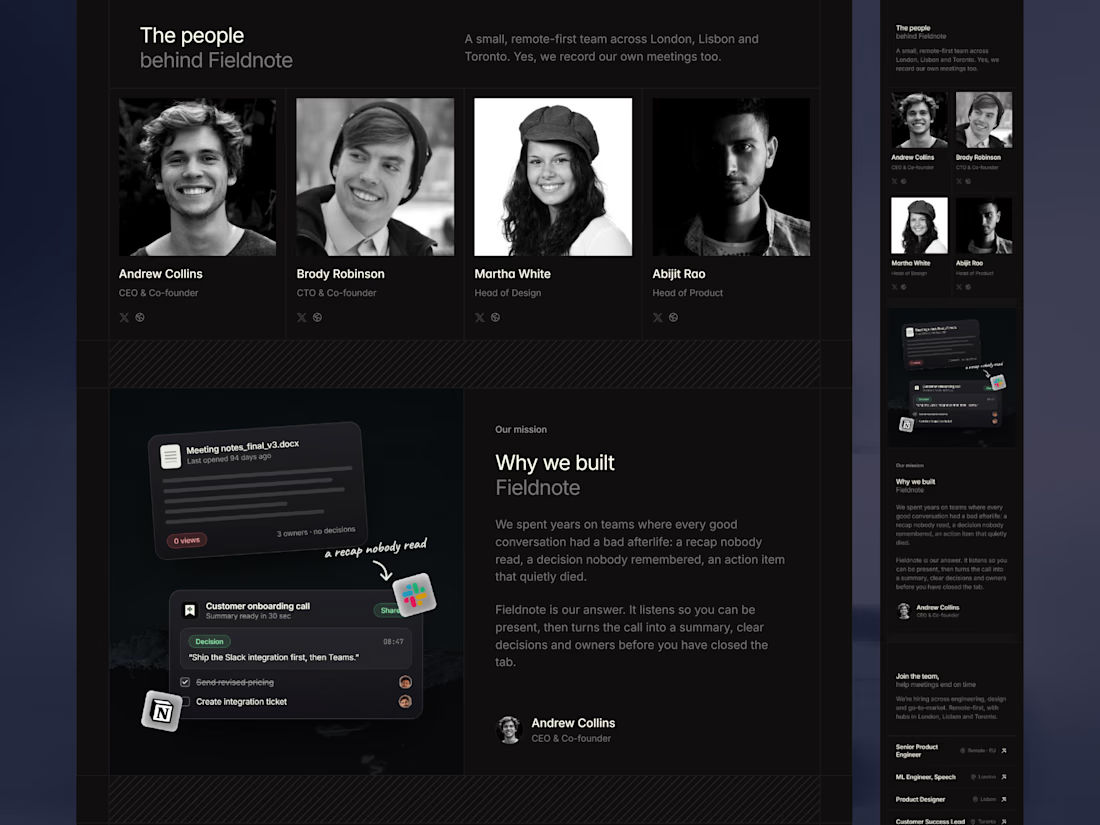
We built Debrief, a free Framer template for AI meeting notes and productivity.
Check it out
It comes with a complete design system, agent-ready skills, and everything you need to build and customize faster with the Framer Agent.


Top