The network for creativity
Join 1.25M professional creatives like you
Connect with clients, get discovered, and run your business 100% commission-free
Creatives on Contra have earned over $150M and we are just getting started
Back to feedPost

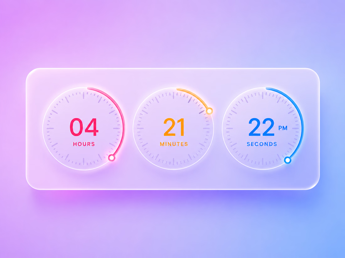
Glassmorphism Digital Clock UI
A front-end UI experiment focused on glassmorphism design principles and smooth visual aesthetics.
Built using HTML, CSS, and JavaScript, this concept explores translucent surfaces, soft gradients, circular progress indicators, and minimalist information hierarchy.
Key Features:
• Glassmorphism-inspired interface
• Circular timer components
• Responsive layout
• Soft gradient backgrounds
• Lightweight and modern visual design
Tools & Technologies:
HTML5 • CSS3 • JavaScript


The network for creativity
Join 1.25M professional creatives like you
Connect with clients, get discovered, and run your business 100% commission-free
Creatives on Contra have earned over $150M and we are just getting started
Related posts




Awesome dude

Same product, three different visual directions.
Exploring alternative concepts for a single product over the weekend.
I started with a simple product shot on a plain background and used Krea 3 to reimagine it in three different settings: playful floating spheres, sculptural glass structures, and a miniature garden.
Which one is your favorite?


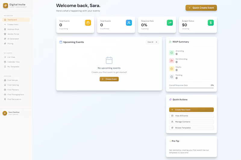
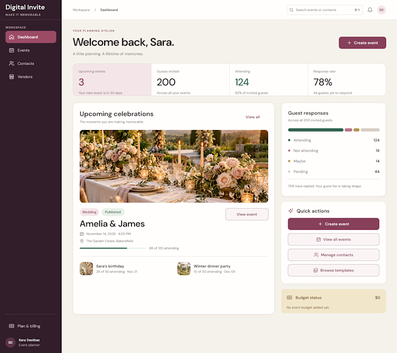
AI can generate a dashboard. But can it give a product its own identity?
The first design was created by my client using AI a familiar dashboard style you've probably seen across countless AI-generated products.
I redesigned it to feel less generic and more intentional, with a distinctive visual identity, clearer hierarchy, and an experience built around meaningful celebrations.
The goal wasn't just to make it look better. It was to make it feel like its own product.
What do you think is missing from most AI-generated interfaces?
#ProductDesign #UIDesign #AI

5 voted
23%
17 voted
77%
22 votes
Closed

I think personality is what makes a product stand out. A clean design is good, but it should also feel unique and memorable. 👏