The network for creativity
Join 1.25M professional creatives like you
Connect with clients, get discovered, and run your business 100% commission-free
Creatives on Contra have earned over $150M and we are just getting started
Back to feedPost

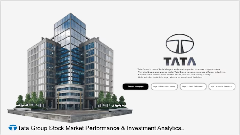
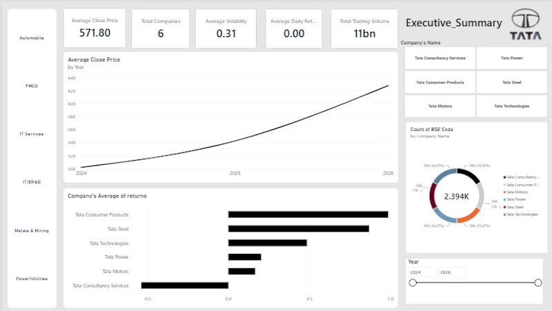
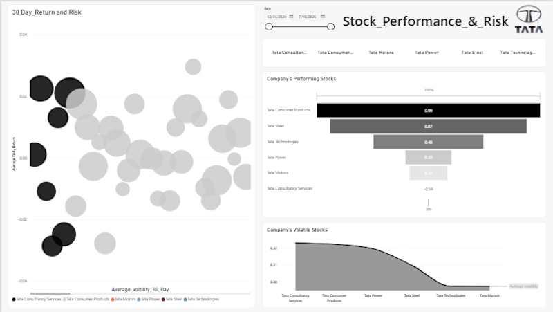
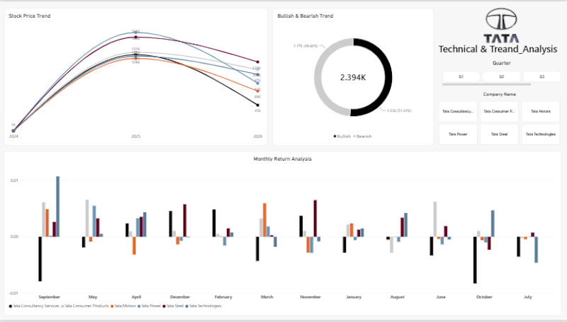
Built an interactive Power BI dashboard to analyze the stock market performance of major Tata Group companies, including TCS, Tata Motors, Tata Steel, Titan, Tata Consumer, and Tata Power.
The project focuses on stock price trends, returns, volatility, trading volume, and comparative performance to identify market trends and support data-driven investment analysis.
I cleaned and transformed the dataset, performed analytical calculations, and designed an interactive dashboard with clear KPIs and visualizations for comparing companies and understanding their historical market performance.
Tools: SQL, Python, :Power BI, Power Query, DAX, Excel, and data analysis techniques.


The network for creativity
Join 1.25M professional creatives like you
Connect with clients, get discovered, and run your business 100% commission-free
Creatives on Contra have earned over $150M and we are just getting started

Challenges
View all


Related posts

Finding the right job often requires manually comparing a resume against dozens of job descriptions.
This project automates that process by:
Analyzing a resume against multiple real job postings
Generating AI-powered match scores
Identifying missing skills
Providing resume improvement suggestions
Storing results in a SQL database
Visualizing insights in Power BI
Offering a live Streamlit web application
🛠️ Tech Stack
Python
Pandas
SQLite
SQL
Google Gemini AI API
Streamlit
Power BI
VS Code
📊 Key Features
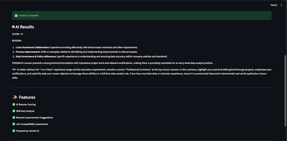
AI Resume Analysis
Resume-to-job match scoring (0–100%)
Missing skill identification
AI-generated recruiter feedback
Resume improvement recommendations
Database & SQL
Stores analyzed jobs in SQLite
Performs analytical queries
Identifies skill gaps
Finds best-fit companies and locations
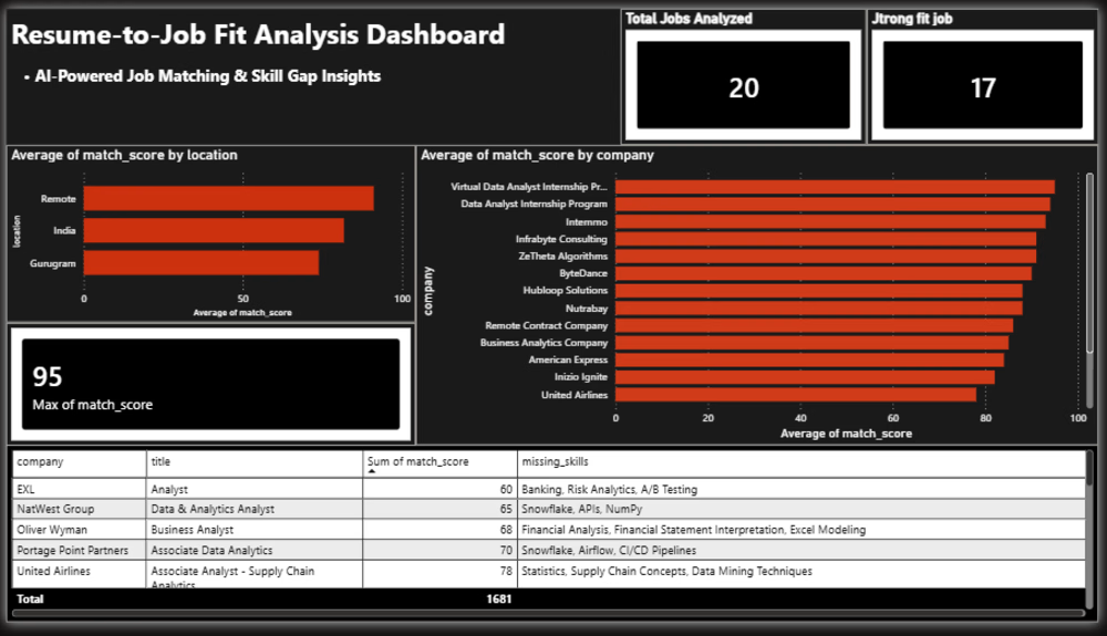
Power BI Dashboard
Average Match Score
Strong Fit Jobs
Top Match Score
Company Match Analysis
Skill Gap Analysis
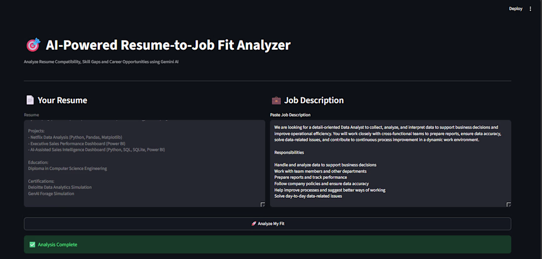
Streamlit Application
Paste any job description and instantly receive:
Match Score
Missing Skills
AI Feedback
Resume Improvement Tips
📈 Dashboard Insights
The dashboard provides:
Overall resume strength across jobs
Best matching companies
Skill gap analysis
Job fit distribution
Career improvement opportunities
🎯 Business Value
This project demonstrates:
Data Cleaning
Data Analysis
SQL Querying
AI Integration
Dashboard Development
Data Visualization
End-to-End Analytics Workflow
🔮 Future Improvements
Analyze 100+ job postings
Automated LinkedIn job ingestion
Multiple resume comparison
Industry-specific recommendations
Advanced skill trend tracking
👨💻 Author
Gourav Jangid
Aspiring Data Analyst passionate about transforming data into actionable insights using Analytics, SQL, Python, Power BI, and AI.



Awesome use case! Automating resume-job matching saves so much time.

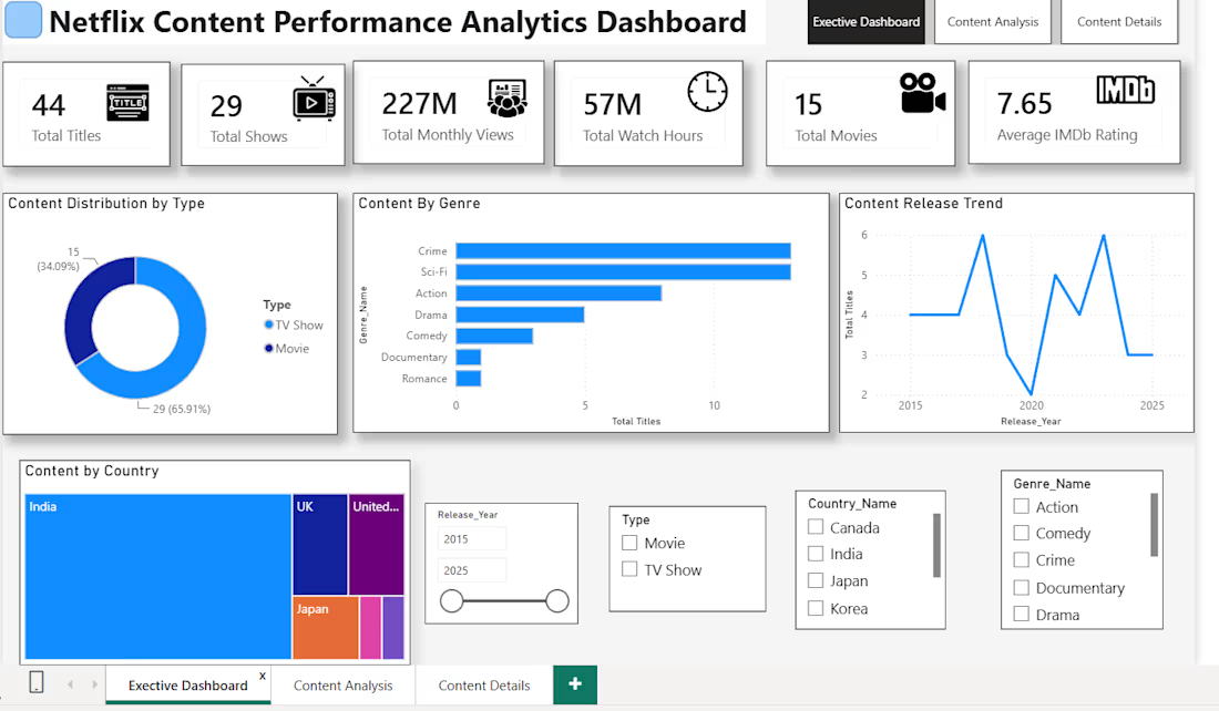
Built an interactive Power BI dashboard to analyze Netflix content, genres, countries, ratings, and release trends. Used data cleaning, data modeling, DAX, and interactive visualizations to transform raw data into meaningful insights.

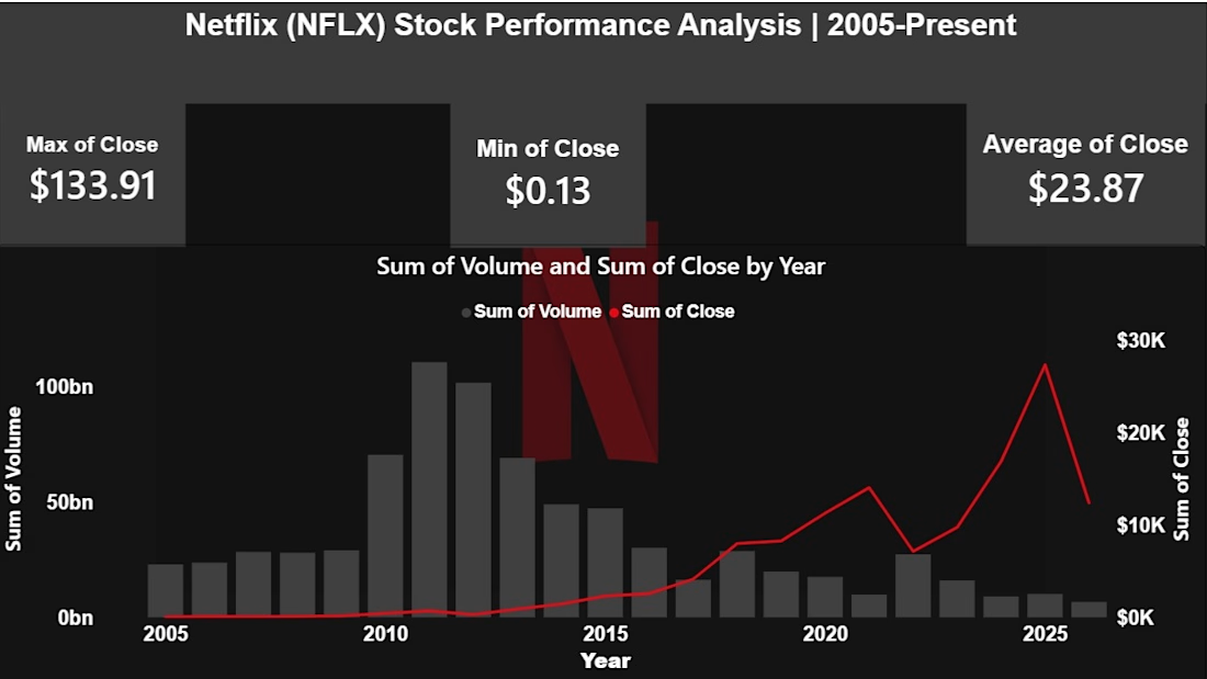
Interactive Netflix Stock Performance Analysis built using Power BI. Designed custom KPI metrics (Max, Min, and Avg Close Prices) and visualized stock volume vs. closing price trends over time.