The network for creativity
Join 1.25M professional creatives like you
Connect with clients, get discovered, and run your business 100% commission-free
Creatives on Contra have earned over $150M and we are just getting started
Back to feedPost

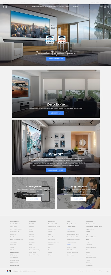
WordPress multisite platform for Screen Innovations, a home theater and shading company: 5 separate brand sites (Residential, Commercial, Support, Drivers, Shade Innovations), 500+ pages and 500+ posts, on a custom theme built on Avada.


The network for creativity
Join 1.25M professional creatives like you
Connect with clients, get discovered, and run your business 100% commission-free
Creatives on Contra have earned over $150M and we are just getting started




Related posts

I designed and built this landing page for Atelier.
It was a fun exploration of shader-driven visuals, tactile textures, and motion. Using WebGL alongside GSAP opened up a lot of possibilities for creating interactions that feel more alive, immersive, and intentional, not just animated for the sake of it.
#GSAP #WebGL #Textures


Great work!!

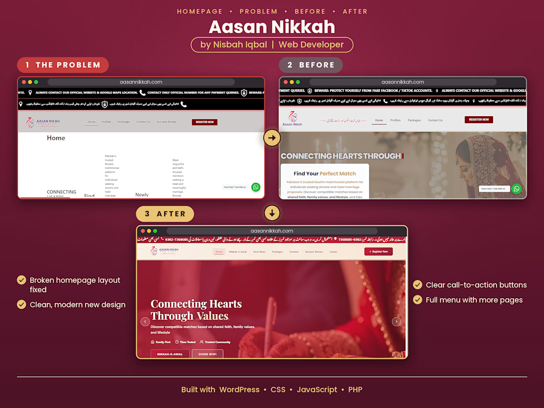
Title: Aasan Nikkah Matrimonial Website: Homepage Fix and Redesign
The homepage of this matrimonial website had a broken layout with text overlapping and no proper structure. I first fixed this problem, then redesigned the full homepage. The new design has a clean crimson and cream theme, a clear "Find Your Perfect Match" section, a full menu with more pages, and clear call-to-action buttons. Built with WordPress and custom code in CSS, JavaScript, and PHP.


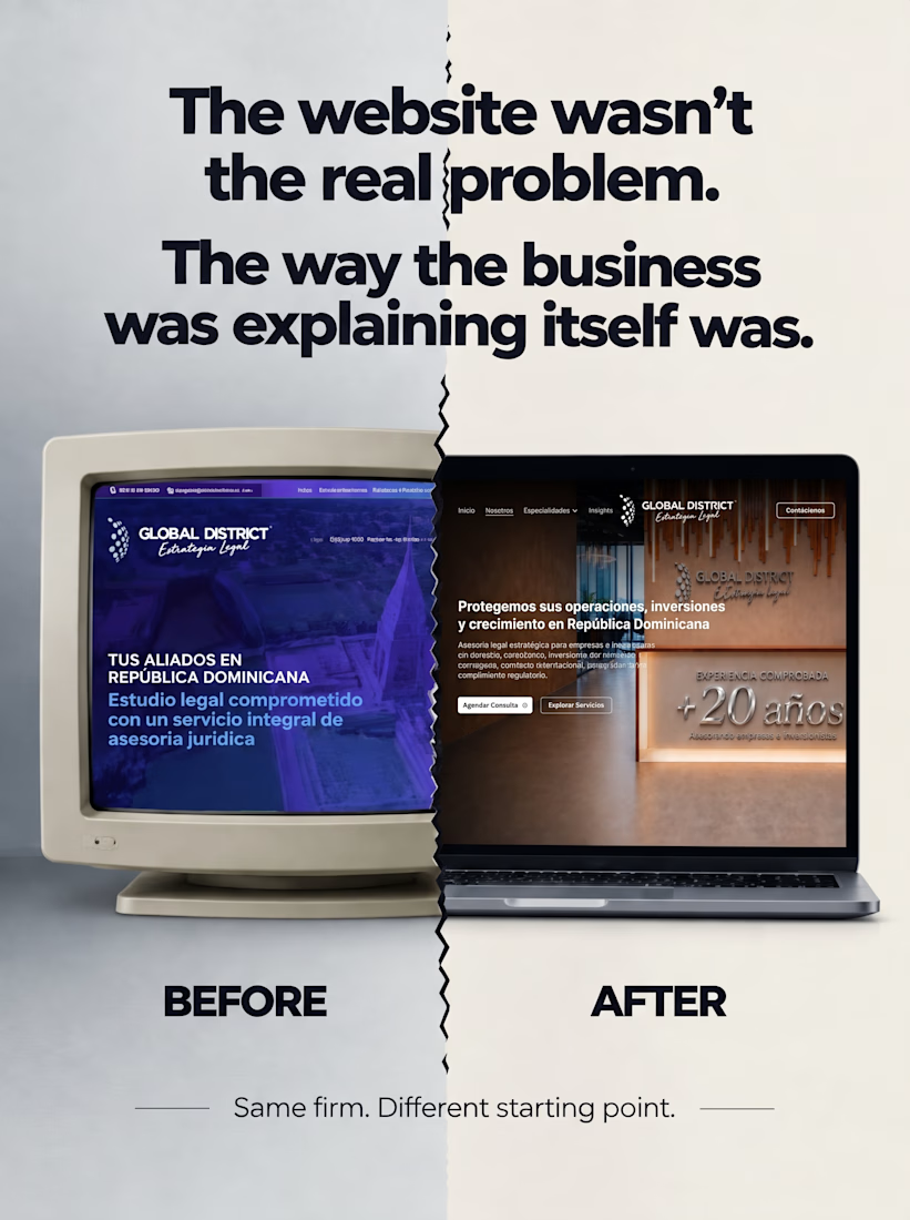
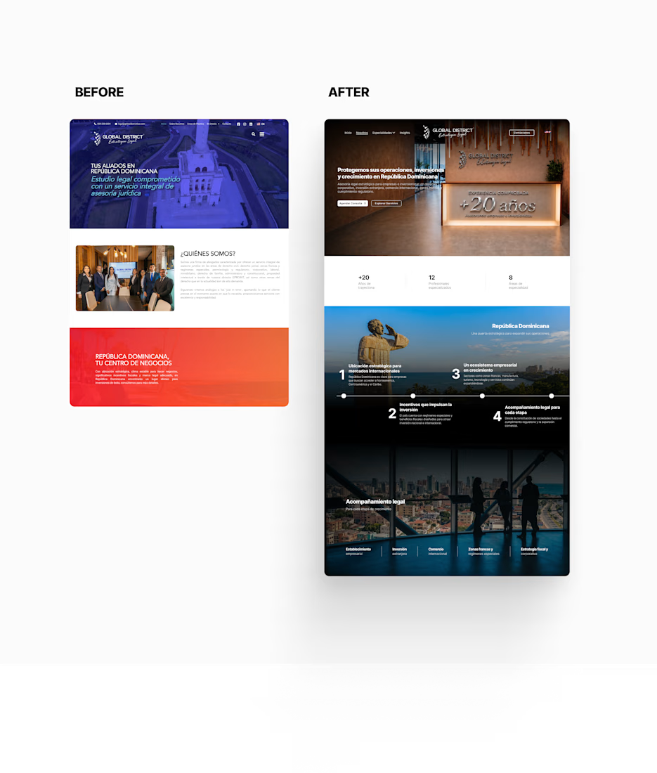
This is one of those projects that starts as a simple redesign, but the more you dig into the business, the more you realize the foundations aren’t quite clear.
It made me think a lot about how to help users understand something that requires a high level of specialized knowledge. At some point, it became clear that simply proposing a new design wasn’t what this project was really about.
The reality was that, regardless of how the website looked, understanding a law firm with so much technical language was intimidating for users. So I proposed a new communication strategy that would allow us to restructure the website around a clearer journey — one that guided users through the firm, helped them understand what the business actually does, and made it easier for them to recognize themselves in the services being offered.
What started as a redesign eventually became a much deeper project: redefining the communication strategy, reworking the copy, restructuring the practice areas, and only then rethinking the visual design.
It was one of those projects that really makes you think, and I genuinely loved every part of it.
And if you’re curious enough to see the whole thing, you can find it right here