The network for creativity
Join 1.25M professional creatives like you
Connect with clients, get discovered, and run your business 100% commission-free
Creatives on Contra have earned over $150M and we are just getting started
Back to feedPost


404 page interaction for the upcoming framer template


Awesome design and animation. Well done 👏👏

thanks!


Great work👏🔥🔥
appreciate it


Can't wait for this template to drop
in the next 24h 😎

Great work🔥
thank you!

The scattered card drift keeps it playful without burying the "back to home" CTA, that balance is hard to pull off on a 404. How long did the timing take to feel right?

Cool job!
thanks!

user will be confused whether the page not found or this is playing time, very interactive design
😅😅😅

Hands down best thing I saw today
haha thanks

This is nice
thanks

Super cool for a 404 man, love it! 🚀
appreciate it


pretty nice

This is amazing

How long did the timing take to feel right?

What is that font? It's nice!
Sora
?

I meant nice one

Always make your 404 error page fun, thanks for this man

Nice work 🧡
thank you!

404 pages deserve this much attention 😂 Really nice execution🙌

This would really be fun

Lovely interaction, Alex. Well done.
Thanks Aliu!

love!


looks interactive!
it is!

Wow, love this!

This is classic

nice


the floating photos on the 404 are fun. nice one alex
thanks Benjamin!

Absolutly love ittt
The network for creativity
Join 1.25M professional creatives like you
Connect with clients, get discovered, and run your business 100% commission-free
Creatives on Contra have earned over $150M and we are just getting started











Related posts

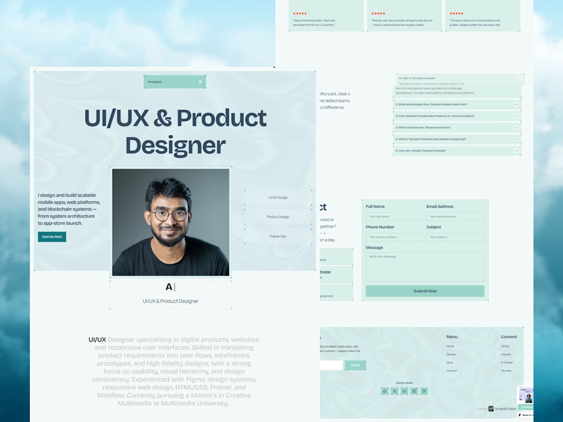
Your next client might be one portfolio away. ✨
MyFolio Pro — a premium Framer template for freelancers, UI/UX designers, and creative agencies.
Template link: https://framer.link/E9JSnLX



love this as well man

Absolute positioning can be really useful in Framer.
For example, when an element needs to overlap another element or sit on top of other stack. (1st clip)
It's also useful when an element needs to stay in a specific position instead of following the normal layout. (2nd clip)
These are just a few cases where absolute positioning makes sense.

Great breakdown! Absolute positioning is so underrated in Framer for those overlap cases. Love how you explained the 2 use-cases - stacking and fixed position vs normal flow. Super helpful tip!


A Recent Framer-Based Brand Experience for a Real Estate Company


Super clean brand system! 🤌 Love the mint on dark contrast and how the mark works across touchpoints - that ID card mockup is chef's kiss. Great Framer execution for real estate!


