The network for creativity
Join 1.25M professional creatives like you
Connect with clients, get discovered, and run your business 100% commission-free
Creatives on Contra have earned over $150M and we are just getting started
Back to feedPost

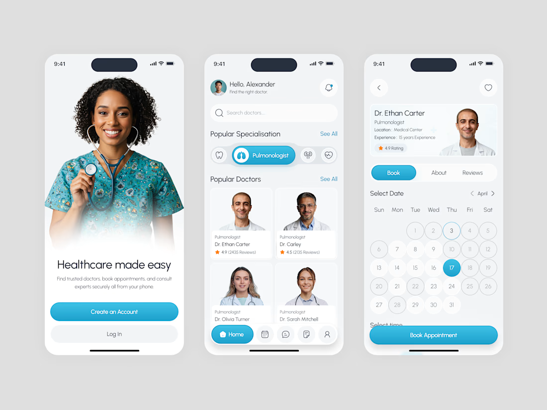
Clinova – Modern Healthcare, Simplified

The network for creativity
Join 1.25M professional creatives like you
Connect with clients, get discovered, and run your business 100% commission-free
Creatives on Contra have earned over $150M and we are just getting started







Related posts

AI Automation SaaS Landing Page
A modern AI automation SaaS website design focused on simplifying workflows, automating repetitive tasks, and helping businesses work smarter. Designed with a clean interface, intuitive user experience, and a scalable visual system to communicate the value of AI-powered automation.

Amazing

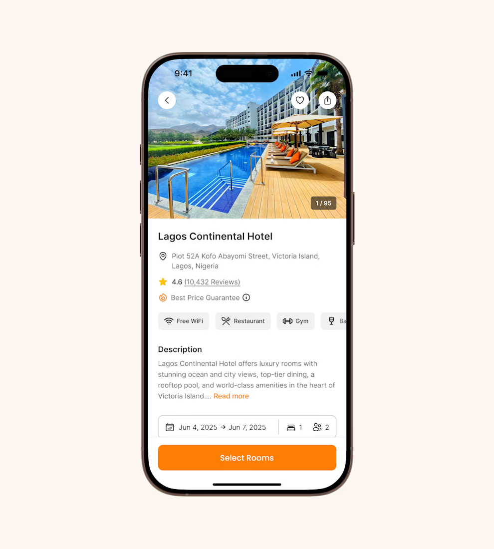
Hotel details screen for a booking app I’ve been designing.
Focused on clear information hierarchy, visual comfort, and helping users make quick booking decisions.
Excited to start sharing my work here 🚀

It's basic design but it's great❤️

Introducing Finora
A modern fintech app designed to make personal finance simpler, smarter, and easier to understand.
Built with a consistent Inter-based design system and a soft, modern visual language.
#UIUX #ProductDesign #Fintech #MobileApp #Figma


All experience in one app well designed.