The network for creativity
Join 1.25M professional creatives like you
Connect with clients, get discovered, and run your business 100% commission-free
Creatives on Contra have earned over $150M and we are just getting started
Back to feedPost
Taste Test
Let’s look at design through a pure business lens: How does a background swap actually change how people shop?
When designing this #dresscode platform, I wanted to test how light and dark modes impact buying behavior, even when the layout remains exactly identical. It’s wild how a color flip changes the emotional trigger.
If you were launching an elite clothing brand, which vibe would you trust to convert your audience?
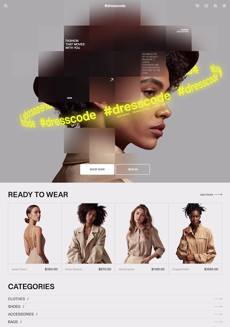
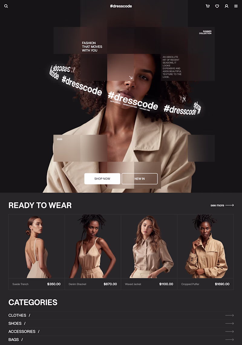
53 votes
Ends in 10h
the white version is top-tier! 💯
Black looks more aesthetic
White is more cleaner
Going for the darker version
Nice design!
I voted white
The white is clean i tell yu.
I tend to lean more towards the dark colors! I like the lighter as well but the dark looks so edgy!
White version is looking sleek!
White one looks like a better fit for this design!
Black for sure
white
Outstanding
The network for creativity
Join 1.25M professional creatives like you
Connect with clients, get discovered, and run your business 100% commission-free
Creatives on Contra have earned over $150M and we are just getting started
Related posts
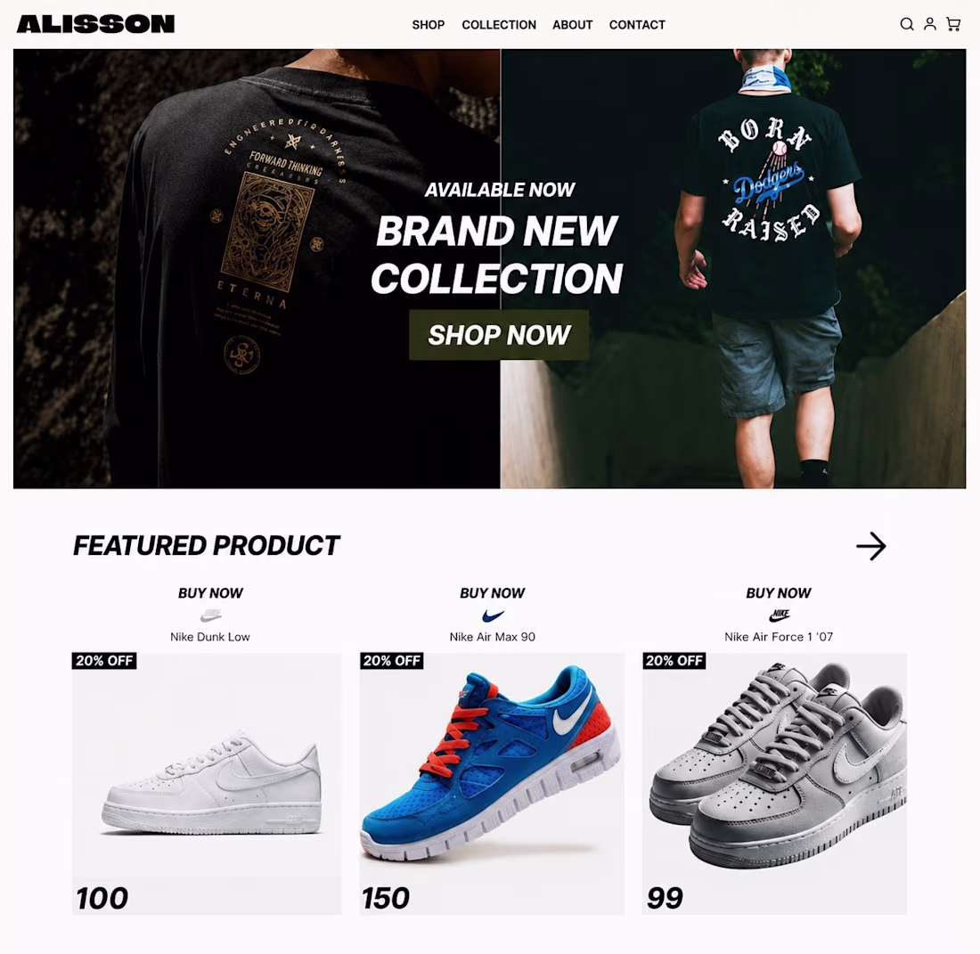
ALISSON — Streetwear E-Commerce Design (Shopify-Ready UI/UX)
Built a bold, conversion-focused storefront for ALISSON using framer and claude Ai, a streetwear and sneaker brand, blending editorial-style imagery with a clean, mobile-first shopping experience designed to drive impulse purchases and brand loyalty.
Highlights:
Full-bleed split-hero with high-impact lifestyle photography and a clear "Shop Now" CTA. A "Featured Product" grid built for fast scanning, with discount badges and pricing front and center. Bold, editorial typography that leans into the streetwear aesthetic while keeping navigation frictionless. Fully responsive and ready for Shopify, WooCommerce, or custom builds.
Available for: e-commerce builds, landing pages, Shopify theme customization, UI/UX design, and brand identity for fashion and lifestyle brands.
One of the best designs have seen so far todayyy,, keep it up
I built a digital paper fashion atelier. It's called Vogue & Scissors.
It started with a simple wish: I wanted to try on different outfits on myself online. But make it 1960s Vogue, inspired by collages, cutouts, and paper dolls.
Built the entire thing in @Figma Make, first thing I've ever vibecoded with it.
I used Figma Weave to transform the dress images.
Every visitor gets a doll and a wardrobe. You mix, match, and layer vintage-inspired pieces to style your own look on an interactive canvas.
In Vogue & Scissors the wardrobe never runs out, the scissors are optional, and nothing ever tears.
I love how Figma Make is the kind of tool that lets you focus on what something should feel like, not how to ship it. I can’t wait to use it for real projects at Macromo.
Made for the @contra x Figma Makethon #FigmaMakeathon
Try it yourself, link is in the first comment.
Love the visual direction here. The attention to detail really stands out.
If I had a brand I will definitely keep you in charge of the marketing sector
Trending
Claude
Claude has entered the design space. How are you using Claude Design?
Contra University
Learn from expert creatives how to earn more using next-gen AI tools.
MagicPath
The canvas is infinite, and exploration is becoming the workflow. How are you using MagicPath?
creativeaiflow
Creative AI workflows are evolving. What tools do you use, and what are their strengths and weaknesses?
freelancerlife
Freelancer life is wins, pivots, and everything in between. What’s yours right now?