The network for creativity
Join 1.25M professional creatives like you
Connect with clients, get discovered, and run your business 100% commission-free
Creatives on Contra have earned over $150M and we are just getting started
Back to feedPost


The network for creativity
Join 1.25M professional creatives like you
Connect with clients, get discovered, and run your business 100% commission-free
Creatives on Contra have earned over $150M and we are just getting started

Challenges
View all


Related posts



Cool!

Your votes are in! Here's the final TutorIQ website ☀️
Thank you to all 20 of you who voted on the two concepts 🏄🏼♀️ It was close: 55% chose light and playful and 45% chose softer and calmer.
The final version mixes the two moods. Its bright colors are from the playful first concept. From the second one, it took the serif headline and the product preview on the first screen.
Quick context: TutorIQ is an AI tutoring platform for UK families. It matches each child with a tutor based on how they learn. Our task was a website that attracts parents and tutors before the platform launches.
Every parent comes with one question: 'Is this the right place for my child?' So the first screen answers it with the product itself. Parents see the lesson schedule and the AI summary they get after each lesson.
Now it's your turn 👇🏻 What would you keep from this version? And what would you change?


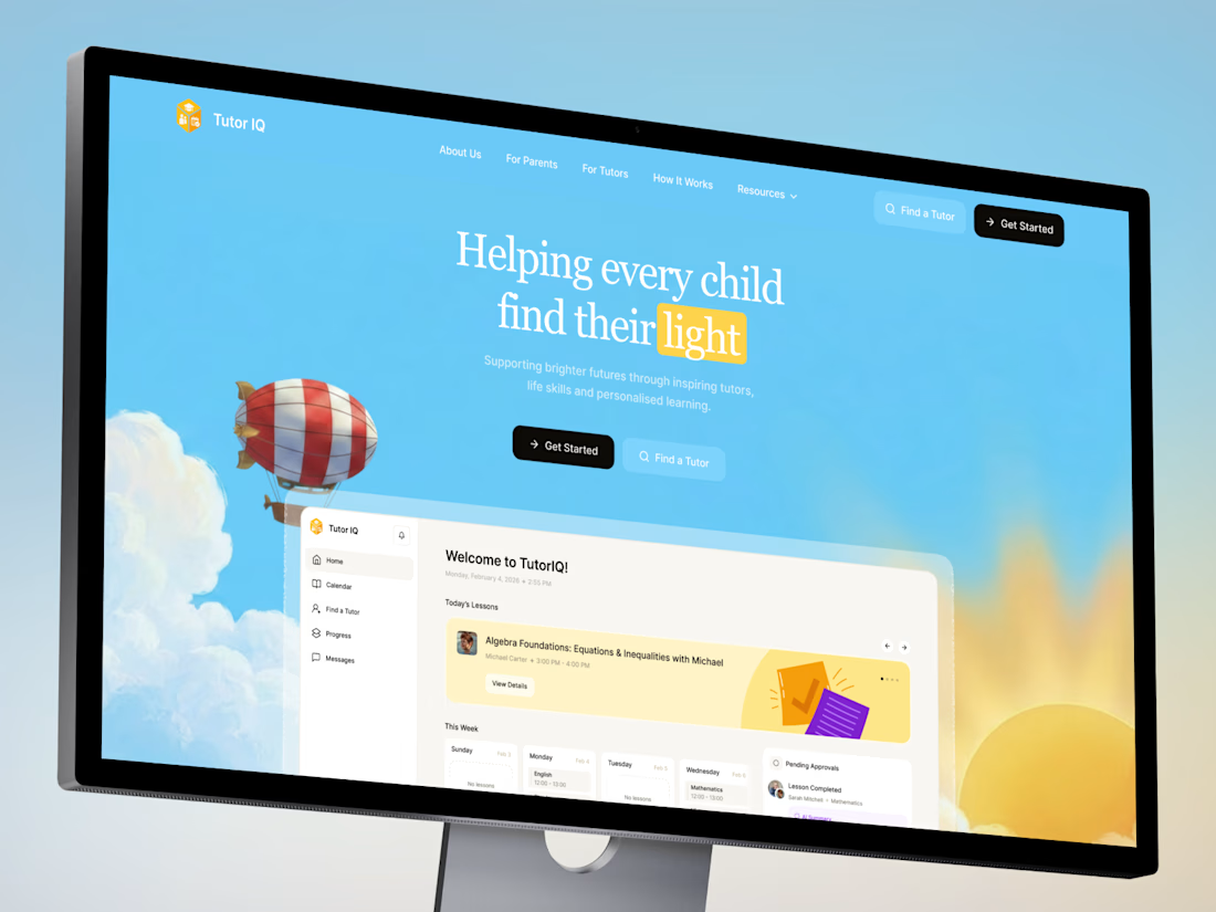
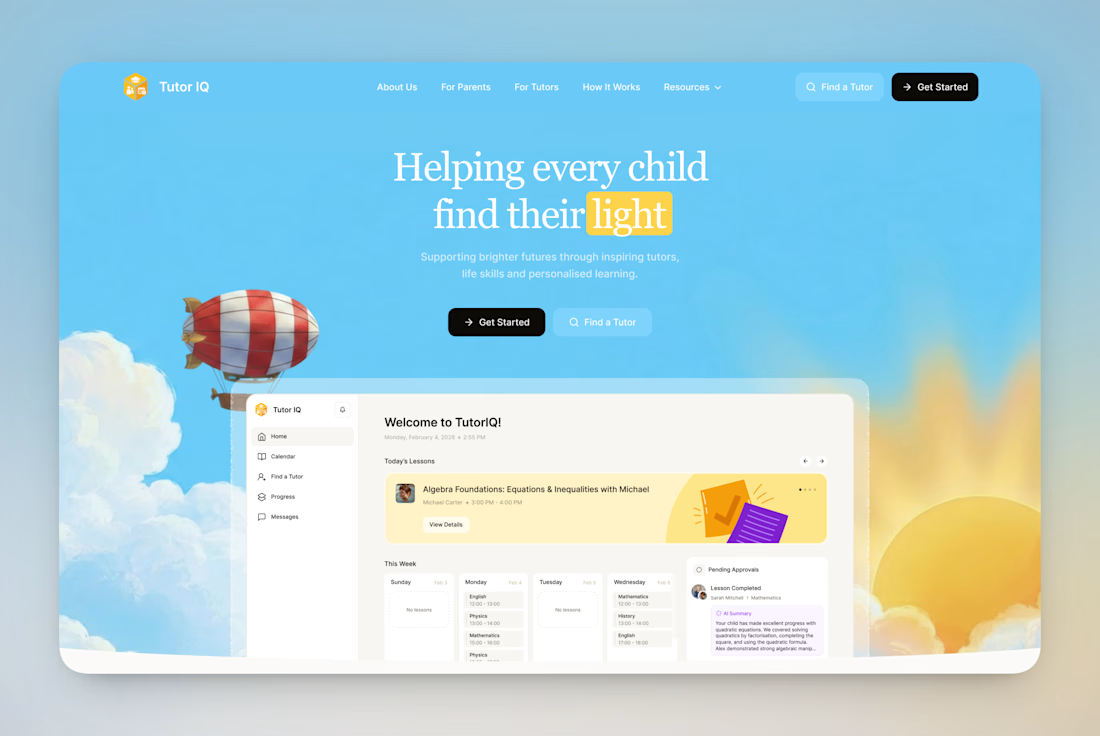

Keep: the “light” metaphor, a single idea that earns trust before the product appears. Change: contrast.

PROJECT TYPE
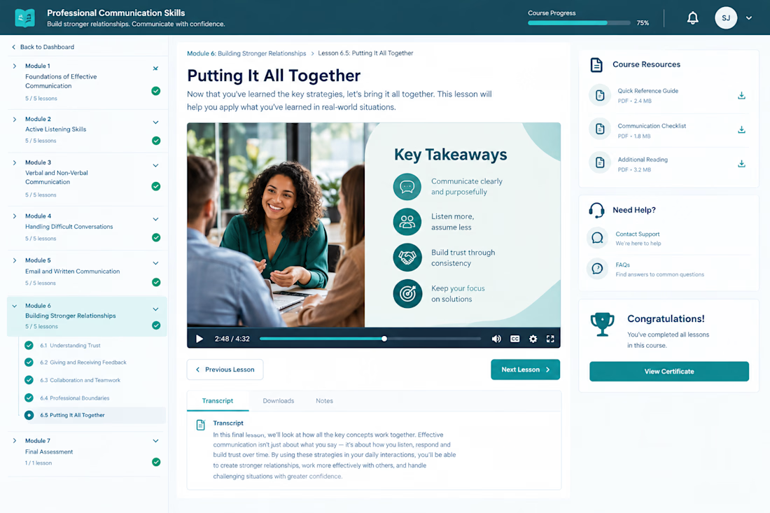
Self paced eLearning course design and development concept based on an existing 250 slide professional training presentation.
CLIENT PROBLEM / BUSINESS CHALLENGE
The organization had a substantial PowerPoint presentation containing the core training material, but the content needed to become more than a collection of presentation slides.
A successful eLearning experience needed to organize the material into a clear learning journey that could support approximately four hours of self paced learning while keeping learners engaged and helping them apply the information.
The challenge was therefore not simply transferring slides into an LMS. The content needed instructional structure, learner focused navigation, multimedia, activities, assessments, resources, and a consistent digital learning experience.
WHAT I DID
I approached the project as an instructional design and eLearning development workflow, restructuring the existing content around the learner experience.
The course concept includes:
• Clear modules and lesson progression
• Structured learning objectives and content flow
• Learner focused navigation
• Multimedia based lesson presentation
• Practical learning activities and application points
• Assessment and knowledge check opportunities
• Progress tracking throughout the course
• Downloadable learning resources
• Transcript support for lesson content
• Clear previous and next lesson navigation
• Completion recognition and certificate access
• Consistent visual treatment across the learning experience
The course interface was designed to make a large amount of professional training content feel easier to navigate and consume independently, while maintaining a polished corporate learning standard.
RESULT / OUTCOME
The completed concept demonstrates how an existing presentation can be transformed into a structured self paced eLearning experience rather than simply reproduced as slides.
The final experience provides learners with a clear course structure, visible progress, interactive lesson elements, supporting resources, assessment opportunities, and a consistent path through the training.