The network for creativity
Join 1.25M professional creatives like you
Connect with clients, get discovered, and run your business 100% commission-free
Creatives on Contra have earned over $150M and we are just getting started
Back to feedPost


🎓 Afterbell — A tutoring business that needed to eliminate the back-and-forth of finding the right tutor, checking availability, and confirming lessons, turning “Can I book?” into “You’re booked.” 🚀 Built with Lovable ❤️ →
Project Link : https://afterbe11.lovable.app
The network for creativity
Join 1.25M professional creatives like you
Connect with clients, get discovered, and run your business 100% commission-free
Creatives on Contra have earned over $150M and we are just getting started






Related posts

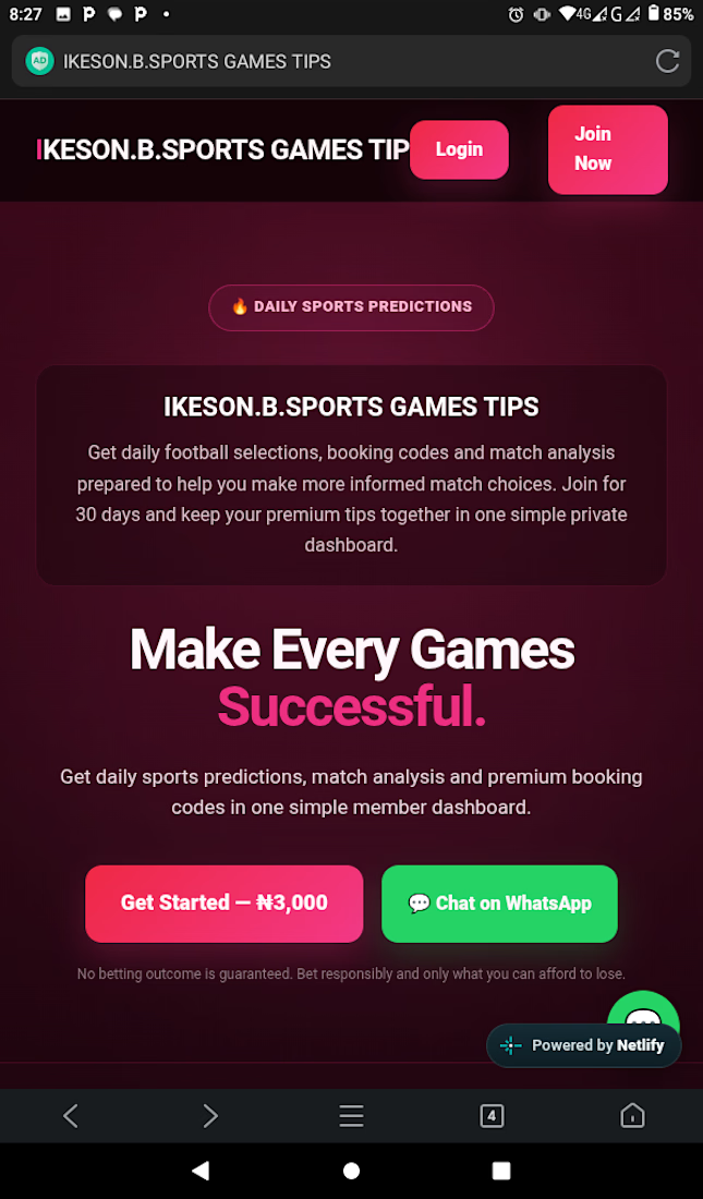
I just finished building a website for Tipstar - clean, fast, and made to bring customers from Google and WhatsApp.

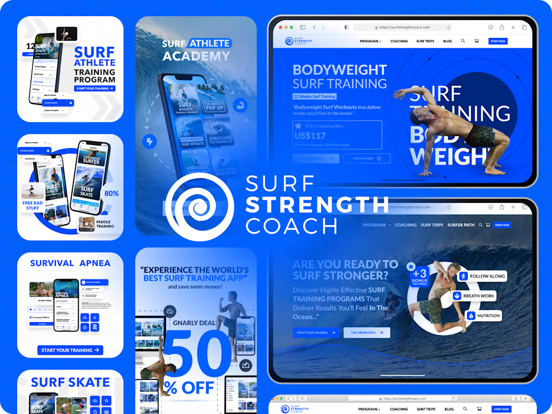
I took a role as UI Designer that create stunning graphic element for website, Create phone mockup programs for app store thumbnail and social media.


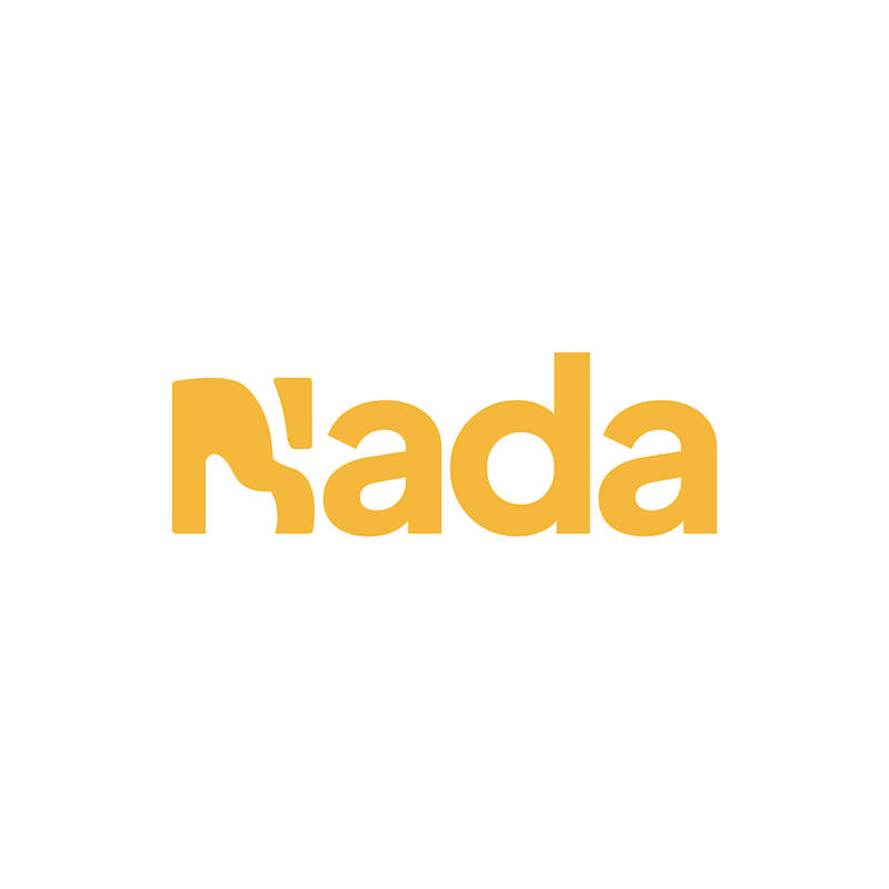
Challenge: Nada's old logo had a unique shape, but the "N" was hard to read and the design didn't connect to music.
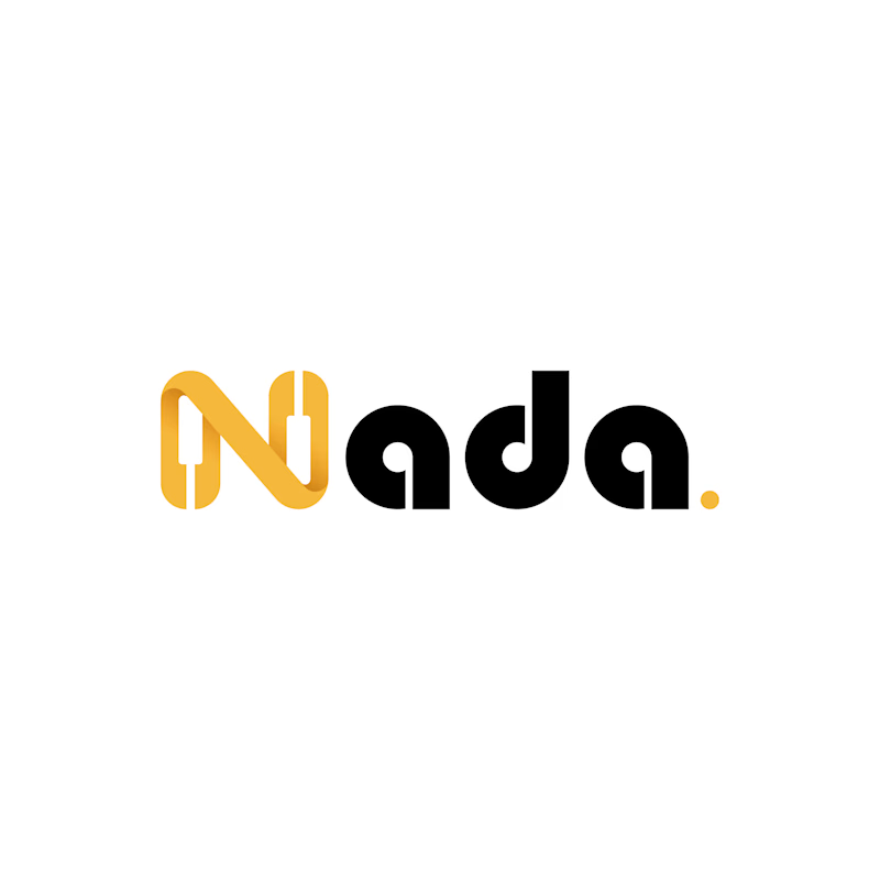
Solution: I redesigned the logo with a piano-built "N" monogram and letterforms that carry music notes. A golden dot closes the wordmark like a final note. The warm gold stays, now paired with black for a more premium look.
Result: A clearer, more memorable logo that tells the brand story at a glance. The client loved it.
1 vote
Ends in 19h

The piano keys forming the N is a smart fix, it solves the readability problem and the music link in one move. The golden dot as a final note is a lovely detail.