The network for creativity
Join 1.25M professional creatives like you
Connect with clients, get discovered, and run your business 100% commission-free
Creatives on Contra have earned over $150M and we are just getting started
Back to feedPost

As a creative, it’s always hard to translate all the ideas I have in my brain into a disciplined list of essential points, because at the beginning everything is essential to branch from.
In building brand identities, I came face to face with a repetitive process that is fundamental but sometimes tiring in the lack of creativity.
With the Spiral Spectrum Protocol technique you can be your own agency by being time efficient and vision locked. Delegate your vision.
The technique is a 7-phase creative engine. You drop in a raw, half-baked brand idea, and it extracts the tension, maps the brand world, and outputs a complete identity system—including programmatic campaign visuals and a market viability output along with its investor’s card verdict.
I’d love for the community to stress-test it. Drop your wildest brand idea into the engine and let me know what it generates!
#Floratechnique


This is solid, it feels both clean and engaging. If someone wanted to create something at this level, what would you say matters most in your process?
The network for creativity
Join 1.25M professional creatives like you
Connect with clients, get discovered, and run your business 100% commission-free
Creatives on Contra have earned over $150M and we are just getting started
Challenges
View all


Related posts

A useful way to evaluate a brand identity: place the business card, packaging, and social posts side by side.
Do they feel like they belong to the same business—even when the logo isn’t prominent?
That’s what I look for in a visual system. Typography creates hierarchy. Color builds recognition. Patterns and layout give the brand a character that can carry across different formats.
For business owners reviewing a new identity, ask your designer to show how it works in the places your customers will actually encounter it. Those applications can reveal more than a logo presentation alone.
Which touchpoint is hardest to keep consistent in your brand?

That's great visuals and motion graphics Great job Mohammed

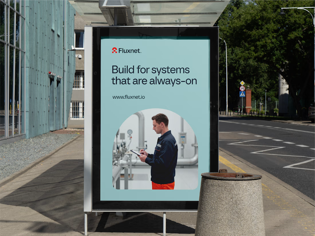
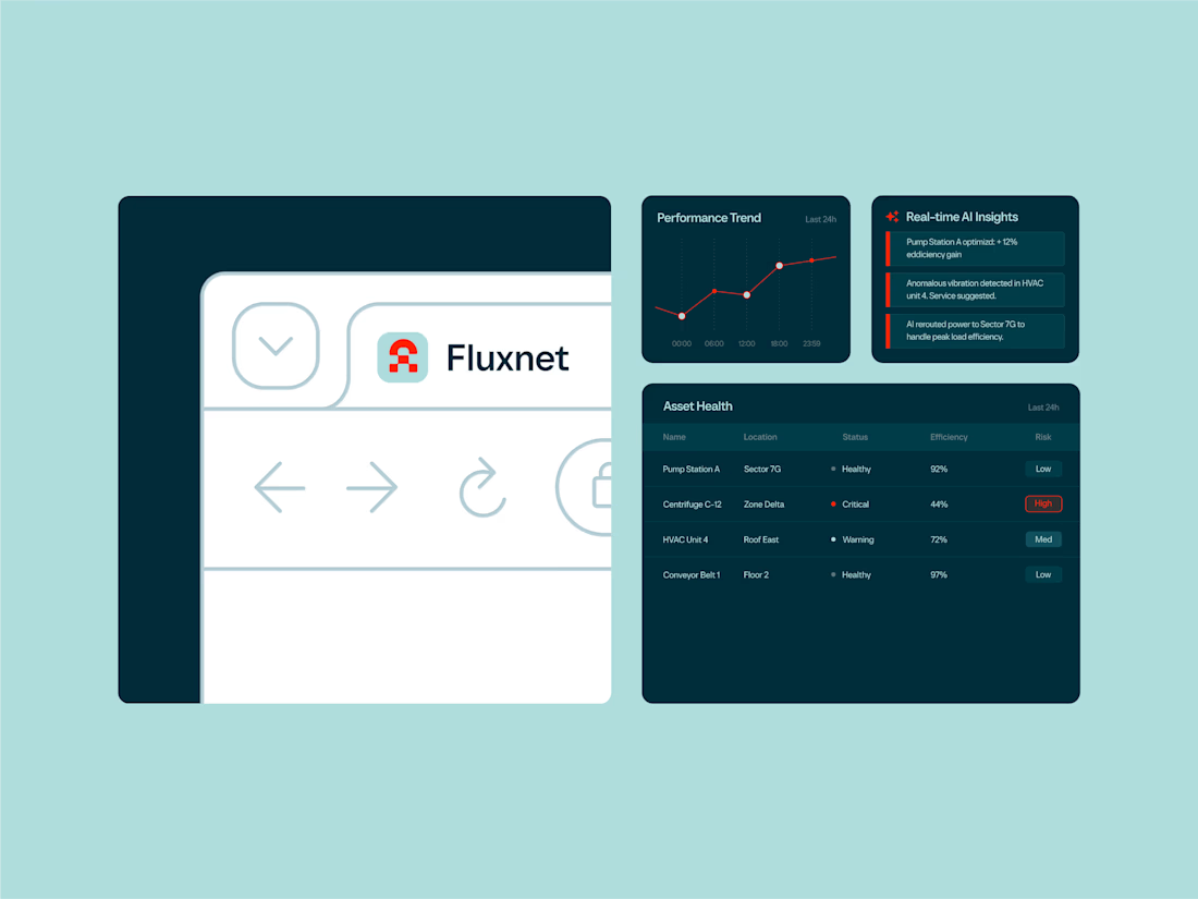
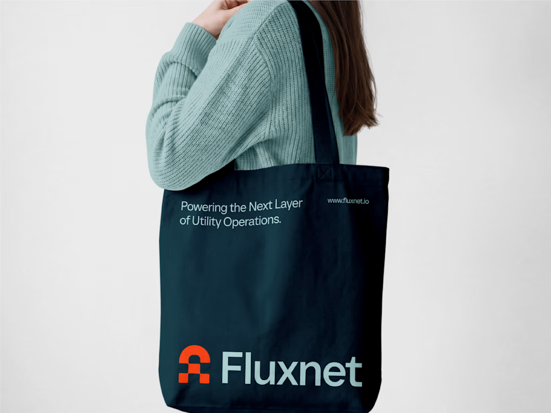
One of my favorite projects this year 👉 Fluxnet.
The challenge of this project was to create an identity for a company bringing AI into complex industrial environments, where trust and reliability matter just as much as innovation.
The direction was to balance these two worlds: a brand that feels grounded and dependable, but still looks ahead. The goal was to make complex technology feel clear and accessible without losing its technical edge.
Full project here
Curious to hear your thoughts. How do you approach branding in such a technical spaces?


how did you land on the balance between industrial and innovative?

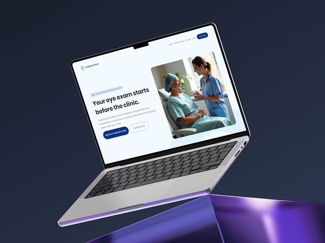
I designed the brand identity for a medical health AI startup in 2025, a mobile app that helps cataract patients complete their pre-exam on their phone, so doctors understand the diagnosis faster when they arrive.
The challenge: make a medical brand feel trustworthy for doctors and calm for older patients and their families.
What I created:
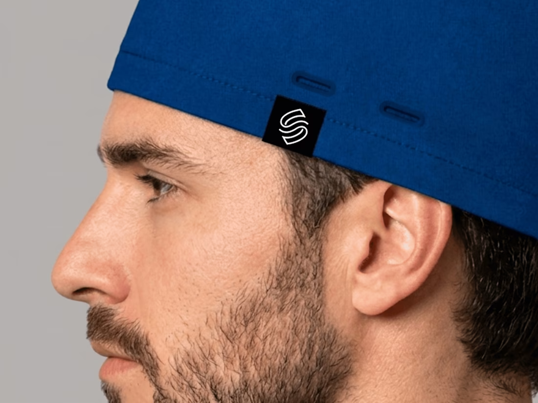
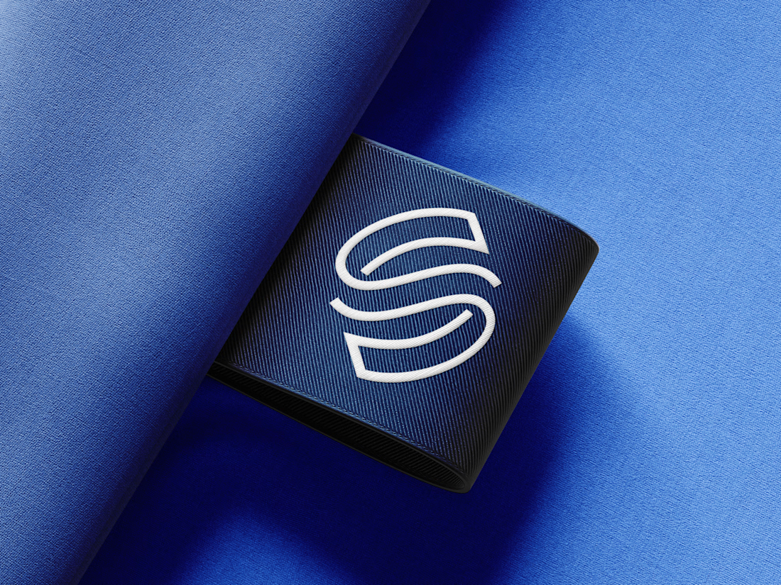
✦ A logo that combines an eye with a double S monogram
✦ A blue and cyan palette built for trust and clarity
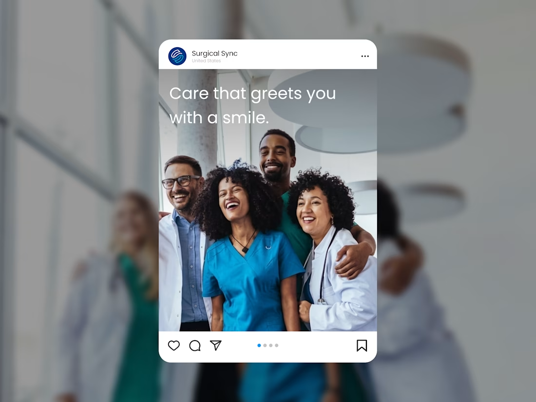
✦ A visual system for the app, website, Instagram, uniforms, and outdoor banners
Which part would you like to see more of: the logo concept, the color system, or the billboard designs? Tell me in the comments 👇
Building a healthcare or medical brand? Let’s talk.
#brandidentity #visualidentity #logodesign #healthcarebranding #medicalbranding #brandesigner #logodesigner #eyecare #cataract #appdesign #brandingdesign #contra