The network for creativity
Join 1.25M professional creatives like you
Connect with clients, get discovered, and run your business 100% commission-free
Creatives on Contra have earned over $150M and we are just getting started
Back to feedPost
Taste Test

Decided to experiment with shaders instead of the usual gradient backgrounds.
Which one looks better to you?
Drop your vote below 👇
0 voted
0%
2 voted
100%
2 votes
Closed
The network for creativity
Join 1.25M professional creatives like you
Connect with clients, get discovered, and run your business 100% commission-free
Creatives on Contra have earned over $150M and we are just getting started





Related posts

Sneak peek! 👁️✨
Currently putting the final touches on my 11th Framer template. Dropping soon... Blue or Green? What do you think?


Which Kajabi sales page design would you choose for this course? Vote for A or B and tell me what made the difference.

23 voted
50%
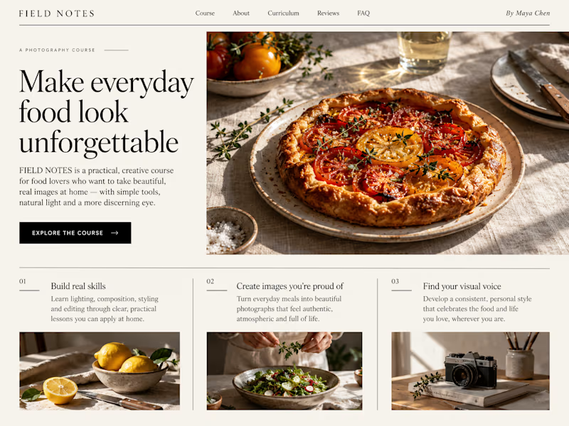
23 voted
50%
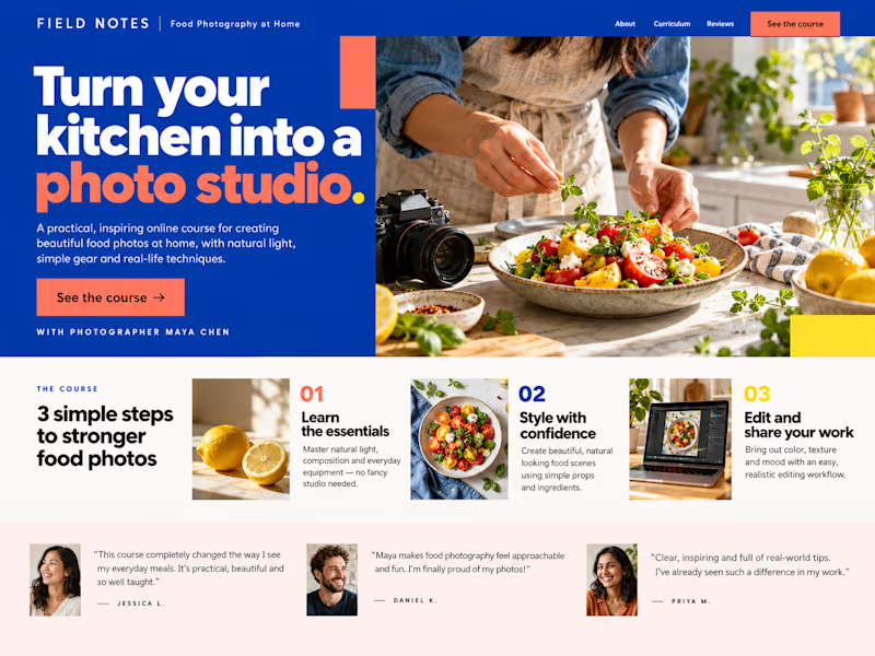
46 votes
Closed

B still could be polished though...maybe try giving the text section little bit more real estate..I don't know

i create a 3D cube component for a Framer website to add creativity. which one is better dark or light? Check the live preview here
22 voted
51%
21 voted
49%
43 votes
Closed

Snap to the position in the last will feel more real