The network for creativity
Join 1.25M professional creatives like you
Connect with clients, get discovered, and run your business 100% commission-free
Creatives on Contra have earned over $150M and we are just getting started
Back to feedPost
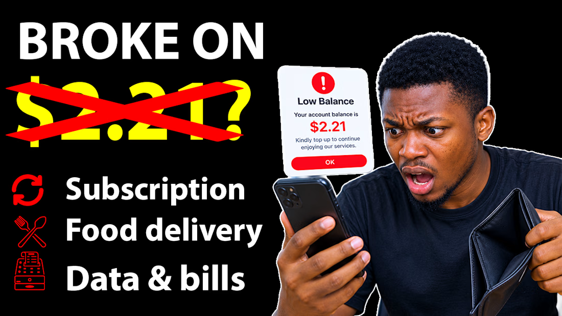
Broke on $2.21? 💸
I designed this high-converting YouTube thumbnail for a finance video about subscriptions eating your money.
The goal: Stop the scroll and make people click.
What I did:
✅ Bold text "BROKE ON $2.21?" with red strike-through for curiosity
✅ Shocked expression + empty wallet for emotion
✅ Low balance popup to make it relatable
✅ Clean icons for Subscription / Food delivery / Data & bills
Result: Eye-catching, relatable, and built to increase CTR.
Tool: Photoshop + PixelLab
Size: 1280x720 (YouTube optimized)
Need a thumbnail that gets clicks? Let's work.


The network for creativity
Join 1.25M professional creatives like you
Connect with clients, get discovered, and run your business 100% commission-free
Creatives on Contra have earned over $150M and we are just getting started







Related posts

Custom high-CTR YouTube thumbnail design built to grab viewer attention, boost click-through rates, and grow channel views

Design Direction Poll!
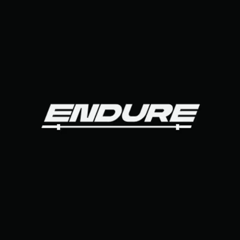
Two versions of the same Endure logo concept; same aggressive italic letterforms, same racing DNA. One detail changes the entire read.
Which version hits harder? 👇
14 voted
78%

4 voted
22%
18 votes
Closed

Custom YouTube Thumbnails for Creators