The network for creativity
Join 1.25M professional creatives like you
Connect with clients, get discovered, and run your business 100% commission-free
Creatives on Contra have earned over $150M and we are just getting started
Back to feedPost

𝗖𝘂𝗿𝗿𝗲𝗻𝘁𝗹𝘆 𝘄𝗿𝗮𝗽𝗽𝗶𝗻𝗴 𝘂𝗽 𝗮 𝗺𝗼𝗯𝗶𝗹𝗲 𝗮𝗽𝗽 𝗱𝗲𝘀𝗶𝗴𝗻 𝗳𝗼𝗿 𝗮 𝗨𝗦-𝗯𝗮𝘀𝗲𝗱 𝘀𝗼𝗰𝗶𝗮𝗹 𝘁𝗲𝗰𝗵 𝗽𝗿𝗼𝗱𝘂𝗰𝘁. 💻✅
This is a look into the info screen, where first impressions are made.
The goal here was to clearly communicate the product’s value while guiding users seamlessly into action (get started or sign in).
Focused on clarity, flow, and creating a simple but engaging entry point into the experience.
90% done… final touches coming soon 👀
hashtag#uiux hashtag#productdesign hashtag#uxdesign
The network for creativity
Join 1.25M professional creatives like you
Connect with clients, get discovered, and run your business 100% commission-free
Creatives on Contra have earned over $150M and we are just getting started

Challenges
View all


Related posts




🎴 TASTY TEST 06/30: Which travel discovery experience would you choose?
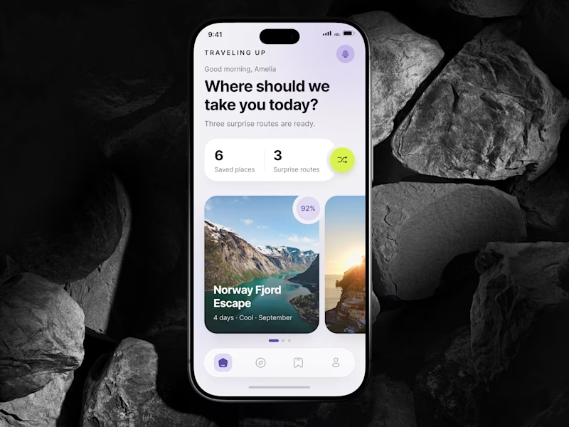
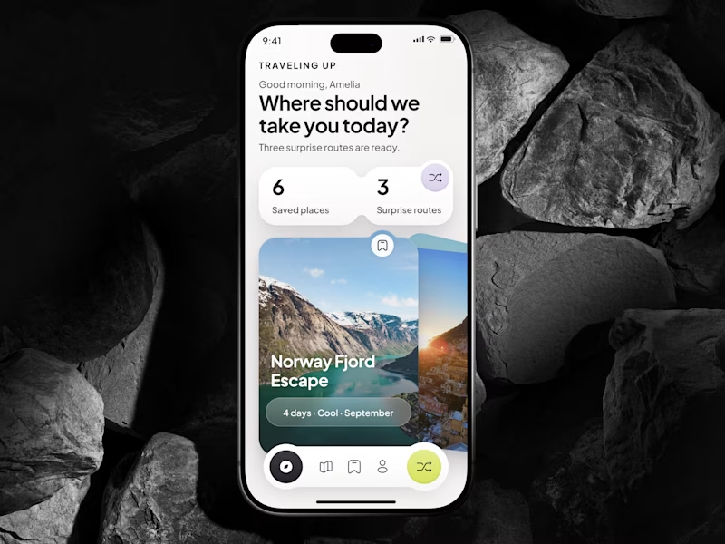
Traveling Up is probably my first mobile concept outside client work in almost three years. It was inspired by a trip where not knowing the destination was part of the fun.
Same app. Same destination. Two ways to discover it.
🤍 A Clean Carousel
Calmer, lighter, more familiar.
💚 B Immersive Deck
Bigger imagery, stronger overlap, more tactile navigation.
Which one makes you want to swipe and see where the app takes you next?
A or B? 👇
#MobileAppDesign #TravelApp #MobileUX #UIDesign #ProductDesign #AsolDesign
23 voted
49%
24 voted
51%
47 votes
Closed


Took a little time to challenge my motion design skills.
I recreated a Spotify app concept to explore how UI elements, motion, timing, and transitions can come together to create a more engaging product experience.
This was a self initiated practice project, but I treated it like a real product animation project.
Always looking for ways to make interfaces feel more alive through motion.
#MotionDesign #MotionGraphics #UIAnimation #AppAnimation #AfterEffects #ProductDesign #VideoEditing #Animation


NICE WORK REALLY LOVE IT