The network for creativity
Join 1.25M professional creatives like you
Connect with clients, get discovered, and run your business 100% commission-free
Creatives on Contra have earned over $150M and we are just getting started
Back to feedPost

Interval: A Landing Page for an AI Meeting Assistant
Overview
Interval is a tool that handles the scheduling, notes, and follow-ups around meetings. I designed the full landing page in Figma, from layout and structure to the final UI. My goal was to make a busy, complicated workflow feel calm and simple and to get visitors to start for free.
The Problem
Meetings create a lot of hidden work: finding a time, avoiding double-bookings, taking notes, sending follow-ups, and collecting payments. Most tools solve only one of these. The page had to show that Interval brings it all together and make that clear within seconds.
My Approach
I focused on one feeling: relief. The headline, the visuals, and the layout all say “this is taken care of.” I kept the design light and spacious so the page itself feels as calm as the product promises to be.
Key Design Decisions
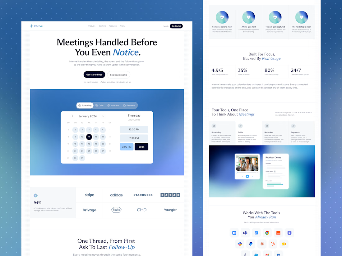
1. A hero built around a promise. The headline “Meetings Handled Before You Even Notice" tells visitors the benefit immediately. Two clear buttons (“Get started free” and “See how it works”) and small reassurance notes (“No card required” and “Takes about two minutes to set up”) remove common doubts before visitors even scroll.
2. Showing the product, not just describing it. Below the headline, a live-looking booking calendar sits on a soft blue gradient. Tabs for Scheduling, Callie, Notetaker, and Payments hint at the full toolset, so visitors see the product in action right away.
3. Trust early. A row of well-known brand logos and a strong stat (94% of bookings confirmed without back-and-forth) appear right after the hero, so visitors feel confident before reading further.
4. One story from start to finish. “One Thread, From First Ask To Last Follow-Up” uses four equal cards: someone asks to meet, a time gets held, the call gets captured, and the next step is clear. Matching icons and short text make the whole workflow easy to understand at a glance.
5. Numbers that are easy to scan. “Built For Focus, Backed By Real Usage” puts four big stats in a clean row: rating, fewer no-shows, same-day bookings, and calendars synced 24/7. A short privacy note underneath addresses a common worry: Is my calendar data safe?
6. Four tools, one place. The tools section uses simple tabs for Scheduling, Callie, Notetaker, and Payments, each with a short description. A product preview below shows a video call next to an AI-generated summary with action items, so visitors can picture the result.
7. Fits into existing workflows. “Works With The Tools You Already Run” shows a grid of integration icons, with Google and Microsoft options explained below. This answers the question, "Will it work with what I already use?"
8. Real voices. The testimonial section starts with one large featured quote, then a row of shorter customer quotes with names and roles. A simple carousel keeps it compact.
9. A memorable personal touch. Blue italic accents on key words in each headline (like "Notice," "Follow-Up," and "Real Usage") add personality and guide the eye. A big “Interval” wordmark in the footer gives the page a confident, branded ending.
10. A clean visual style. Light backgrounds, soft blue gradients, rounded cards, and generous spacing keep the page easy to read and professional. The black primary buttons stand out clearly against the light design.
The Result
A calm, modern landing page that explains a multi-feature product in plain language, builds trust quickly, and keeps the next step visible from the top of the page to the bottom.
Tools Used
Figma
Let’s Work Together
Have a product with lots of features and want to explain it clearly?
Message me and let’s design a website that makes it simple.



Clean SaaS page!
The network for creativity
Join 1.25M professional creatives like you
Connect with clients, get discovered, and run your business 100% commission-free
Creatives on Contra have earned over $150M and we are just getting started
Related posts

AI Mental Wellness Platform UI/UX Design
Designed a modern and intuitive AI-powered mental wellness website focused on emotional well-being and personalized digital experiences.
The platform features an AI therapist, mood tracking, meditation, sleep improvement, wellness plans, and data-driven insights. A calming blue color palette, immersive visuals, clean layouts, and thoughtful UI elements create a seamless and engaging user experience.
mentalhealthwebsitedesignartificialintelligenceAI VIsual DesignerResponsive DesignWeb DesignClaudeFigma

love how calm the mood tracking and meditation screens feel in this wellness design


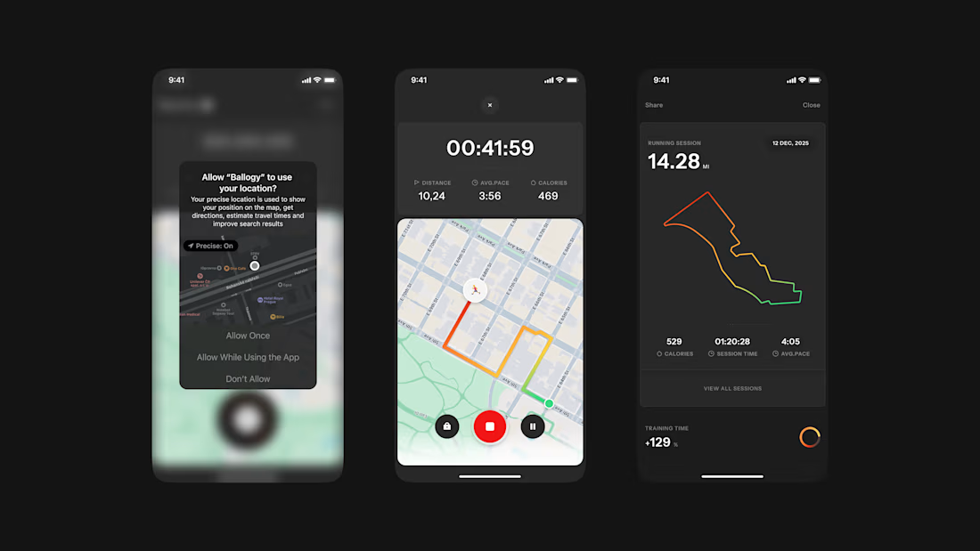
Ballogy app screens pt.2: live workout tracking, from location setup to the route map and session stats.


Really nice one, Max!


