The network for creativity
Join 1.25M professional creatives like you
Connect with clients, get discovered, and run your business 100% commission-free
Creatives on Contra have earned over $150M and we are just getting started
Back to feedPost

An article I wrote https://hackernoon.com/control-usability-and-accessibility-a-deeper-look

hackernoon.com
Control, Usability and Accessibility: A Deeper Look | HackerNoon
Discover how Control, Usability, and Accessibility work together to create intuitive, inclusive, and user-centered digital experiences
The network for creativity
Join 1.25M professional creatives like you
Connect with clients, get discovered, and run your business 100% commission-free
Creatives on Contra have earned over $150M and we are just getting started







Related posts

Building an isometric design tool with a focus on detail, flexibility, and a clean workflow. Which theme do you prefer, light or dark?

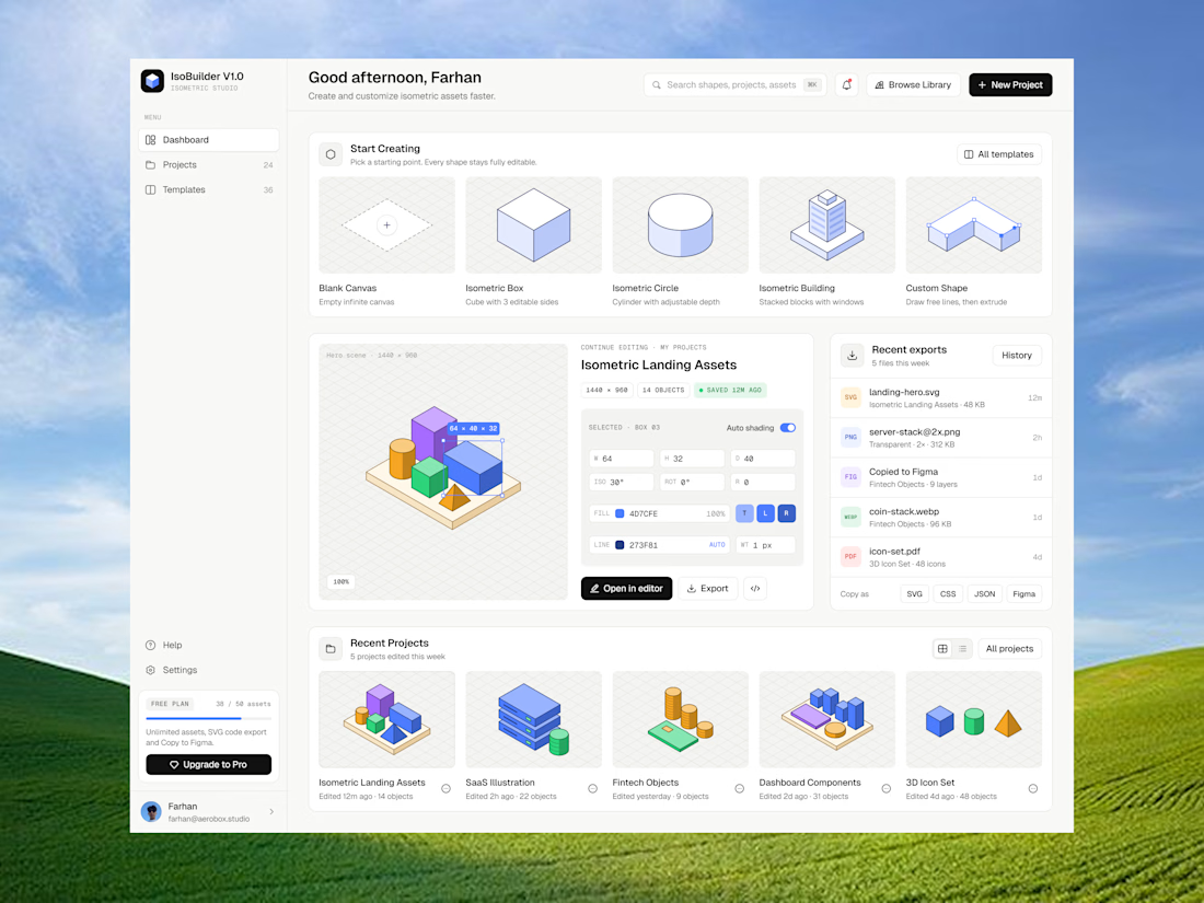
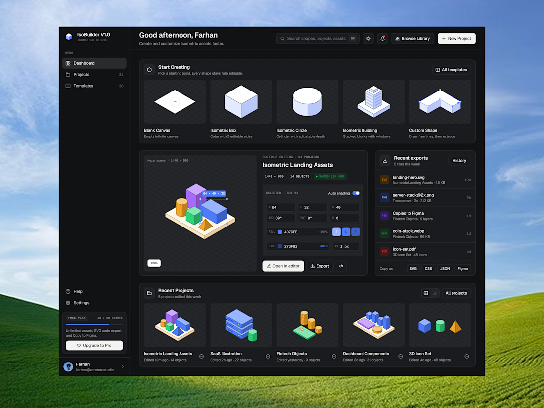

Crisp, clean, and effective.


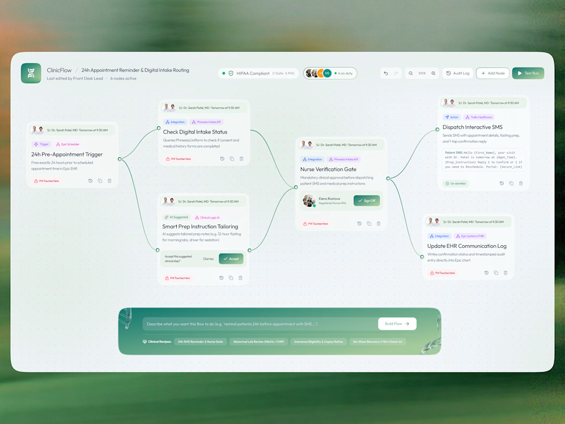
Working on a healthcare automation dashboard concept 🩺
The idea was to explore how complex clinical workflows could feel simpler, more connected, and easier to understand.
The challenge? Balancing multiple automation steps, patient information, approval gates, and EHR integrations without making the interface feel overwhelming.
My visual approach:
→ A node-based workflow to make the process easy to follow
→ Soft green tones to create a calm, healthcare-focused feel
→ Clear cards and visual hierarchy to separate each action
→ Small status indicators and approval states to improve clarity
→ A prompt-based flow builder to make automation feel more accessible
I wanted to explore how visual design can make even complex systems feel approachable.
Just a visual experiment exploring the intersection of UI design, UX thinking, and healthcare automation.
What would you improve in this workflow? 👀
#UIDesign #UXDesign #ProductDesign #HealthcareTech #DashboardDesign
Crisp, clean, and effective.