The network for creativity
Join 1.25M professional creatives like you
Connect with clients, get discovered, and run your business 100% commission-free
Creatives on Contra have earned over $150M and we are just getting started
Back to feedPost

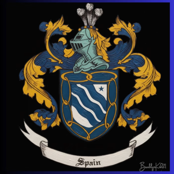
Something new I just started doing family crest/coat of arms with research and complete history


The network for creativity
Join 1.25M professional creatives like you
Connect with clients, get discovered, and run your business 100% commission-free
Creatives on Contra have earned over $150M and we are just getting started







Related posts



New project: Soma Studio, a Pilates studio brand identity
Soma means the body as you feel it from the inside, and that idea shaped the whole identity: calm and premium, with a personality of its own.
Strategy, logo, colors, typography, brand applications and guidelines.





The warm butter-yellow palette running from the studio render into the story frames feels so calm, and that Monday Schedule layout is really clean.

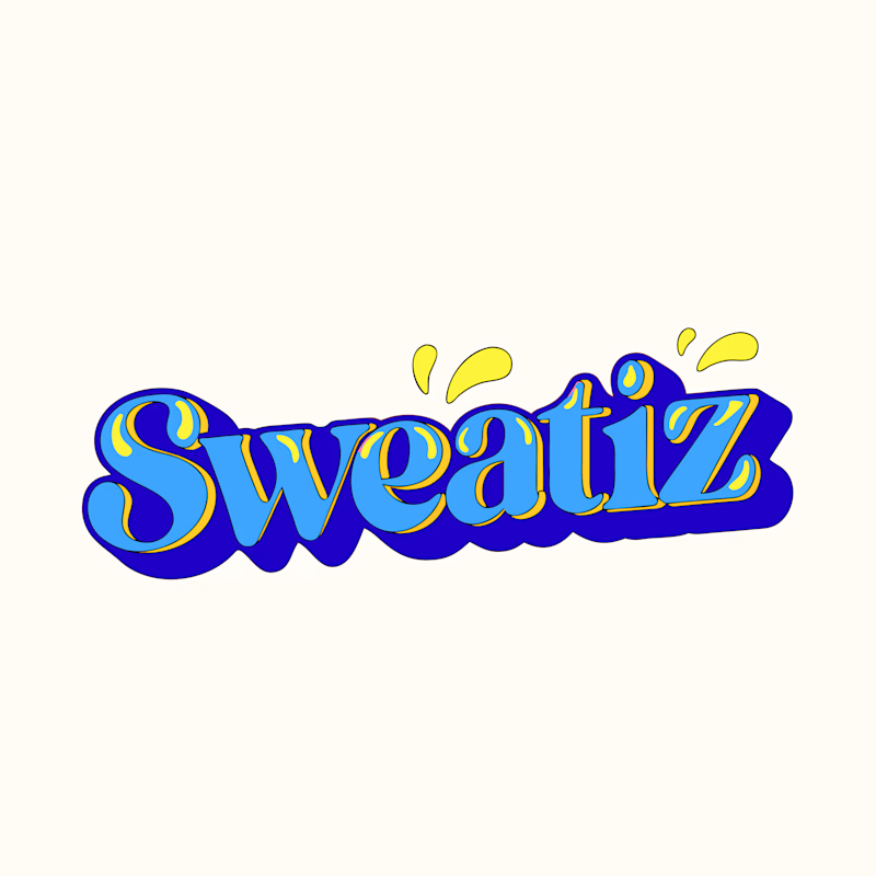
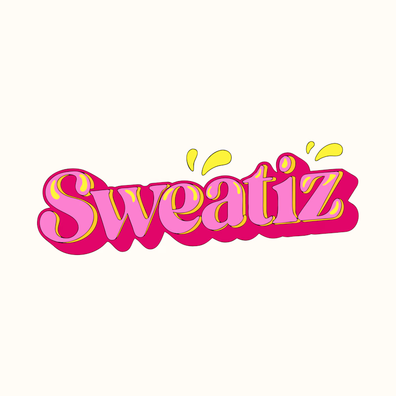
Just created this logo, but I’m stuck on the color scheme! Yellow was the original primary color, so I kept it as the secondary in both versions.
Which one do you guys think works better, A or B? Would love to hear your thoughts!

3 voted
75%
1 voted
25%
4 votes
Closed

Both of them are great but I feel that A belong to sower food and B belong to sweet food nice job bro 🎉