The network for creativity
Join 1.25M professional creatives like you
Connect with clients, get discovered, and run your business 100% commission-free
Creatives on Contra have earned over $150M and we are just getting started
Back to feedPost

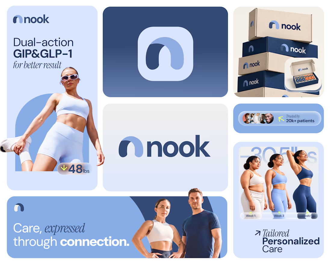
Not every healthcare brand needs a medical cross to communicate care.
That was one of the key things the client wanted to avoid when developing the brand identity for Nook.
Nook is a modern healthcare brand making doctor-led online care more accessible, personal, and convenient, right from the comfort of your own space.
The challenge was to create an identity that feels premium, approachable, and trustworthy without relying on the generic medical plus sign or traditional healthcare design clichés.
So, I explored a more thoughtful visual direction, using simplicity, warmth, and meaningful forms to communicate what Nook stands for.
The goal? To make healthcare feel less clinical and more human.
Here's a glimpse of the identity exploration.
What's your thoughts on this?
Full case study coming soon! 🤞

The network for creativity
Join 1.25M professional creatives like you
Connect with clients, get discovered, and run your business 100% commission-free
Creatives on Contra have earned over $150M and we are just getting started
Related posts

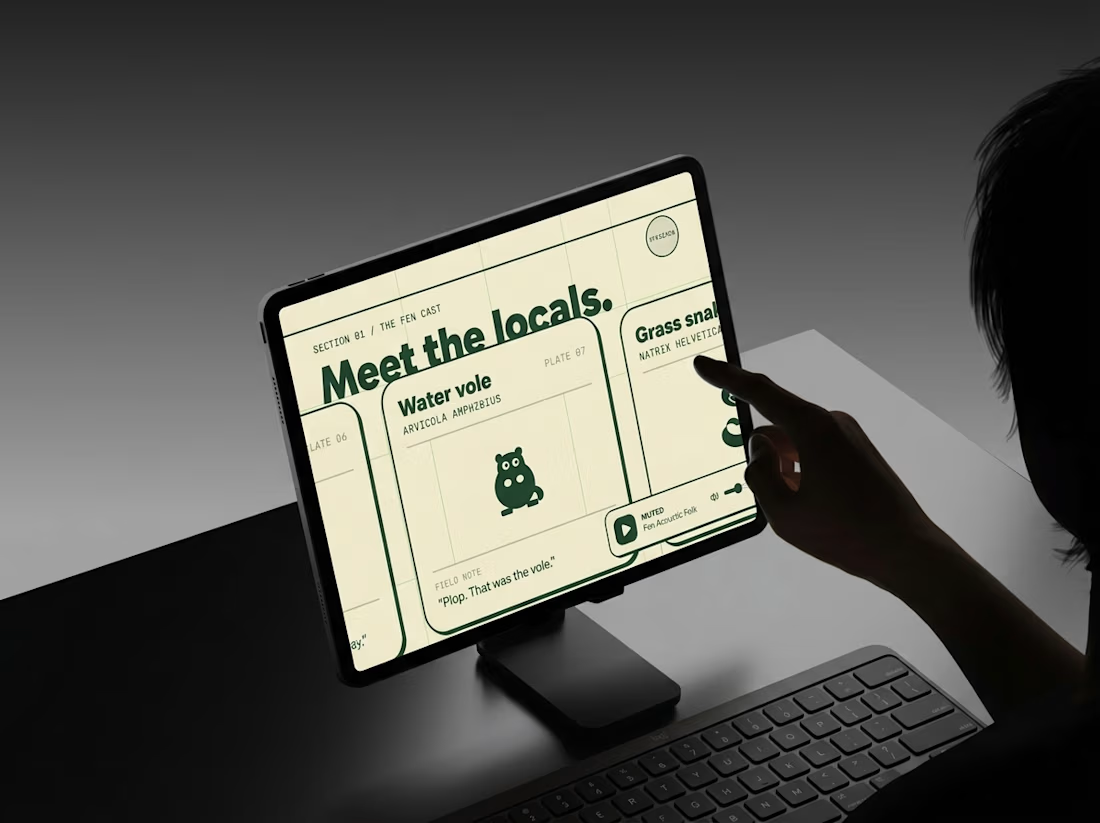
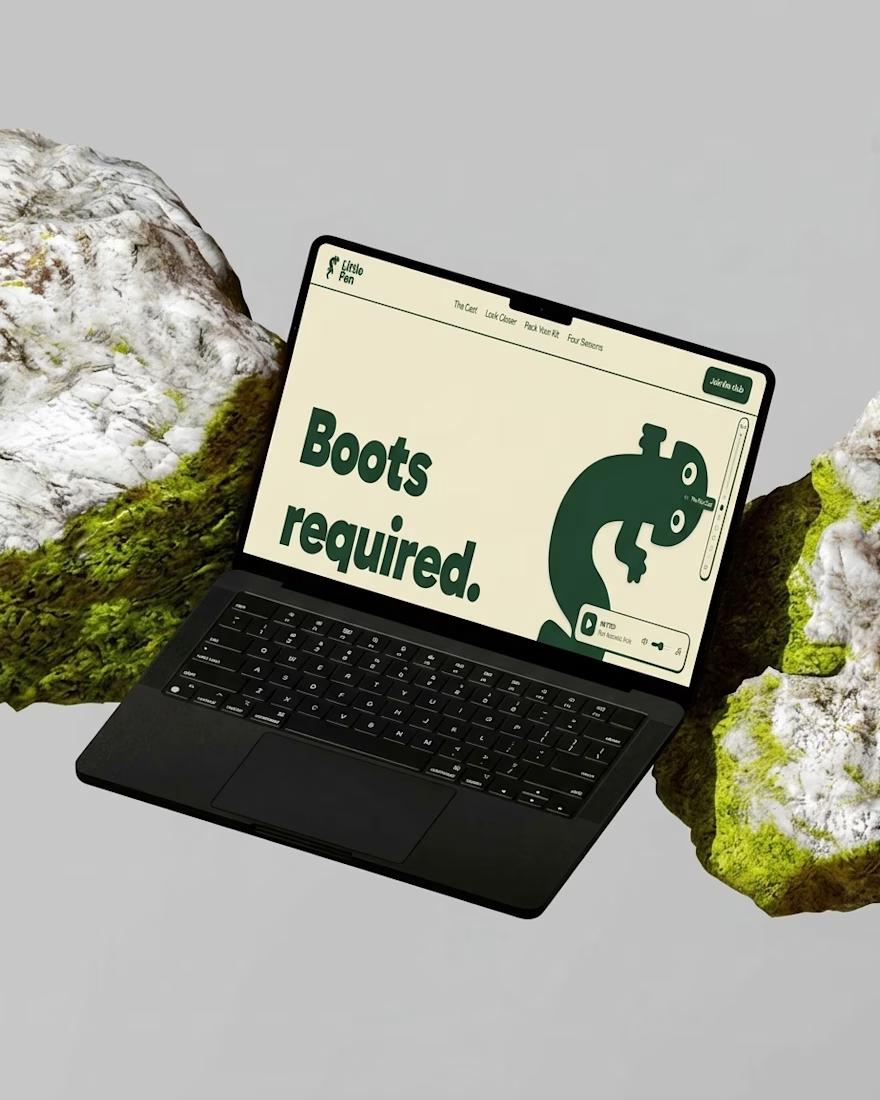
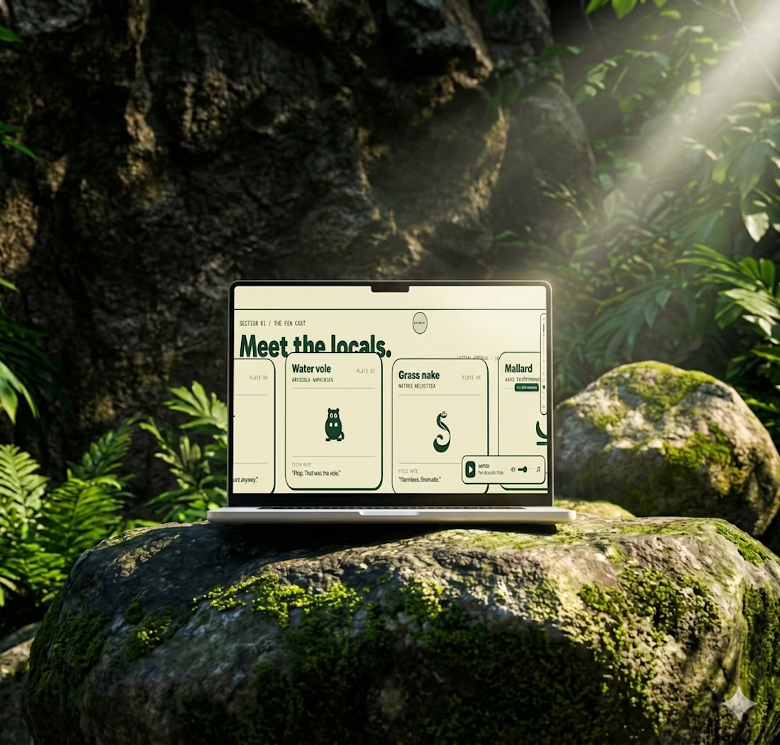
Most websites open with “Welcome.”
This one opens with “Boots required.”
Little Fen’s site is a field guide: locals with Latin names and a heron soundtrack.
Go meet the vole.

A little more about the inspiration behind Tindara.
I wanted the identity to have a connection to Tindari, Sicily. The Madonna di Tindari statue was the starting point for the symbol, while Sicilian decorative patterns inspired the graphics around it.
For the colors, I chose mustard yellow, deep green, and burgundy, balanced with cream. I wanted to bring some of that warmth and richness into the packaging, while keeping the different elements comfortable together.
For me, these references are what give the project its character and sense of place.



IPO Gateway landing page web design 3D animation website

