The network for creativity
Join 1.25M professional creatives like you
Connect with clients, get discovered, and run your business 100% commission-free
Creatives on Contra have earned over $150M and we are just getting started
Back to feedPost
Taste Test
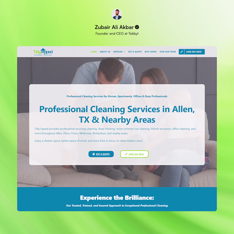
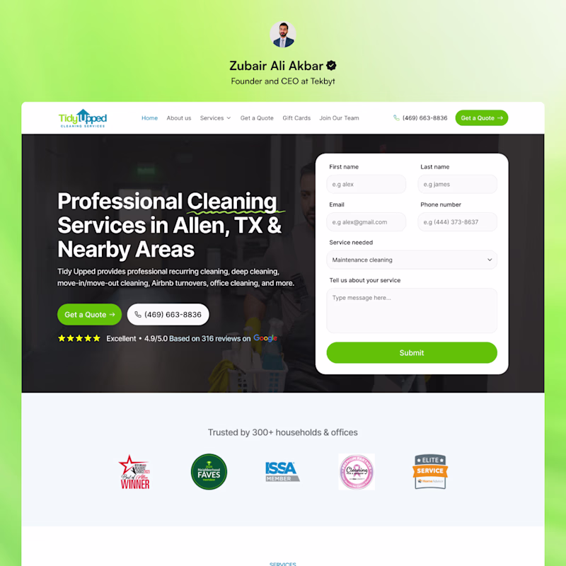
Website Redesign: Tidy Upped – Hero Evolution
Redesigned the cleaning service landing page into a high-converting lead machine, improving trust and reducing user friction.
Before: Low-contrast theme with centered text overlay. Lacked an immediate conversion path and showed zero social proof above the fold.
After: Premium layout featuring an embedded booking form, bold left-aligned typography, dual CTAs, and a prominent trust framework with a 4.9/5.0 Google rating and industry badges.
Which approach do you think drives higher conversions for local services? The minimalist text overlay or the friction-free, form-driven layout?
0 voted
0%
8 voted
100%
8 votes
Closed
Going with After. Moving the form above the fold and anchoring it with the 4.9 Google rating removes the biggest friction points from the original. The centered overlay in the Before version made it feel like a brochure rather than something you'd actually book from.
Amazing
Good job
The network for creativity
Join 1.25M professional creatives like you
Connect with clients, get discovered, and run your business 100% commission-free
Creatives on Contra have earned over $150M and we are just getting started
Related posts
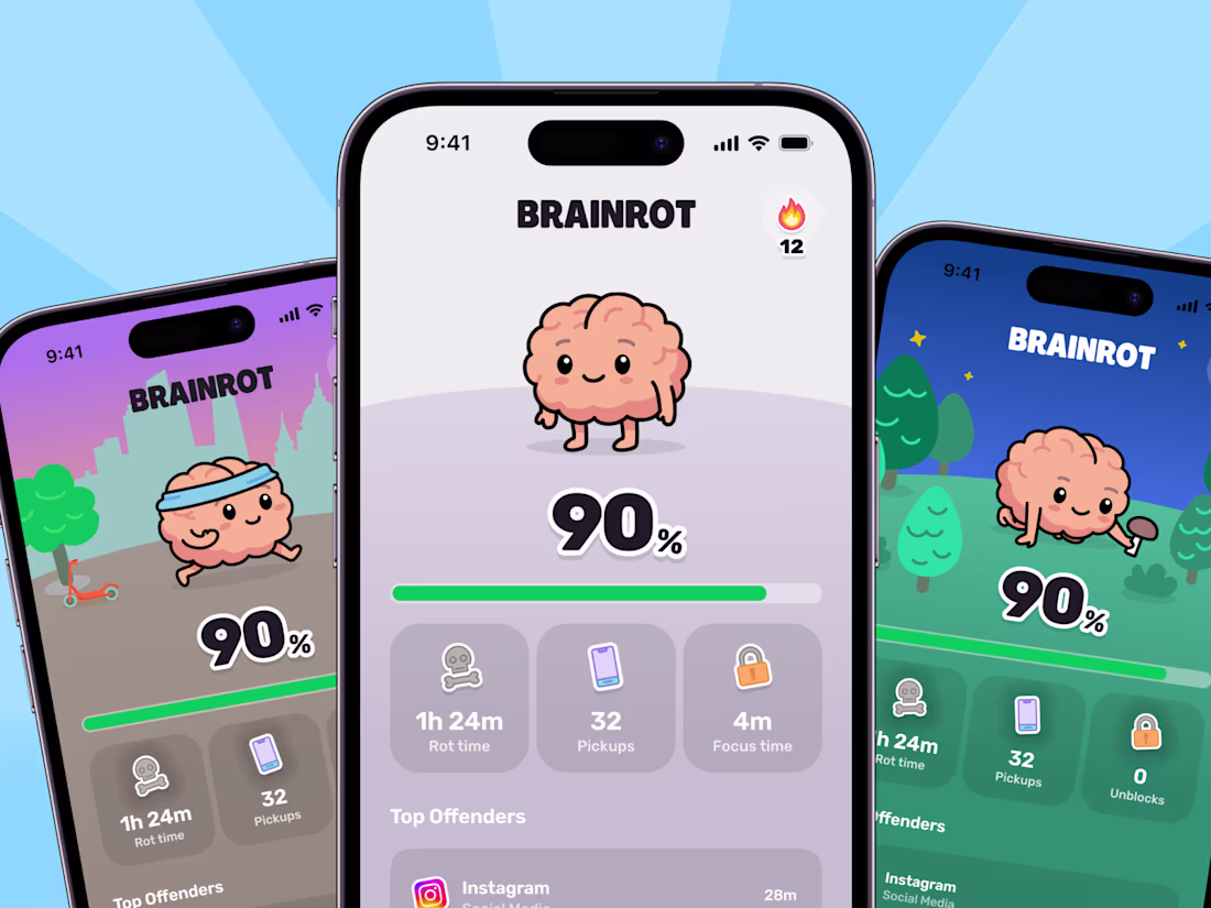
Yay! My new project is almost ready to go public! We are finishing up the last few animations then we will fully release the case study! You can check it out on the appstore and on https://thebrainrotapp.com/ !
Great work
This project is special to me.
I have shared a lot of WIP videos about it a few months ago and now I am ready to share more details about this amazing framer template.
Perfectly executed
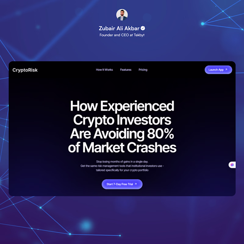
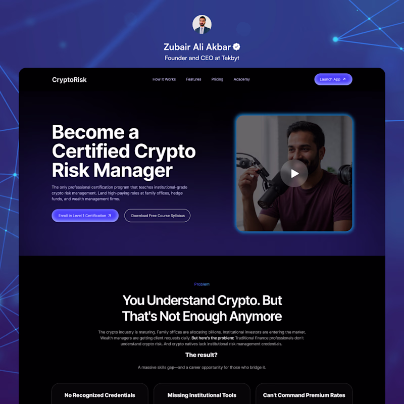
Website Redesign: CryptoRisk – Academy Evolution
Redesigned the landing page to transform the brand from a basic tool into an authority-building certification academy, improving trust and lead capture.
Before: Dark theme relying entirely on heavy headline text. Lacked visual assets, product context, and secondary conversion paths.
After: Premium layout featuring a video placeholder for immediate engagement. Upgraded the copy to a career-focused outcome, added dual CTAs (Enroll vs. Syllabus Download), and structured a clear problem-solution framework below the fold.
Which approach do you think drives higher conversions for premium programs? The text-only hook or the video-driven, multi-action layout?
1 voted
17%
5 voted
83%
6 votes
Closed
After for sure
Trending
Claude
Claude has entered the design space. How are you using Claude Design?
Contra University
Learn from expert creatives how to earn more using next-gen AI tools.
MagicPath
The canvas is infinite, and exploration is becoming the workflow. How are you using MagicPath?
creativeaiflow
Creative AI workflows are evolving. What tools do you use, and what are their strengths and weaknesses?
freelancerlife
Freelancer life is wins, pivots, and everything in between. What’s yours right now?
