The network for creativity
Join 1.25M professional creatives like you
Connect with clients, get discovered, and run your business 100% commission-free
Creatives on Contra have earned over $150M and we are just getting started
Back to feedPost

Addresses only work when people can create, share and trust them.
For Geddit, I shaped the product experience around a straightforward resident flow: create a digital address, use it across services, and receive deliveries with more confidence.
For businesses, the same foundation supports location verification and structured address data, helping delivery teams reduce failed drop-offs.
The design priority was clarity. A complicated national infrastructure problem should still feel simple in the moment someone needs to share where they are.
https://www.geddit.app/


The network for creativity
Join 1.25M professional creatives like you
Connect with clients, get discovered, and run your business 100% commission-free
Creatives on Contra have earned over $150M and we are just getting started



Related posts


Crenaly: a booking SaaS I designed and built end-to-end for appointment-based businesses in France: salons, barbers, beauty and wellness.
The core idea: when a client cancels, the freed slot is automatically offered to clients who asked for an earlier time. The first to accept gets it, their appointment moves in place, and the slot they leave is offered next. No double booking, no manual work.
Around it, a full product:
→ Branded booking page for each business, embeddable on their own site
→ Mobile-first booking flow, no account needed
→ Agenda, client management, team roles & permissions
→ Verified reviews, analytics, Stripe billing
Product, UX/UI, frontend and backend.
Next.js · TypeScript · NestJS · PostgreSQL · Redis


Automatically offering a cancelled slot to the next client is such a practical feature for salons and barbers. Designing and building Crenaly end to end must have made those flows much tighter.

Smart Glasses Landing Page
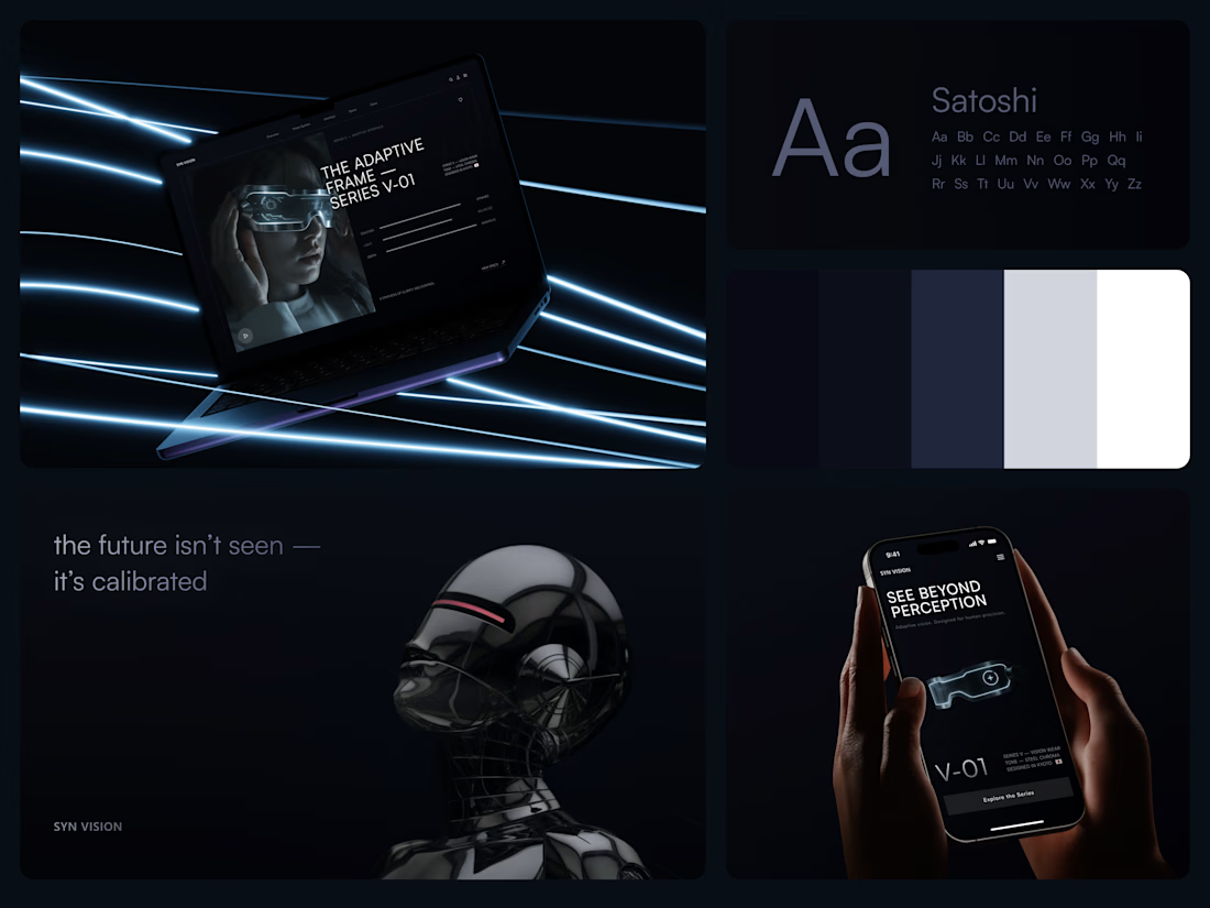
"See beyond perception." Three words on the phone, and the whole page had to earn them.
On desktop, the headline starts over the edge of a tall portrait of the glasses being worn, so the product name and the product in use read as one image. Next to it, reaction, light and depth sit as three thin gauge lines, each with a one-word reading. Specs, without a spec table.
On mobile, a 3D render of the frame sits between the headline and a single Explore the Series button. One image, one next step.
The palette stays in deep navy and soft gray, so the cool light on the frame stands out on every screen.
Designed by the Hue & Machine team.
#WebDesign #LandingPage #ProductDesign #WearableTech #DarkUI #UIDesign #TechProduct #ResponsiveDesign #UXDesign #FigmaDesign



Good work

Ashlar (https://no-code.supply/templates/ashlar), a website for a boutique real-estate office that sells a few houses by introduction.
Five material slabs that open into each house.
A terrace photo you turn by dragging.
A letter that writes itself as you fill in the form.
HTML, React and Framer.


Is it developed already?