The network for creativity
Join 1.25M professional creatives like you
Connect with clients, get discovered, and run your business 100% commission-free
Creatives on Contra have earned over $150M and we are just getting started
Back to feedPost


The network for creativity
Join 1.25M professional creatives like you
Connect with clients, get discovered, and run your business 100% commission-free
Creatives on Contra have earned over $150M and we are just getting started







Related posts

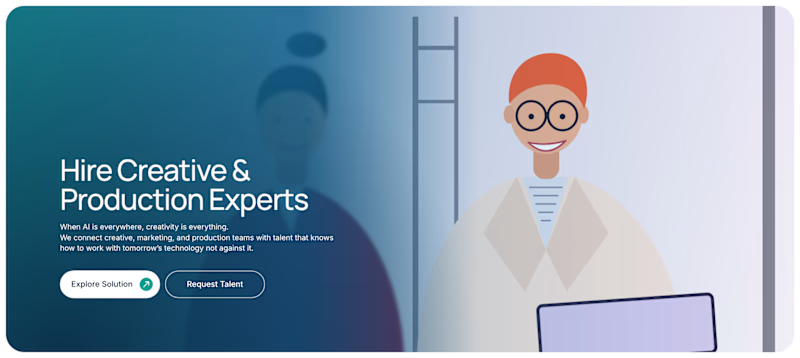
Two hero directions for a creative talent platform. Same copy, totally different visual approach.
A: real photography, purple gradient overlay, feels human and immediate
B: illustrated character, teal gradient, feels modern and brand-forward
Which one makes you want to hire through this platform? 👇

8 voted
100%

0 voted
0%
8 votes
Closed

Most agency websites lead with logos. Arvonn’s leads with the idea.
Four disciplines, one senior team, one idea carried from strategy to launch. Designed to feel like our work: weighted, precise, calm.
Visit: arvonn.com
#webdesign #brandidentity


Leading with the idea is a strong direction!
