The network for creativity
Join 1.25M professional creatives like you
Connect with clients, get discovered, and run your business 100% commission-free
Creatives on Contra have earned over $150M and we are just getting started
Back to feedPost
Taste Test

Hey everyone 👋
I’m currently building a crypto Saas and I’m at a decision point regarding the backend setup.
Right now, my stack includes Lovable + Vercel, and I’ve been exploring two options for handling the database:
Using Lovable Cloud as the database (fully integrated, simpler workflow)
Using Supabase (more control, dedicated backend, scalable)
I’d love to get your feedback based on real experience 🙏
👉 For those who’ve used both:
Which one do you recommend for a SaaS project?
Any limitations or issues with Lovable Cloud?
Is Supabase worth the extra setup/complexity in the long run?


9 voted
64%

5 voted
36%

14 votes
Closed

If you're building a serious SaaS, I would lean towards Supabase. More control and scalability matter a lot once users start growing. Lovable Cloud is good for speed, but can feel limiting later.
The network for creativity
Join 1.25M professional creatives like you
Connect with clients, get discovered, and run your business 100% commission-free
Creatives on Contra have earned over $150M and we are just getting started











Related posts

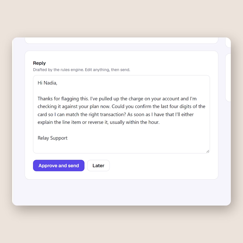
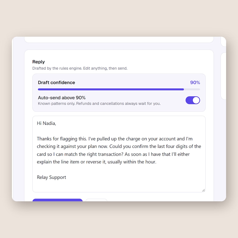
Same support inbox, one difference. Left keeps a human on every send. Right lets the AI send on its own once the draft confidence passes 90, refunds and cancellations excluded.
I built both in Relay this week and I still cannot decide.
Would you flip that switch for your own customers, and at what number?
0 voted
0%
2 voted
100%
2 votes
Closed

I'd flip it per topic, not per score. A 90 on a question the AI has answered hundreds of times is safe. A 90 on a question it has never seen is still a guess. Can Relay set a different threshold per topic?

Exploring a clean, modern SaaS dashboard UI. Focused on simple layouts, smooth interactions, and a better user experience 🚀


i had to like this, it got my attention, very nice build mate.

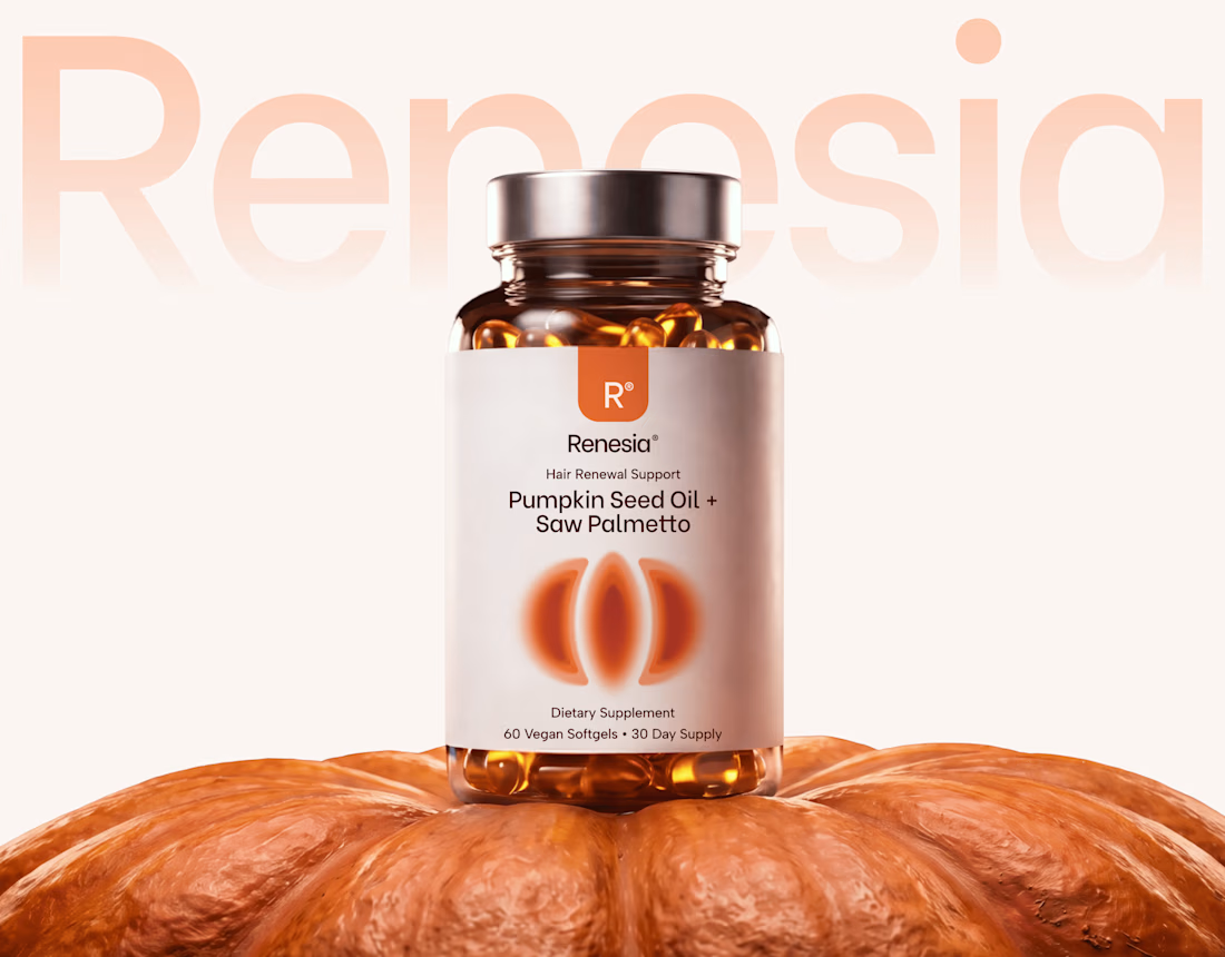
Here we go, check the full case study, I think you will love it! 🎃


Love this! 🎃 The pumpkin concept for Renesia is super creative - perfectly matches the Pumpkin Seed Oil story. Clean work in Illustrator & Figma!