The network for creativity
Join 1.25M professional creatives like you
Connect with clients, get discovered, and run your business 100% commission-free
Creatives on Contra have earned over $150M and we are just getting started
Back to feedPost

Tommy Cash’s site is built like a scroll-through collage — dot-to-dot portraits, glitch text, sticky notes, merch drops scattered across the page like a mood board come to life.
Design like this is bold precisely because nothing sits on a predictable grid. Our job was making sure that freedom didn’t come at a cost: every element positioned exactly where it needed to be, staying fast and stable across every screen size.
Some builds test how well you can follow a system. This one tested how well you can build one that isn’t obvious from the outside.
Design by False Memory
Development by Imferro Agency
Building something ambitious in Webflow? Let’s talk. 👋


The network for creativity
Join 1.25M professional creatives like you
Connect with clients, get discovered, and run your business 100% commission-free
Creatives on Contra have earned over $150M and we are just getting started








Related posts


what if your portfolio page was just all of it?
we put every project from our contra profile on one wall for the new apollo studio site.


Really great to see all of your work

A premium landing page concept for a luxury sauna brand, focused on warm visuals, refined typography, and a smooth interactive experience.

Great landing page 🎉🎉🔥🔥

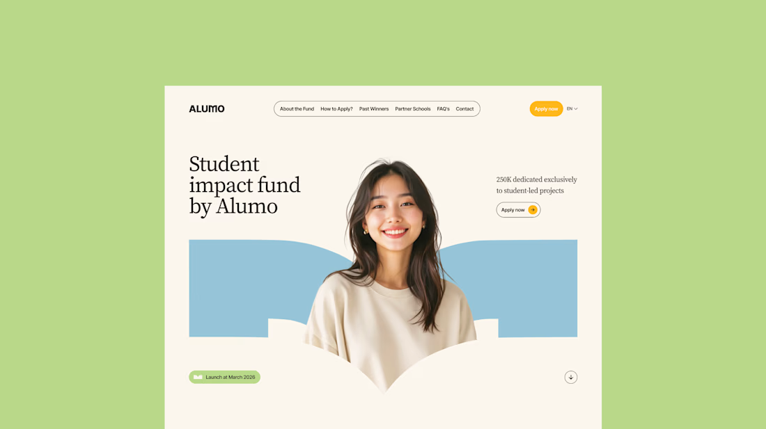
The Client: Alumo is a student impact fund that pools collective influence from influencers and partner schools to deliver a $250,000 annual grant program for student-led projects across Canada.
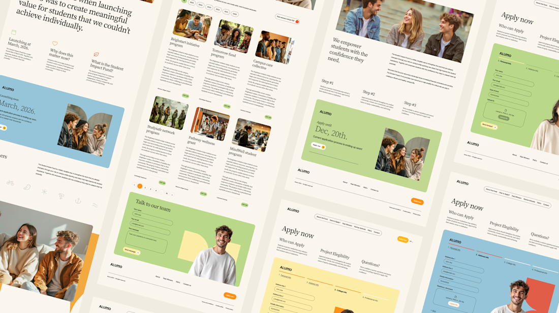
The Issue: The fund needed a website that could communicate trust and purpose to two very different audiences — students applying for grants and partner schools or influencers considering joining — while also showcasing past winners and guiding applicants through the process clearly.
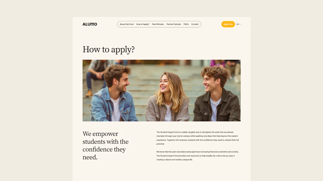
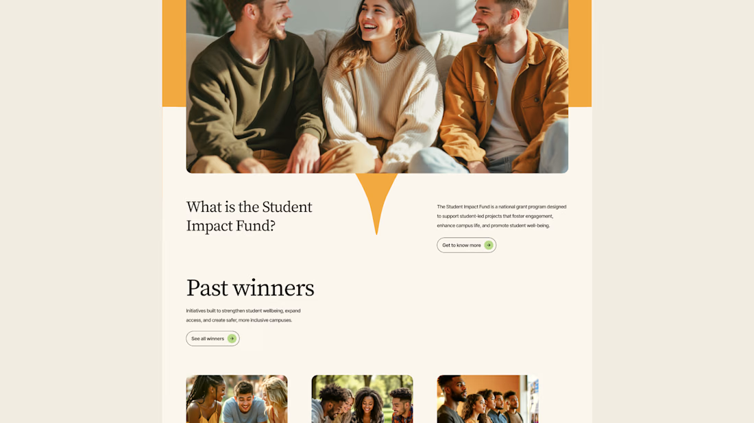
The Solution: A multi-page website was designed with a warm, approachable visual identity using earthy tones, generous imagery, and clear information hierarchy. Each section — About, Past Winners, and How to Apply — was structured to reduce friction and build confidence, making it easy for students to understand eligibility and take action before the deadline.


Love how you're tackling trust + purpose for a $250K fund - that's a tough balance with two audiences. Communicating credibility for a student-led initiative across Canada is huge. Would love to see how you solved it!