The network for creativity
Join 1.25M professional creatives like you
Connect with clients, get discovered, and run your business 100% commission-free
Creatives on Contra have earned over $150M and we are just getting started
Back to feedPost

TEN BKC
Radius Developers
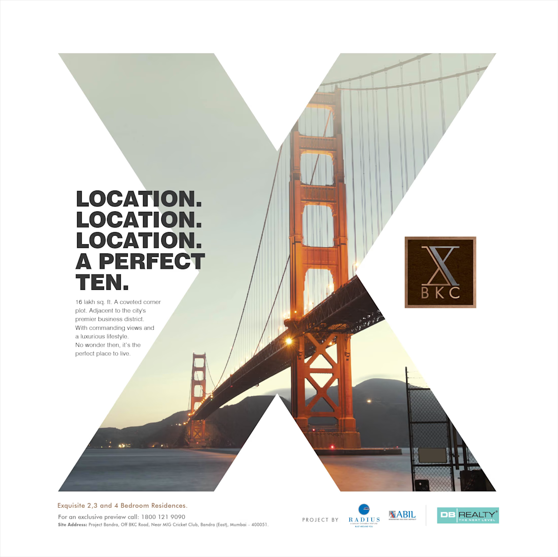
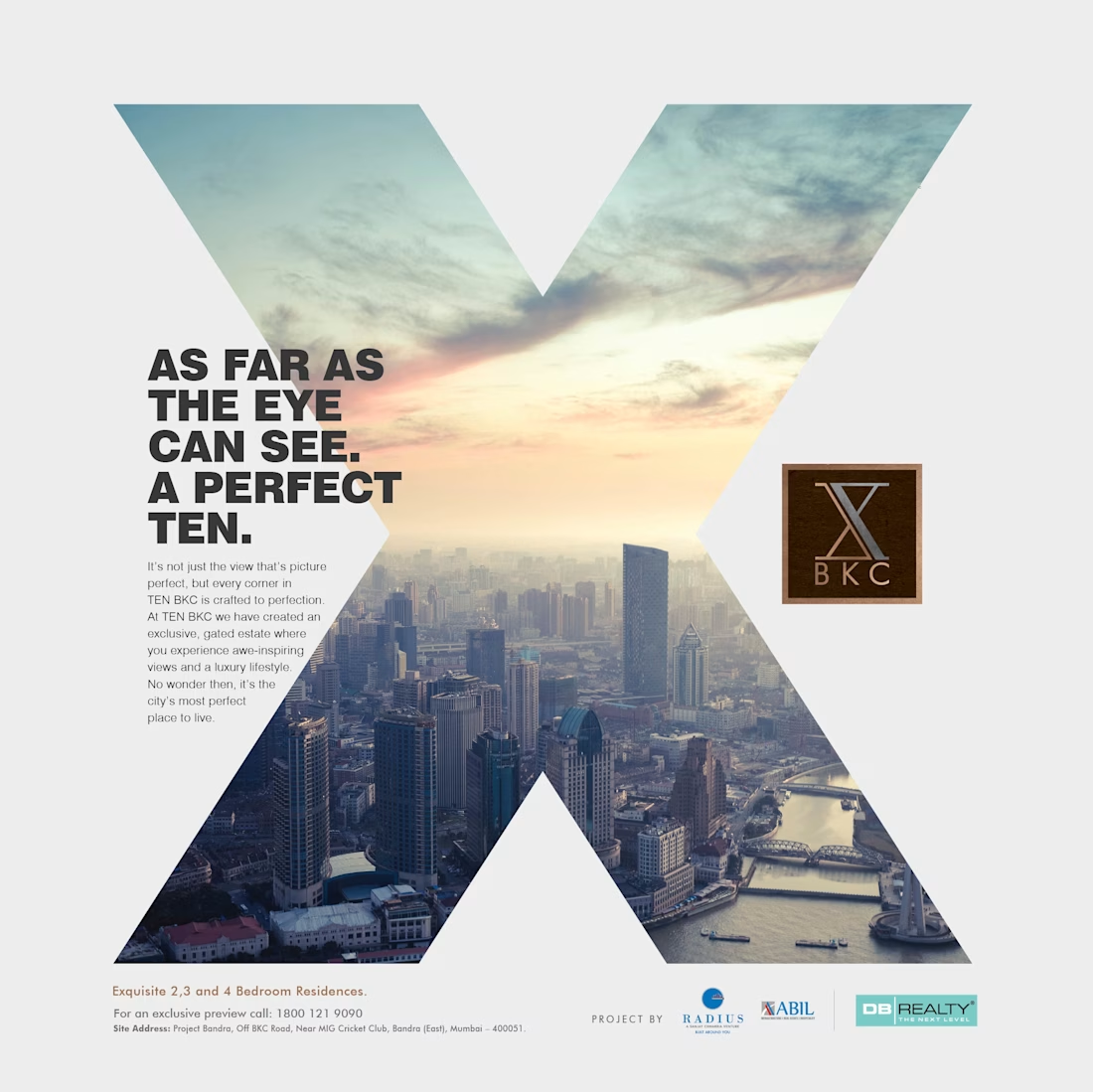
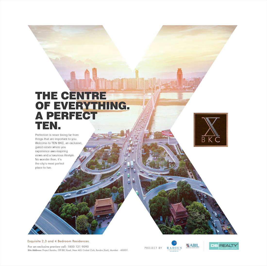
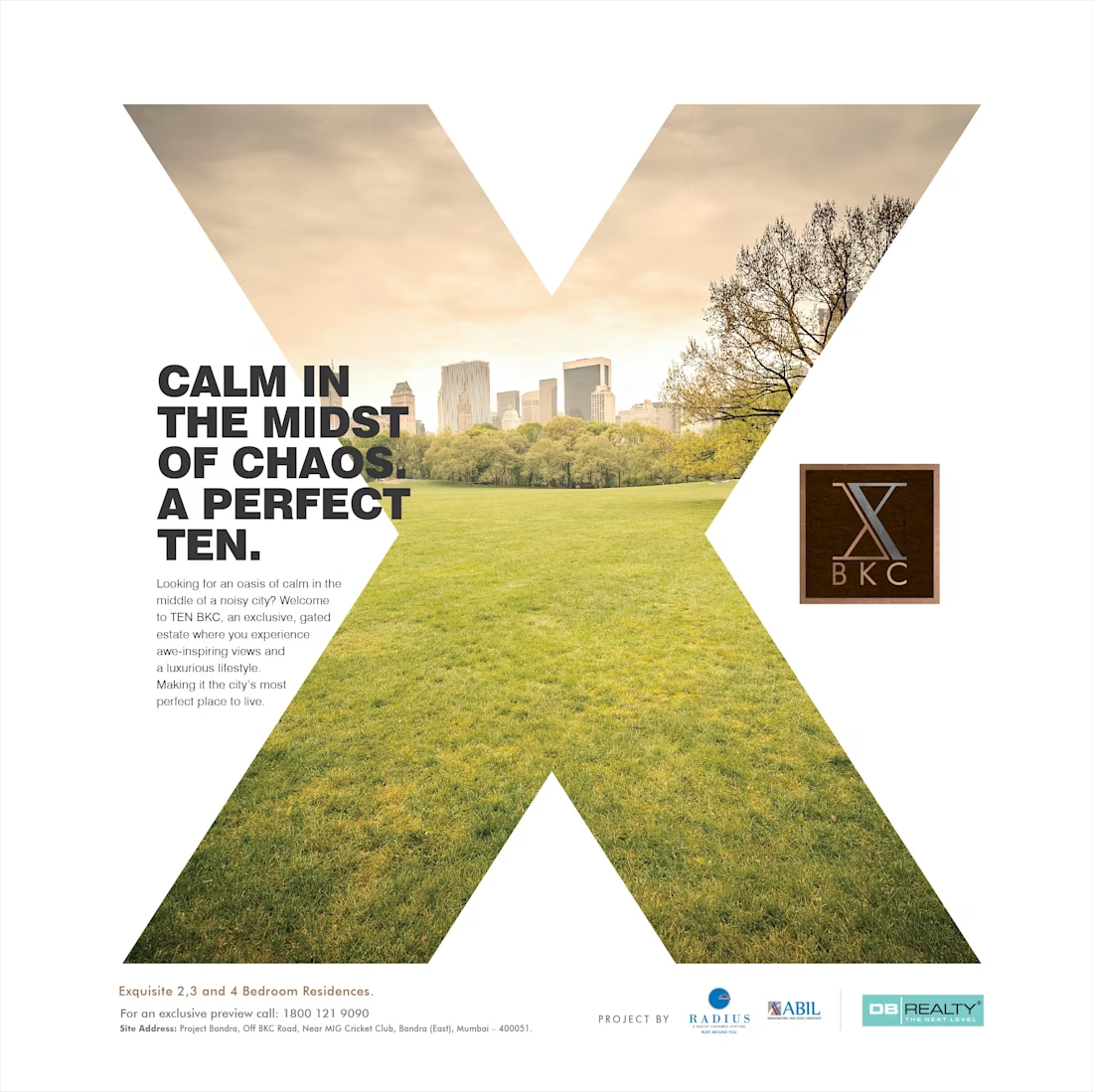
Concept campaign created for the launch of TEN BKC, a premium residential project by Radius Developers in Mumbai’s Bandra Kurla Complex.
The challenge was to create a distinctive identity in an overcrowded luxury real estate market where most communication tends to look and sound the same. With a name like TEN, the opportunity was to build a strong conceptual world around the brand itself.
The solution was the idea of “A Perfect Ten.” Every headline extended that central thought, linking location, views, connectivity and lifestyle back to the language of perfection. Visually, the campaign used the form of the letter “X” as a bold graphic device to create a modern and instantly recognisable identity system across the launch communication.
As part of the concept thinking, we also explored a disruptive front-page newspaper innovation designed to dramatise the arrival of the project and create maximum visual impact.
Though the campaign remained at concept stage, it remains one of my favourite examples of idea-led real estate communication and integrated brand thinking.

The network for creativity
Join 1.25M professional creatives like you
Connect with clients, get discovered, and run your business 100% commission-free
Creatives on Contra have earned over $150M and we are just getting started
Challenges
View all


Related posts


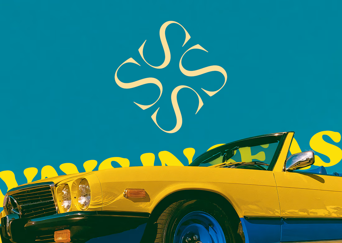
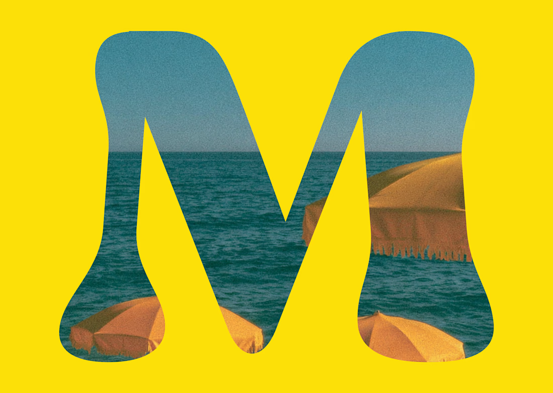
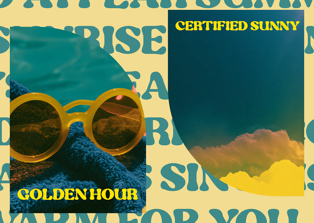
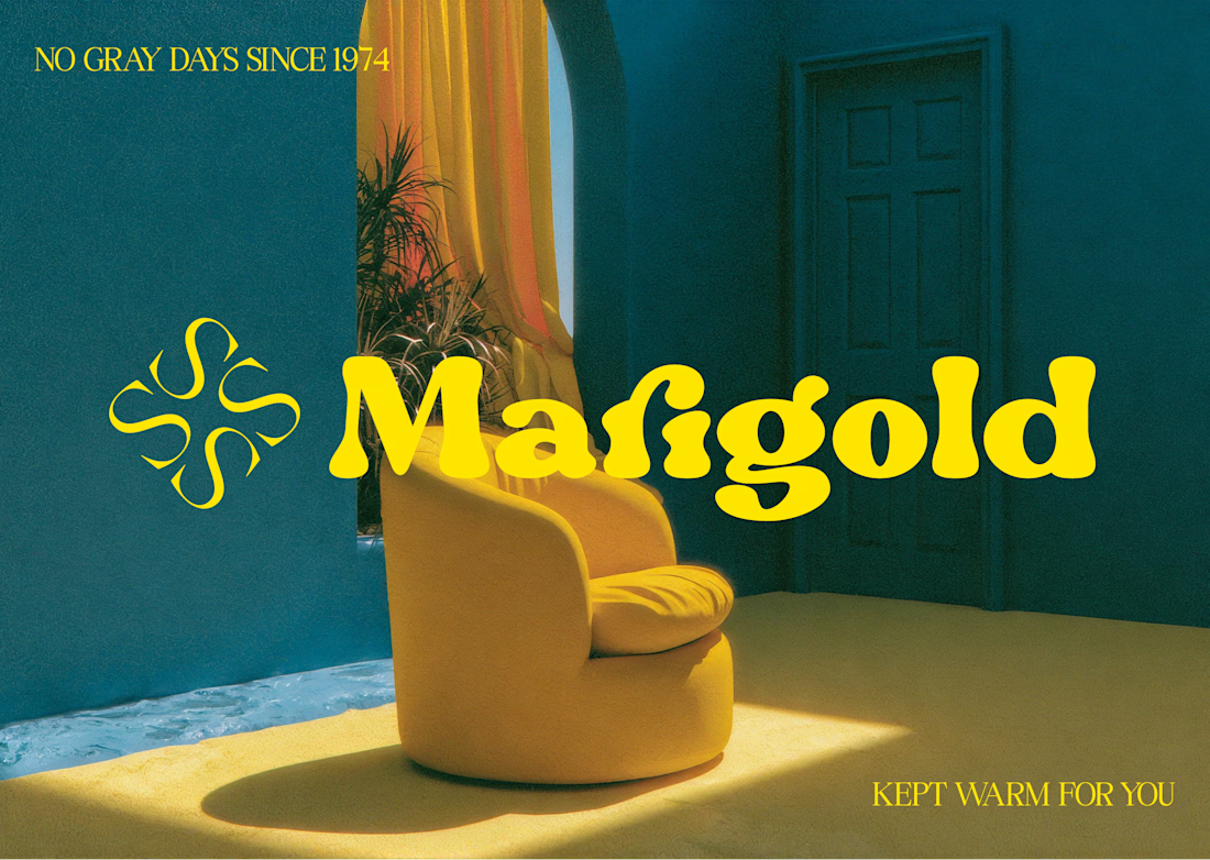
Marigold is a one day concept for envato's human by design challenge. i set the direction in real photography first then generated against that standard.



Making productivity a little more colorful. 💜
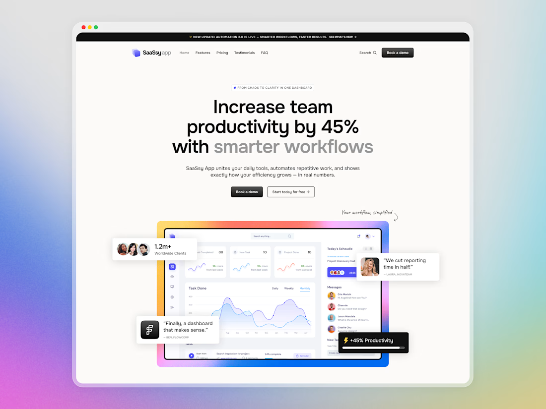
Hey Contra community! Today I want to share a closer look at SaaSsy App – a landing page concept for an all-in-one productivity platform.
The product has a lot going on, so the main challenge was presenting all those features without making the landing page feel overloaded. I kept the structure simple and used colorful gradients and bold typography to make the content easier to follow and a bit more memorable.


Creative work and UI Flow

“We started with just a name and some vague ideas. They left us with a brand.” That’s how our client described their experience working with us on The Growth Fit.
There was no existing identity to refine. Our job was to take an early-stage idea, understand what the brand needed to stand for, and turn it into a visual system with enough clarity and character to grow with the business.
That meant exploring, challenging our own decisions, and going back to the drawing board when something wasn’t landing well. The result was a system built around one central idea: the right fit, carried consistently through the identity, motion and brand touchpoints.
The complete project is live. If you’d like to see how the idea developed into the full identity system, you can explore the case study here: The Growth Fit


I love the colors!