The network for creativity
Join 1.25M professional creatives like you
Connect with clients, get discovered, and run your business 100% commission-free
Creatives on Contra have earned over $150M and we are just getting started
Back to feedPost

Excited to begin a new branding project with Georgi Tactical Integration.
Over the past few months I’ve been refining my focus toward cohesive brand identity systems, and it’s incredibly rewarding to see that work connecting with clients. Looking forward to sharing more soon.


NEW PAID PROJECT
Francesca GeorgiGeorgi Tactical Integrations LLC (GTI Utah)
The network for creativity
Join 1.25M professional creatives like you
Connect with clients, get discovered, and run your business 100% commission-free
Creatives on Contra have earned over $150M and we are just getting started
Related posts

New on Contra, not new to design.
I draw logos by hand, then build everything around them: the brand, the website, the store. Lately I also make product films and ads with AI.
Recent work: an RY monogram and site for a Koreatown law firm, a winged W for a defense firm, and my family's golf eyewear brand, from the mascot to Shopify.
Starting a brand, or have one that doesn't feel like you yet? Show me what you're building.

The logo-led system reads tight because the wordmark sits clean in the negative space instead of fighting the emblem — when a brand has that kind of restraint, the Shopify store usually carries the same hierarchy into the product grid and checkout without inventing new rules....

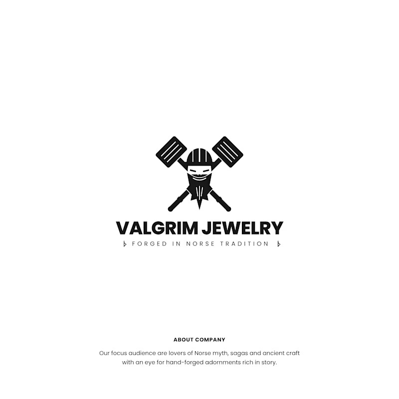
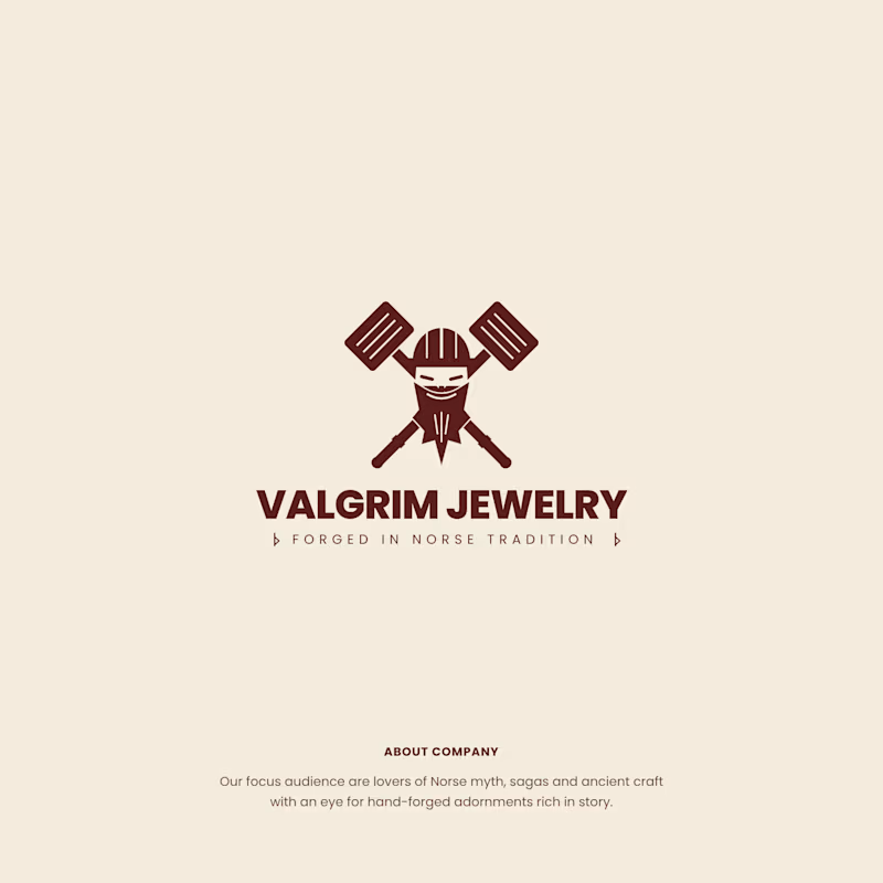
Two colorway directions for Valgrim Jewelry, a Norse-inspired hand-forged jewelry brand.
Same mark. Viking warrior with crossed hammers, “Forged in Norse Tradition.”
Option A: black on white. Raw, bold and graphic. Feels like it belongs on a forge.
Option B: deep burgundy on warm parchment. Aged and earthy. Feels like it belongs in a saga.
Which one would you wear on a pendant? 👇
3 voted
33%
6 voted
67%
9 votes
Closed

If you sell e-bikes, repairs and rentals, your brand should feel energetic before the customer even walks into the shop.
That was the challenge behind eStar Rides.
The brand needed to feel modern, confident and instantly recognizable across both physical locations and digital touchpoints.
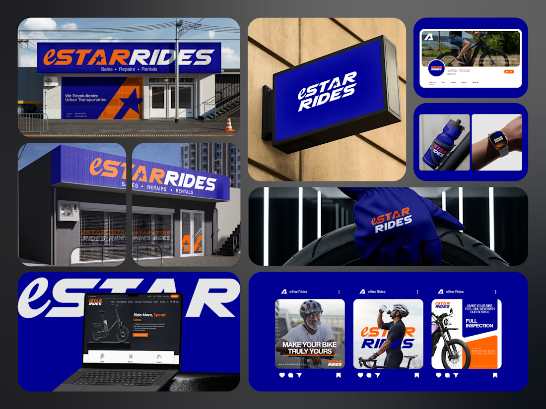
So the identity was built around:
🟠 High-energy orange for visibility and impact
🔵 Deep electric blue for trust and technology
⭐ A bold star-led symbol for direction and recall
🔤 Custom typography with a strong, performance-driven feel
📱 A visual system designed to stay consistent everywhere
Then the identity was carried across:
Storefront signage
Retail environments
Website
Social media
Merchandise
Water bottles
Wearables
Campaign graphics
Digital applications
The goal was not just to make eStar Rides look modern.
It was to make the brand feel established, distinctive and ready to compete.
Because strong mobility branding should communicate:
Energy.
Freedom.
Confidence.
Reliability.
Before a customer even starts comparing options.
eStar Rides
Built for the ride.
What gives the brand the strongest presence?
A. The orange + blue palette
B. The custom wordmark
C. The storefront applications
D. The complete visual system
Drop A, B, C or D below.
If you are building a mobility, automotive, e-bike, transportation or tech-driven service brand and your visuals still feel generic, send me a message.
I help businesses build identities that feel more recognizable, credible and commercially ready.
#BrandIdentity #MobilityBranding #AutomotiveBranding #VisualIdentity #LogoDesign #RetailBranding #CreativeDirection #TransportationBranding




e bikes need branding with this kind of energy,, most of them look like appliance brands