The network for creativity
Join 1.25M professional creatives like you
Connect with clients, get discovered, and run your business 100% commission-free
Creatives on Contra have earned over $150M and we are just getting started
Back to feedPost

Sharing a recent build: the Auxtech website.
My approach on this one - every design decision had to trace back to what that section was trying to say, not just what looked good.
Dark theme + lime accents throughout, because the brand story is "studio, not factory" - it needed to feel like a live workspace, not a brochure. The lime shows up as a pulse across stats, status indicators, and live UI moments (notifications, command palette) so the site feels like it's actively shipping, not just describing that it does.
Where the message was "we're different," I stripped the design down to a plain two-column contrast table - no animation, no color, because the words needed to carry it.
Where the message was momentum (the 14-day process), I used sequential scroll reveals so the page itself feels like it's moving forward.
Full end-to-end build - structure, component system, color and motion decisions all tied back to the story each section needed to tell.
customwebdevelopmentcustomwebdesignanimatedwebsiteWeb DevelopmentWebsite CSSGSAPNext.jsTailwind CSSWeb Design


The network for creativity
Join 1.25M professional creatives like you
Connect with clients, get discovered, and run your business 100% commission-free
Creatives on Contra have earned over $150M and we are just getting started








Related posts


Gorgeous 😍


How fast can a template get without changing a single pixel?
⠀
We just optimized 11 of our templates in Framer, Astro and Next.js. The rule was simple: nothing visible changes, only how things load.
⠀
What we changed: CSS inside the page, fonts from our own domain instead of Google Fonts, WebP images with phone-sized copies, videos that load when you scroll near them, heavy videos re-encoded without visible loss (one template went from about 20 MB of video to 2.4 MB), WebGL that starts near the screen, and analytics after the page. Every page was checked pixel by pixel at three widths before and after.
⠀
Mobile PageSpeed now, Astro / Next.js:
Sunbeam 100 / 100
Auria 100 / 96
Lapse 97 / 98, up from 64 / 66
Parley 97 / 94
Nova Quinn 93 / 92 ⠀
On desktop, Mote scores 98 in Framer and 100 in Astro and Next.js.
More posts on the individual fixes coming.

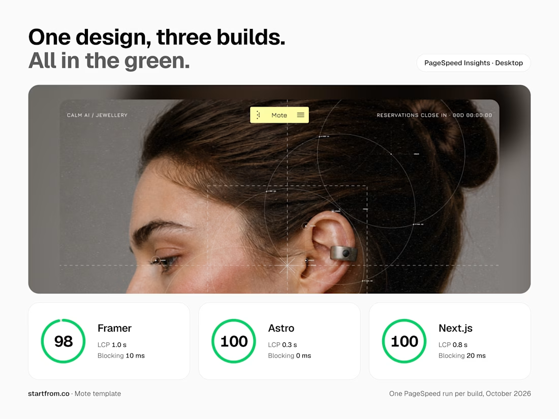

Nothing visible changes, only how things load is such a good rule. Speed work like this is underrated, buyers feel it even if they can't see it.


Your Hero Section Has One Job: Be Clear.
You don’t need huge headlines or long explanations. You need the right image + short headline + clear offer.
For the first version, we worked on the branding, the image and the copy together, so at first glance it’s clear: this is a makeup course, and here’s what you’ll get.
The second version is still beautiful and still feels like beauty. But what are you actually getting? A makeup course? Products? A store? That’s the problem with a Hero that looks good but isn’t thought through.
Your first screen doesn’t need to say everything. It just needs to say the right thing.

22 voted
61%

14 voted
39%

36 votes
Closed
