The network for creativity
Join 1.25M professional creatives like you
Connect with clients, get discovered, and run your business 100% commission-free
Creatives on Contra have earned over $150M and we are just getting started
Back to feedPost

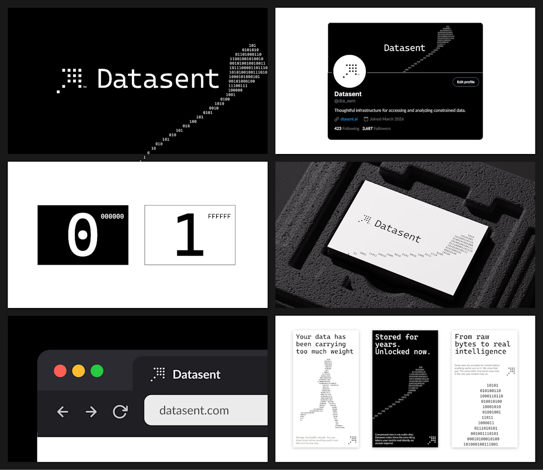
Not every brand needs color. The idea behind this direction for Datasent was to build everything around 0 and 1 - nothing in between. So: black and white only, with the key visual shapes formed from 1s and 0s.




I agree! Monochrome aproach is so underrated nowadays. Clean work!
Thank you!

Very nice expression! Love the connection between 1-0 as a data and both colors.
Thank You Jeihun.

Pairing the binary-only visual system with copy like "your data has been carrying too much weight" gives the 0s and 1s an actual argument to make, not just a pattern - the constraint is doing narrative work, not just aesthetic work.
Absolutely, it all comes down to the core concept of this visual system.
The network for creativity
Join 1.25M professional creatives like you
Connect with clients, get discovered, and run your business 100% commission-free
Creatives on Contra have earned over $150M and we are just getting started
Challenges
View all


Related posts

Ram Mascot Logo Design



Reroll Brand Identity
A full visual identity created for Reroll, built around the idea of turning the “O” into a die.
The project includes logo design, social media identity, motion, graphics and a custom playing card back.
Creative direction: Dmitry Lepisov
Identity design + motion: Arthur Skripnik
3D + motion created with Spline


That mint card-back pattern is such a fun extra, and the chunky Anton headers keep the whole system feeling punchy.

A little bit of the work I did for an agency in Australia some time ago.
I hope you like it.

Amazing