The network for creativity
Join 1.25M professional creatives like you
Connect with clients, get discovered, and run your business 100% commission-free
Creatives on Contra have earned over $150M and we are just getting started
Back to feedPost
Quick one for anyone who tests responsive layouts: do you drag the browser window to random widths and see what breaks, or pick a fixed list of device sizes in dev tools and only check those?
No wrong answer, just curious which one people actually default to. Reply with "drag" or "fixed."

drag

Drag gang, same here. Curious if that holds up once more fixed replies come in.
The network for creativity
Join 1.25M professional creatives like you
Connect with clients, get discovered, and run your business 100% commission-free
Creatives on Contra have earned over $150M and we are just getting started
Related posts

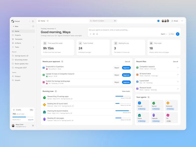
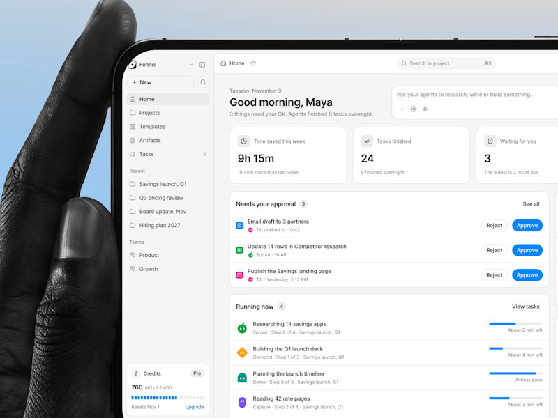
Designed an AI agents dashboard where you approve work, track running tasks, and see your whole team of agents in one place.
Same screen, two shots. Which one would stop your scroll? 👀


2 votes
Ends in 23h

nice one dude


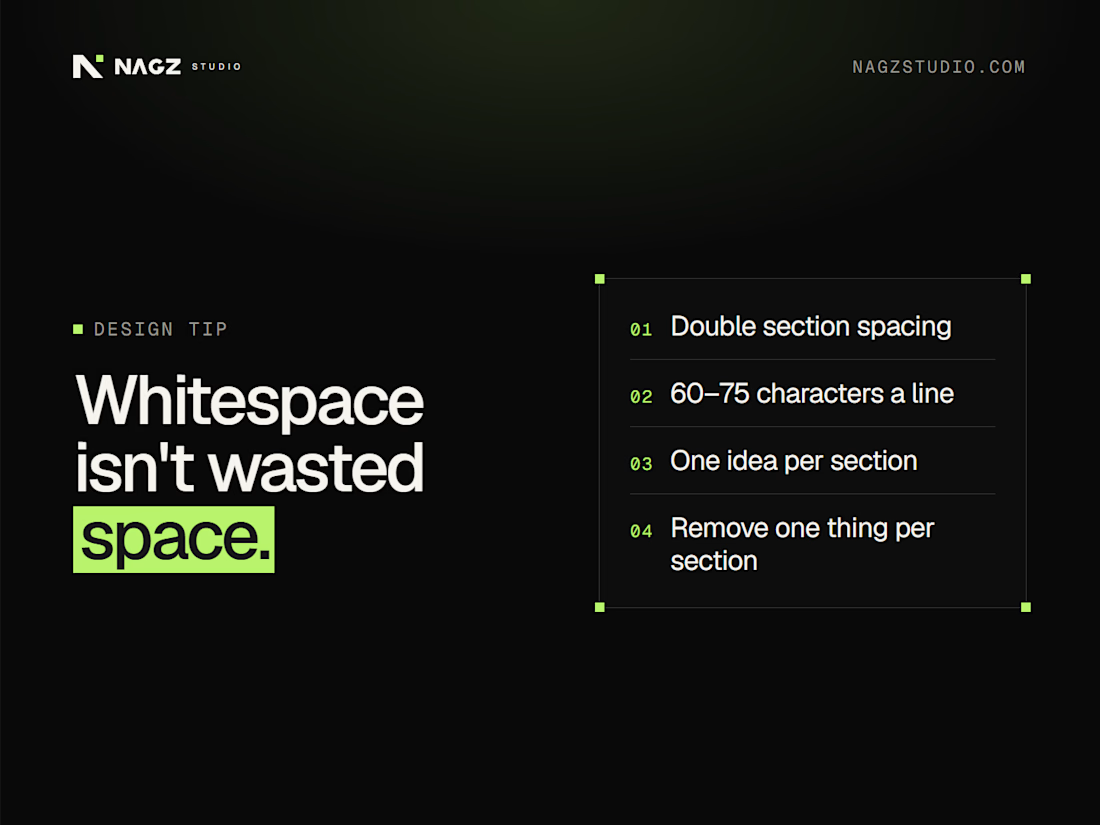
Whitespace isn't wasted space
Crowded pages feel cheap. Space makes a page feel confident.
Quick fixes you can make today:
→ Double the space between sections
→ Keep lines of text to about 60–75 characters wide
→ One idea per section
→ Give the headline room: more space above it, less below
→ Remove one element from every section
Space tells visitors what matters. Clutter tells them nothing does.
Which section of your site feels the most crowded?
#WebDesign #UIDesign #DesignTips #WebsiteDesign #UX

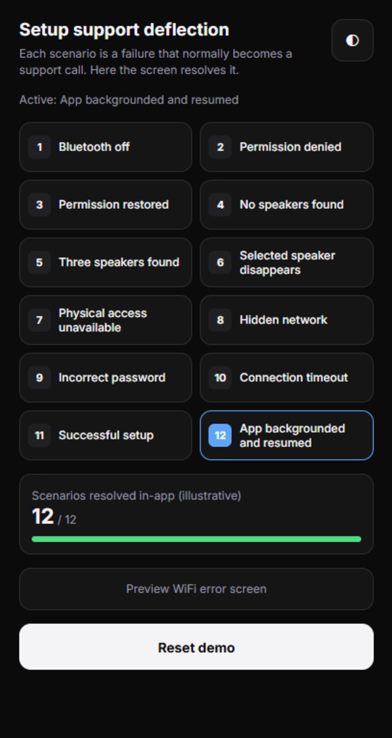
12 Scenarios. 1 Mission: Make Setup Friction Disappear. | SONOS UX
What if a setup failure didn't mean the end of the experience? 🎵
I turned 12 frustrating setup scenarios into 12 opportunities for a smarter, smoother user experience.
No generic error loops. Just clearer guidance, smarter recovery, and better product thinking.
This is what happens when design meets problem-solving. ⚡
Curious? Explore the project, test the demo, and tell me what you think!
If this inspires you, share it with your design community. 🤝
Want to experience it yourself? The live demo link is waiting for you in the comments!
— Arif Khan | Design Forensics

0 votes
Ends in 6h

Designing for the setup failure instead of just the happy path is the right call, since that is where people get frustrated. Which of the 12 scenarios turned out to be the hardest to make feel smooth?