The network for creativity
Join 1.25M professional creatives like you
Connect with clients, get discovered, and run your business 100% commission-free
Creatives on Contra have earned over $150M and we are just getting started
Back to feedPost

Strategic Executive Support: Founder Prioritisation
Project Need
Evan, a Marketing agency founder, was drowning in operational "noise"—podcasts, client rescheduling, and low-priority tasks—which was distracting him from partnership deals and strategic growth.
I was tasked with managing Evan's high-velocity schedule CEO across Slack, Email, and Notion.
What I did
I applied an Impact vs. Effort vs. Urgency matrix to filter every request and determine what got to Evan's desk. I colour-coded his calendar (Red for Strategy, Green for Revenue) to protect his high-energy hours for billionaire meetings and investor prep.
I proactively moved operational tasks to my own plate and updated him via SoD/EoD (Start/End of Day) reports to eliminate unnecessary "check-in" meetings.
The Result
1. Ensured 100% attendance and prep for high-stakes partnership meetings.
2. Eliminated 5+ hours of manual administrative decision-making for the CEO weekly.
3. Provided a systemised daily visibility loop that allowed the founder to focus on leadership while I handled the infrastructure.
P.S The entire case study is linked in this case study


The network for creativity
Join 1.25M professional creatives like you
Connect with clients, get discovered, and run your business 100% commission-free
Creatives on Contra have earned over $150M and we are just getting started



Related posts

Educational College Website | Modern Kajabi Web Design
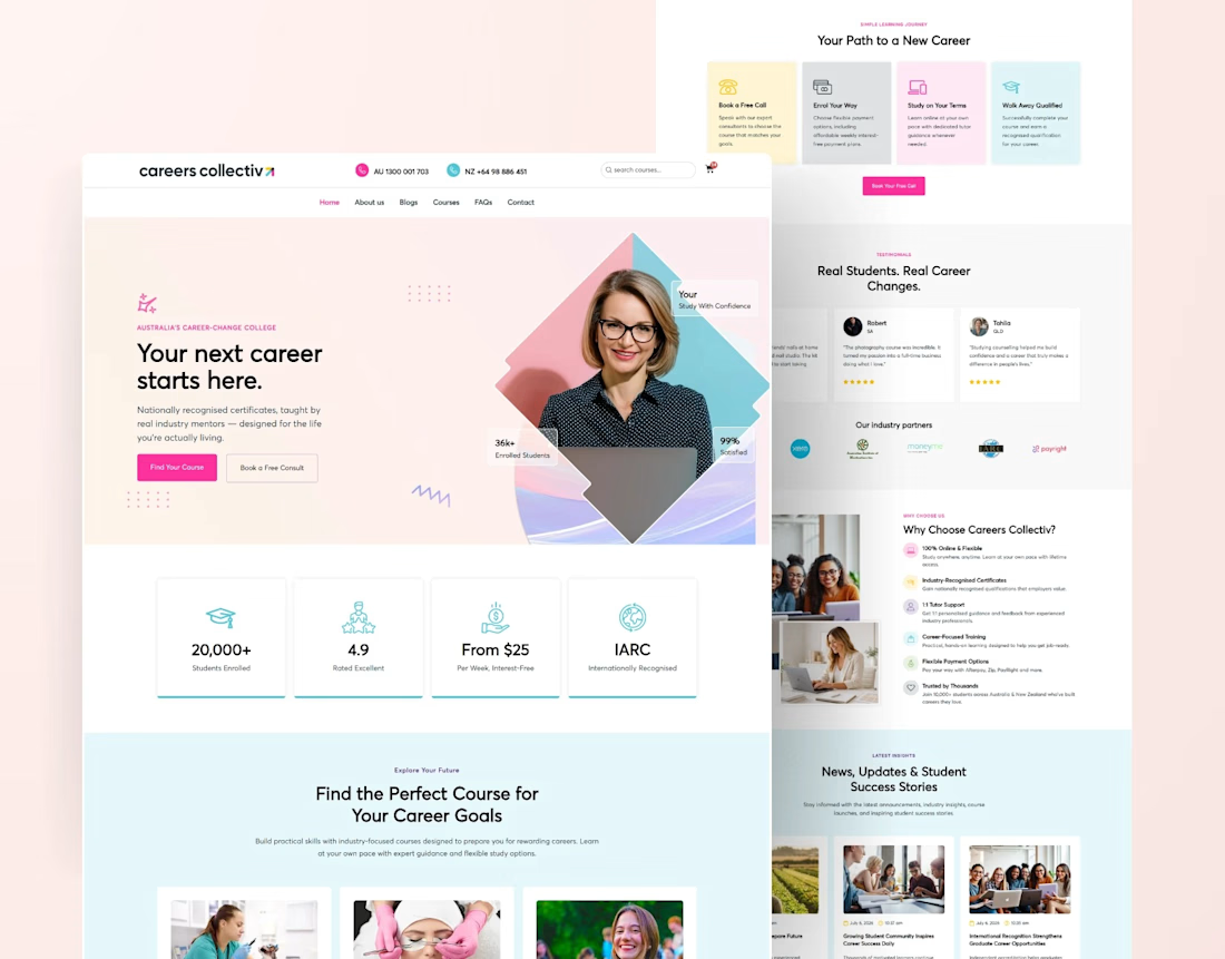
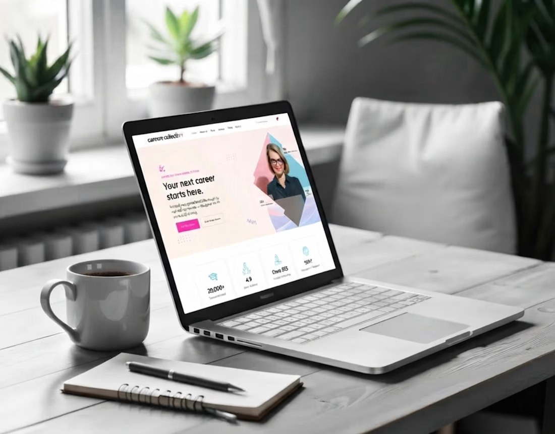
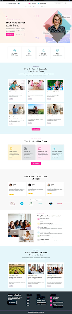
This project was about turning a college's online presence from a digital brochure into something that actually enrolls students. They needed a website that loaded fast, guided visitors naturally, and made the leap from "I'm interested" to "I'm applying" feel obvious.
Built on Kajabi, so the whole thing runs in one system: no clunky add-ons, no plugins fighting each other, no inflated maintenance.
What went into it:
Modern, mobile-first design that reflects identity
Clear program and course pages that answer questions before they're asked
A streamlined admissions funnel from first visit to application
pages, all built to convert, not just to look pretty
The part I care about most: it performs. Every section exists to move a prospective student one step closer to saying yes.
If your school, academy, or education brand is living on a dated site, that's my lane. Let's build yours.




The first thing I created for LedgerFlow wasn't a screen.
It was a set of questions.
I'm kicking off a new concept project: **LedgerFlow, an accounting and financial management SaaS platform for small businesses, freelancers and independent business owners.
The goal is to design a website that helps visitors understand what the product does, how it helps their business, and why they should book a demo.
But before opening Figma, I needed to understand the business.
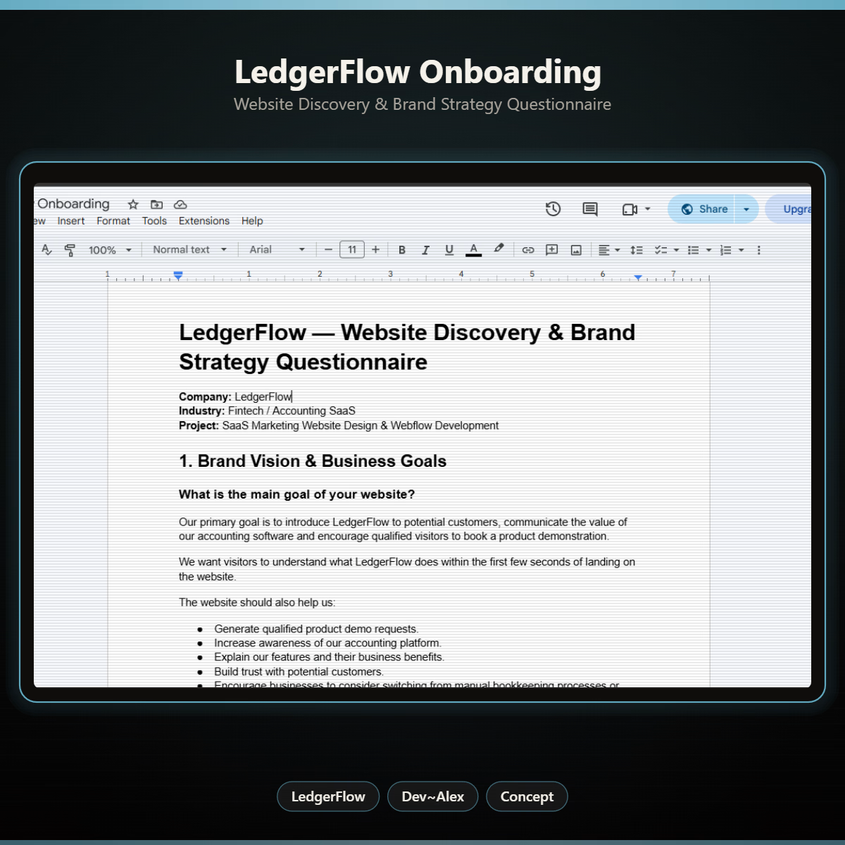
So I created a website discovery and brand strategy questionnaire.
It covers:
→ Brand vision and business goals.
→ Target audience.
→ Website goals and user experience.
→ Branding and visual direction.
→ Services and offers.
→ Project direction and logistics.
I want to understand things like:
Who exactly are we designing for?
What problem does the product solve?
What makes it different from traditional accounting software?
What should visitors understand within the first few seconds?
And what would make them confident enough to book a demo?
Because the answers will influence the website's messaging, content, visual hierarchy and calls to action.
You can't design a clear experience when you don't understand what the business needs to communicate.
LedgerFlow is a concept project, but I'm treating the process like a real client engagement.
I'll be sharing the journey from discovery to website structure, UI design and Webflow development.
And if you're building a SaaS product or need a website that communicates your business value clearly, I'm open to website design and Webflow projects.
Let's talk about what you're building. 🤝



Starting with a discovery questionnaire instead of a screen is how good briefs begin, and "explain what LedgerFlow does in the first seconds" is the right goal to design around. Will the answers become a one page brief?

I designed this skincare product promotion for a natural beauty brand.
The concept is clean, soft and fresh to show the natural ingredients of the products.
I used warm beige tones, green leaves and elegant typography to create a premium and organic feel.
This design includes Day Cream 50ml packaging, Vitamin C Serum packaging and social media promotional design.
I focused on clear product labels, beautiful layout and a natural glow look that attracts customers.

Love the clean, premium look! The natural tones and product presentation are beautifully done. Great work!