The network for creativity
Join 1.25M professional creatives like you
Connect with clients, get discovered, and run your business 100% commission-free
Creatives on Contra have earned over $150M and we are just getting started
Back to feedPost

I designed a cinematic storytelling workflow that transforms a single emotional idea into a complete short-film production system — from concept to final edit-ready sequence.
It is built around one core emotional moment:
A young man achieves his dream job and rushes to share the news with his father, only to discover that his father has passed away moments before he arrives.
Instead of treating this as a story, the workflow converts it into a repeatable cinematic engine for emotional filmmaking.
The system breaks down any emotional idea into a structured production pipeline:
Emotional intelligence analysis (core emotion, conflict, subtext)
Character psychology mapping (behavior over exposition)
5-phase cinematic narrative structure
Shot-by-shot visual storyboard design
AI-ready image prompt generation per frame
Sound design and silence mapping for emotional control
Editing timeline for final video assembly
The goal is to enable creators to turn simple human emotions into cinematic short-form films using a consistent, reusable system — not by writing stories, but by engineering emotional experiences.
X Post Link: https://x.com/i/status/2045906815351980477


The network for creativity
Join 1.25M professional creatives like you
Connect with clients, get discovered, and run your business 100% commission-free
Creatives on Contra have earned over $150M and we are just getting started




Related posts

💳 Making Financial Products Feel Simple
I designed this finance website for Sendit, with one goal in mind: make everyday payments feel simple, trustworthy, and effortless.
The design focuses on:
Clear messaging and strong visual hierarchy
Trust-focused finance UI
Simple payment interactions
Clean, modern layouts
Conversion-focused sections
A responsive experience designed around the user
For fintech products, good design isn’t just about looking modern. It’s about making people feel confident when money is involved.
If you’re building a fintech, SaaS, payment platform, or financial product and need a website that communicates trust and clarity, I’d love to work with you.


Solid execution on a hard brief.

Title:
VAULT — Personal Finance & Wallet iOS UI
VAULT is a modern personal finance & wallet app designed for iOS, focused on making everyday money management simple, clear, and intuitive.
The complete UI includes:
• Overview / Home
• Transactions
• Transaction Details
• Budgets
• Analytics
• Profile & Settings
Designed in Figma with an iOS-first approach, clean layouts, clear financial data visualization, and a consistent mobile experience.
📱 iOS UI Design
🎨 Figma
💰 Personal Finance App

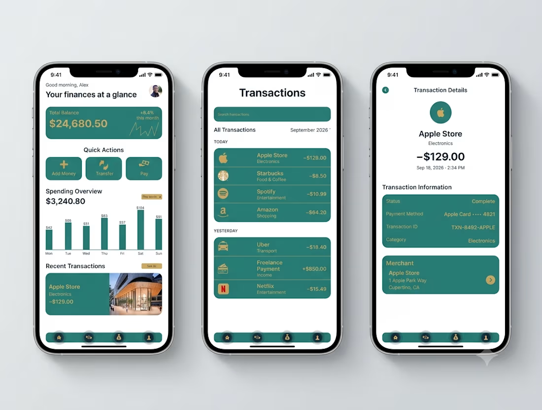

Transaction Details splits the payment record from the merchant card - status, card, transaction ID in one block, the store address in another. That separation is what makes a dispute resolvable.

Website Design | UI/UX Design | Web Design
A modern website design concept focused on creating a clean, engaging, and user-friendly digital experience.
The design combines strong visual hierarchy, intuitive navigation, thoughtful spacing, and responsive layouts to create an interface that feels polished while keeping the user journey simple and clear.
From the overall page structure to typography, imagery, and calls-to-action, each element was designed to create a cohesive experience that works across desktop and mobile.


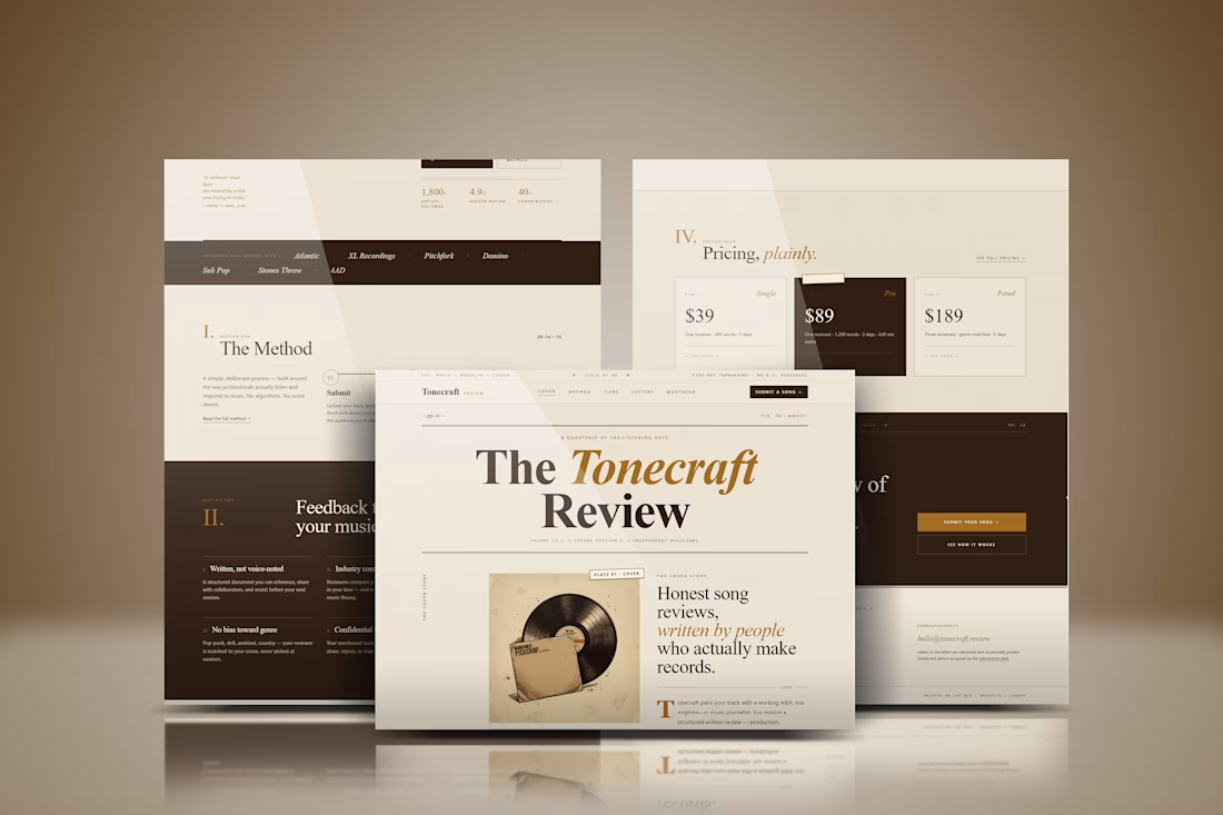

The spacing and hierarchy keep the experience approachable.