The network for creativity
Join 1.25M professional creatives like you
Connect with clients, get discovered, and run your business 100% commission-free
Creatives on Contra have earned over $150M and we are just getting started
Back to feedPost

AZERO Steelhead - Premium Seafood Brand Website
I developed a custom WordPress website for AZERO Steelhead, a premium ocean-farmed seafood brand focused on sustainability, transparency, and exceptional product quality. The goal was to transform the company's brand identity into a high-performance digital experience that communicates trust, craftsmanship, and premium positioning to global buyers and partners.
The project involved building a scalable WordPress solution with reusable components, responsive layouts, and a flexible content management system that enables the marketing team to manage content efficiently. Special attention was given to performance, SEO, accessibility, and smooth user interactions to deliver a polished experience across all devices.
Key Contributions
Custom WordPress development
Pixel-perfect implementation from Figma
Responsive, mobile-first architecture
Flexible CMS using reusable content modules
Performance & Core Web Vitals optimization
SEO-friendly semantic markup
Interactive animations and micro-interactions
Cross-browser compatibility
Clean, maintainable, component-based codebase
Tech Stack: WordPress, PHP, JavaScript, HTML5, SCSS/CSS3, ACF, GSAP, Responsive Web Design, Performance Optimization.


The network for creativity
Join 1.25M professional creatives like you
Connect with clients, get discovered, and run your business 100% commission-free
Creatives on Contra have earned over $150M and we are just getting started
Related posts

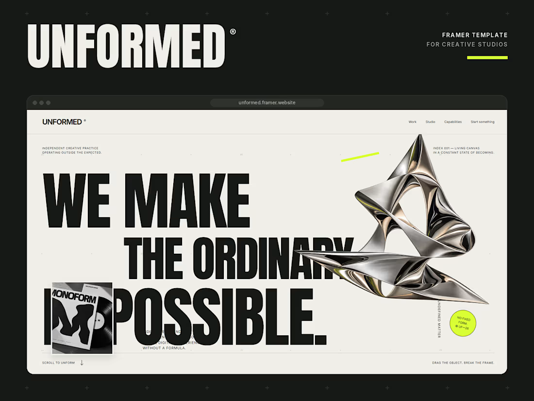
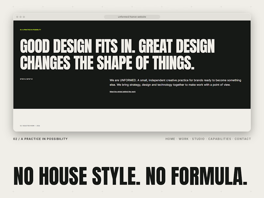
Meet UNFORMED, my new Framer template for independent creative studios and agencies. 🖤💚
I wanted to build something that doesn’t play it safe. Most studio sites look the same, so this one leans into huge condensed type, a warm off-white and black palette, and one loud lime accent.
A few things I’m proud of:
A draggable chrome object in the hero. Grab it and break the frame.
A type experiment where visitors drag the words to make their own composition, and it works by keyboard too.
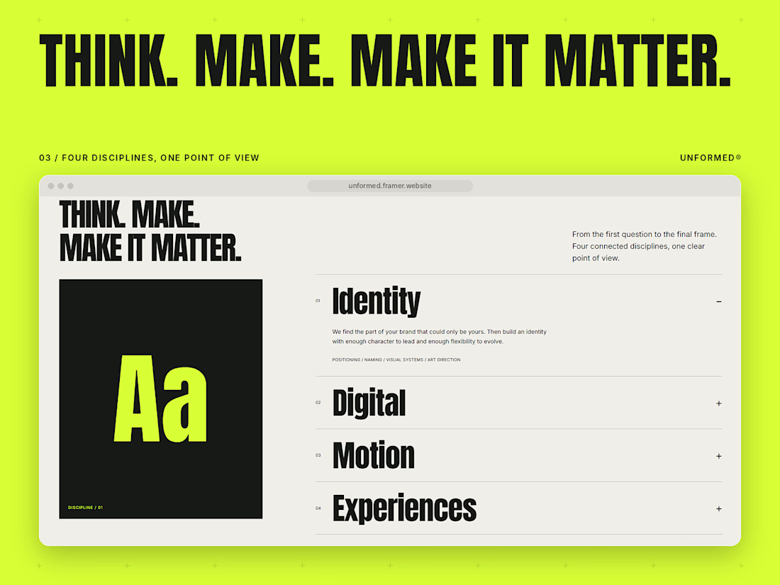
CMS case studies, an accordion services section and a live local clock.
Fully responsive, with clean text and colour styles and a template guide to help you set it up.
Pages: Home, Work, Project, Studio, Capabilities, Contact and a Template guide.
Built for studios that want their site to have a point of view. Would love to hear what you think.



The MacWhisperer | Kajabi Website Design for Online Courses & Memberships
I designed The MacWhisperer website using Kajabi, creating a professional online platform that helps users learn how to use Apple technology with greater confidence, simplify everyday tasks, and improve productivity.
The design focuses on making technology education approachable through a clear website structure, engaging content sections, and a user-friendly experience. I aimed to help visitors understand the value of the training, explore educational resources, and discover the available courses and membership opportunities.
What I Focused On
Kajabi Website Design: A professional website layout aligned with the brand's identity and educational mission.
Course Presentation: Clear organization of learning content to help visitors explore technology training.
Membership Experience: Structured presentation of membership benefits and learning opportunities.
User-Friendly Navigation: An intuitive browsing experience that makes important information easy to find.
Trust Building: Strategic presentation of testimonials, brand information, and service benefits.
Conversion-Focused Design: Clear calls to action that encourage visitors to explore courses, memberships, and contact options.
The goal was to create an engaging digital learning platform that builds trust, communicates the value of online education, and makes it easier for visitors to take the next step.
Platform: Kajabi
Service: Website Design
Industry: Technology Education, Online Courses & Memberships

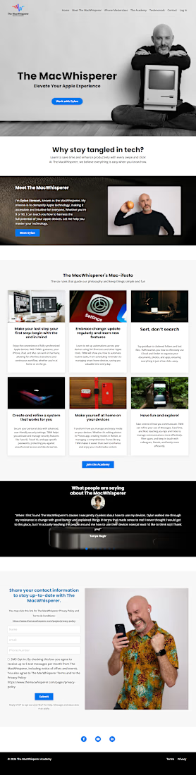

For technology training, I’d make the course-versus-membership choice explicit: solve one specific problem with a course, or get ongoing help through membership. Showing who each path suits beside its CTA could reduce the decision load for someone who already feels unsure about the technology.

For BrewMetrics, an analytics platform for cafés and coffee shops, handled both the design and the development.
The goal was to make data feel friendly and easy to understand for café owners. We went with a warm coffee-inspired palette, clear typography and simple visuals that explain the product at a glance.
Then built it, so the final site looks exactly like the design. No lost details between Figma and launch.
What do you think of the result?
Need someone to design and build your website? My DMs are open ✨

Looks great!