The network for creativity
Join 1.25M professional creatives like you
Connect with clients, get discovered, and run your business 100% commission-free
Creatives on Contra have earned over $150M and we are just getting started
Back to feedPost

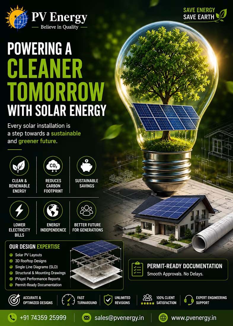
🌱 The future isn't just powered by energy. It's powered by smart design.
Every successful solar project starts with accurate engineering, thoughtful planning, and a commitment to quality.
At PV Energy, we help solar installers, EPC companies, and developers with:
⚡ Solar PV Layouts
🏡 3D Rooftop Designs
📐 Structural & Mounting Drawings
🔌 Single Line Diagrams (SLD)
📊 PVsyst Reports
📋 Permit-Ready Documentation
From residential rooftops to large-scale commercial and industrial projects, our goal is simple:
Deliver faster approvals, reduce revisions, and build smarter solar systems.
🌍 Let's build a cleaner, greener future—one solar project at a time.
📩 Looking for a reliable Solar Design & Engineering partner? Let's connect.


The network for creativity
Join 1.25M professional creatives like you
Connect with clients, get discovered, and run your business 100% commission-free
Creatives on Contra have earned over $150M and we are just getting started







Related posts

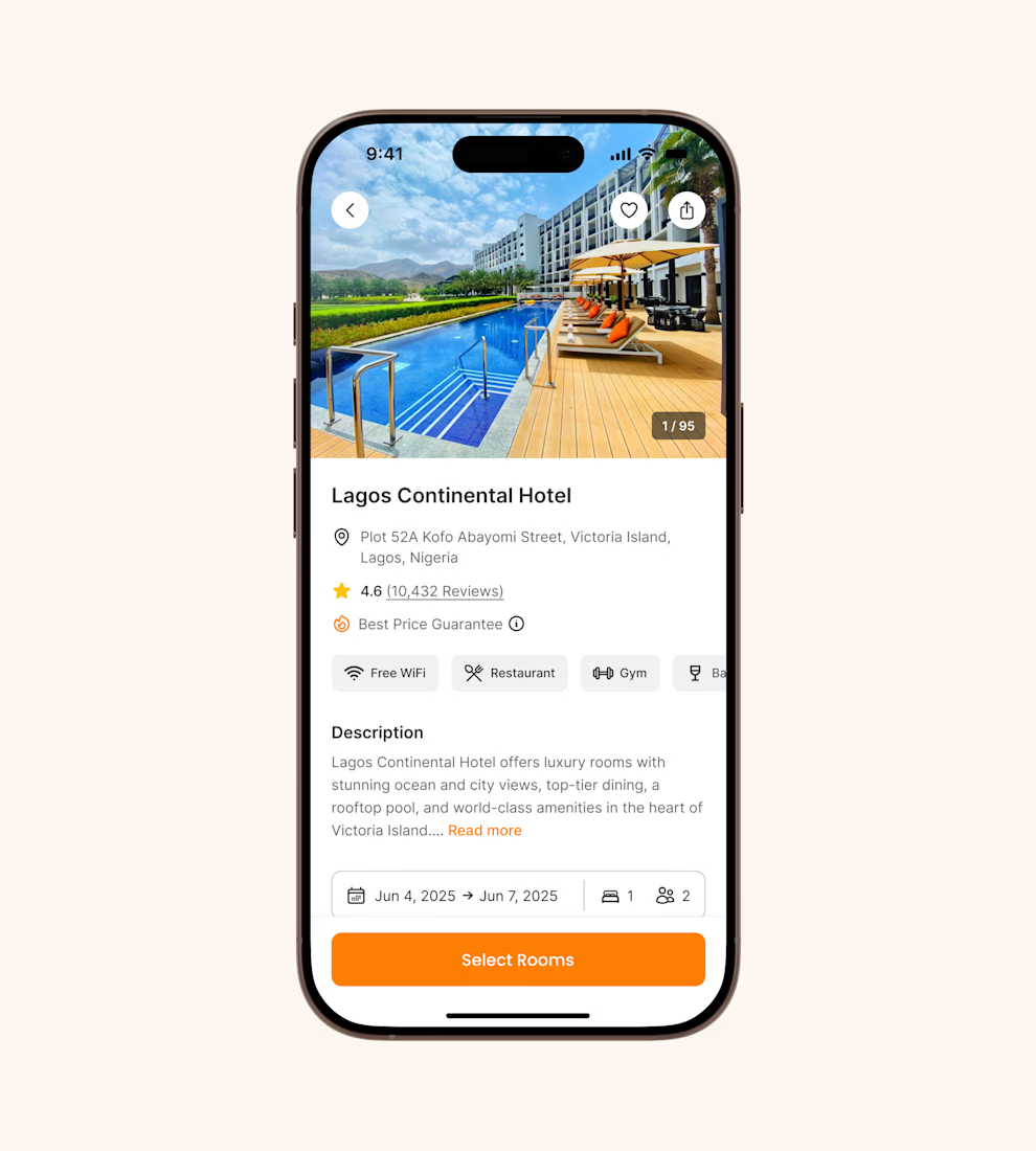
Hotel details screen for a booking app I’ve been designing.
Focused on clear information hierarchy, visual comfort, and helping users make quick booking decisions.
Excited to start sharing my work here 🚀

It's basic design but it's great❤️

Refreshing my portfolio and revisiting one of my favorite projects from 2025 🧡💙
Bilsoft has made accounting software for over 20 years, and 100,000+ businesses use it every day. When we started, the trust was there, but the brand had grown piece by piece until it looked like several different companies.
The tricky part was a tension most fintech brands face. The software has to feel precise and serious, but the people using it are small business owners who just want things to be simple. So I drew the wordmark on a strict grid and softened every corner. The name does the rest: “Bil” means knowing, “Soft” means steady. Then I built it into a system the team could use without a designer in the room.
While putting the case study together, I added something new: a motion piece where the logo builds itself letter by letter.
Curious how others here handle this: when a client’s product is serious but their users want simple, which way do you lean? 👇
Full case study on my Contra profile.


Niiiiice 🔥

Project Management Dashboard UI – A powerful and intuitive interface designed to enhance team collaboration, productivity, and workflow efficiency.

the yellow date card gives the eye a clear place to start, which most dashboards skip. how does the to-do list hold up when someone has 30 tasks instead of 5?


