The network for creativity
Join 1.25M professional creatives like you
Connect with clients, get discovered, and run your business 100% commission-free
Creatives on Contra have earned over $150M and we are just getting started
Back to feedPost



The network for creativity
Join 1.25M professional creatives like you
Connect with clients, get discovered, and run your business 100% commission-free
Creatives on Contra have earned over $150M and we are just getting started





Related posts


Definitely the new one. Seems more fluid and easier to interact with

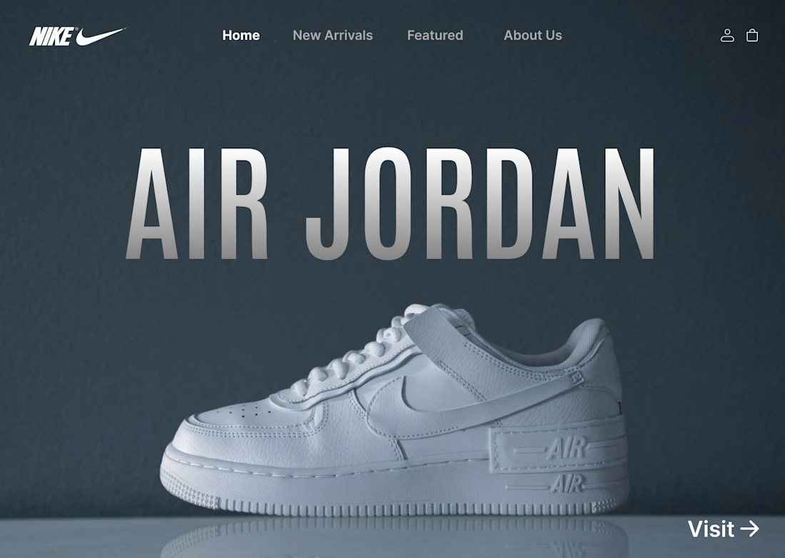
I designed a clean, minimalist e-commerce concept for Nike centered around the iconic Air Jordan series. The goal was to create a bold, modern hero section that instantly grabs attention while keeping the navigation effortless for shoppers.
Key Highlights:
Hero Visual: Featured high-resolution shoe imagery paired with bold display typography.
Minimal Layout: Dark, muted color scheme that makes the product pop without visual noise.
Streamlined UI: Essential navigation tabs paired with a direct CTA for seamless user flow.
#UIDesign #UXDesign #Figma #WebDesign #NikeConcept #LandingPage #DesignShowcase #UXUI #ECommerceDesign


From problem to polished product.
I started by identifying the UX problems, then refined the same product through better structure, hierarchy, spacinga navigation, and interactions making the experience clearersimpler, and easier to use.
1 voted
50%
1 voted
50%
2 votes
Closed