The network for creativity
Join 1.25M professional creatives like you
Connect with clients, get discovered, and run your business 100% commission-free
Creatives on Contra have earned over $150M and we are just getting started
Back to feedPost
Taste Test
Designers, I need your taste check 👀
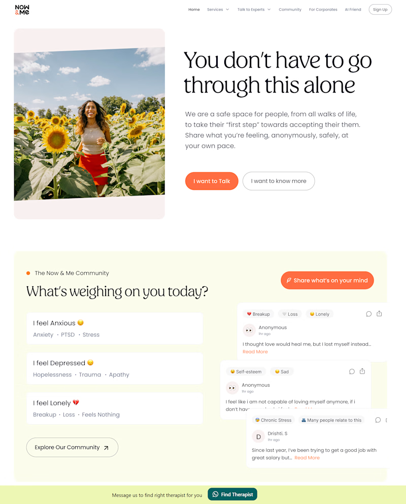
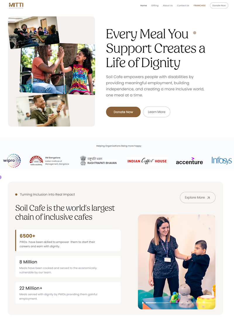
I’ve been exploring a few visual directions for website section designs, and I’d love to know which one feels the strongest to you.
Would really appreciate your honest take and which one do you like the most and why?

4 voted
67%
2 voted
33%
6 votes
Closed

It’s hard to compare them since they tell such different stories, but from a design standpoint, the left one has a slight edge. The soft green background for the community section creates an immediate sense of calm and safety, which perfectly aligns with the supportive message of the platform.

Thanks, such a great perspective 🙌

Both look great
Thanks 😊
The network for creativity
Join 1.25M professional creatives like you
Connect with clients, get discovered, and run your business 100% commission-free
Creatives on Contra have earned over $150M and we are just getting started
Related posts

Design is rarely about making things prettier. It's about making better decisions.
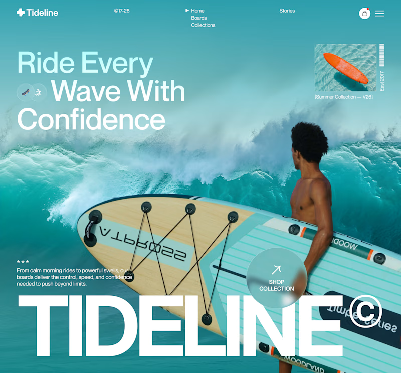
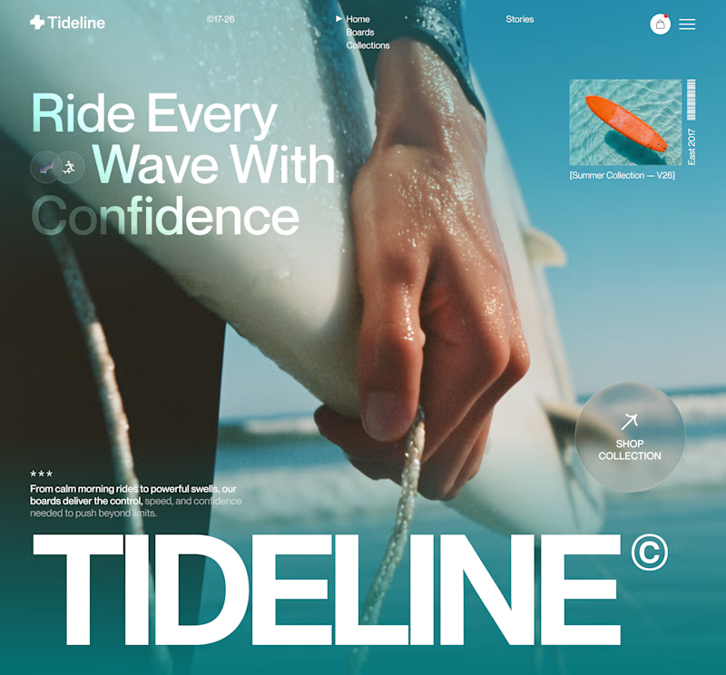
For this surf brand concept, I explored two hero directions.
A → Product-first. Puts the board and experience at the center.
B → Lifestyle-first. Creates a stronger emotional connection before introducing the product.
Which hero creates a stronger first impression?
A or B — and why?
Your feedback helps shape better design decisions.
#UIDesign #LandingPage #WebDesign #Figma #UXDesign #ProductDesign #CreativeDirection #BrandDesign #JuiceLab #DesignProcess

11 voted
32%
23 voted
68%
34 votes
Closed

Both work well, but B feels more premium to me.

This World Cup month, we settled the ball to design the cover system for our blog articles. We were after something simple to run, backed by code that generates random textures to bring each image to life. Here are a few examples.
A blog article is twice as interesting when a sexy cover comes with it ;) Right?

Generating the cover textures with code instead of hand-designing each one is such a smart way to keep a blog's visual system consistent without it getting repetitive. What are you running that on - some kind of shader or generative script?

UI July Day 3! 🌿
Drop a comment: Would you actually design this from scratch? 👇
When I got challenged to design a sidebar for a gardener, my brain immediately went: Wait, what? Why would a gardener need a custom app? Why wouldn't they just use a basic, already existing CRM? 🤦♀️
I almost didn’t post this because I thought, “Is this even cool enough?” But a challenge is a challenge, so I forced myself to dig deeper.
So here's my answer to how to make a sidebar special for a gardener:
☀️ Weather-First UI: The gardeners always have to check the forecast, so it definitely has to be there. One of my favorite touches- it's actually connected to the gardener's tasks and alerts them if the weather could affect their job today.
🧪 Fertilizers + Tools Trackers: They have to keep track of their inventory!
It turns out designing for the soul means finding the magic in the unexpected workflows and quitting overthinking. How did I do?
Btw, for day 2 I dropped a video about useful games for designers, but didn't post it here, because "it's not serious enough"🧐

Great concept! The weather integration is a really thoughtful touch. 👏








Trending

Claude
Claude has entered the design space. How are you using Claude Design?

Contra University
Learn from expert creatives how to earn more using next-gen AI tools.
fifaworldcup2026
The World Cup is here and the whole world's watching. How are you designing for the world stage?
creativeaiflow
Creative AI workflows are evolving. What tools do you use, and what are their strengths and weaknesses?
freelancerlife
Freelancer life is wins, pivots, and everything in between. What’s yours right now?