The network for creativity
Join 1.25M professional creatives like you
Connect with clients, get discovered, and run your business 100% commission-free
Creatives on Contra have earned over $150M and we are just getting started
Back to feedPost

Built Financial Infrastructure from Scratch



The network for creativity
Join 1.25M professional creatives like you
Connect with clients, get discovered, and run your business 100% commission-free
Creatives on Contra have earned over $150M and we are just getting started










Related posts

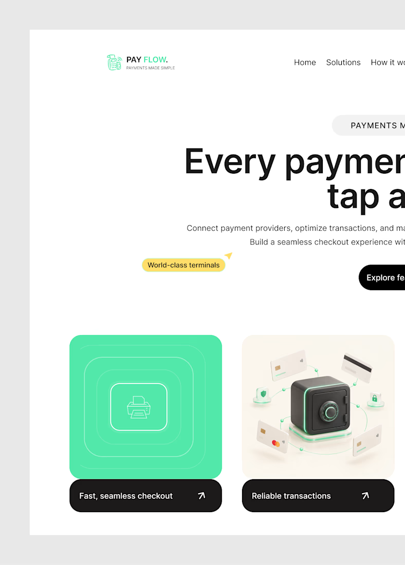
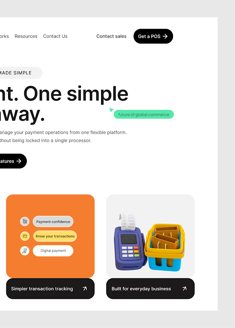
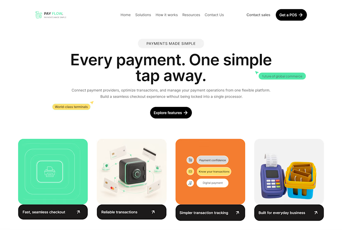
Here's the hero section of the fintech website I'm working on.
Sometimes you open Figma with an idea, and the final result is actually giving what it was supposed to give.
This is one of those moments.And I like what I have going on here.



Created an finance video for Smart Money Tips, combining clean motion graphics, bold typography, and engaging visuals to make financial advice easy to understand.


Really impressive


Finance platforms for startups usually go navy and safe. Nice to see Ballast take a point of view on the product screens as well as the mark, that is where founders actually form the opinion. What was the brief: calm, or fast?


