The network for creativity
Join 1.25M professional creatives like you
Connect with clients, get discovered, and run your business 100% commission-free
Creatives on Contra have earned over $150M and we are just getting started
Back to feedPost
Taste Test


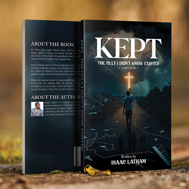
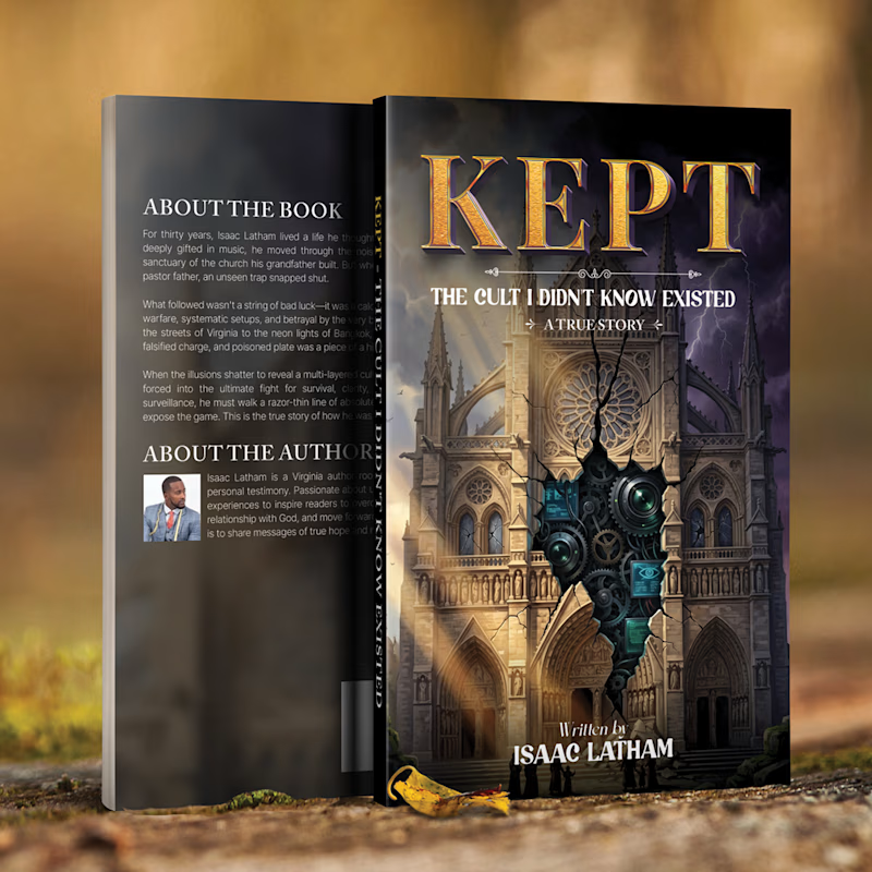

Upgoating the dark and mysterious version
The network for creativity
Join 1.25M professional creatives like you
Connect with clients, get discovered, and run your business 100% commission-free
Creatives on Contra have earned over $150M and we are just getting started

Challenges
View all


Related posts

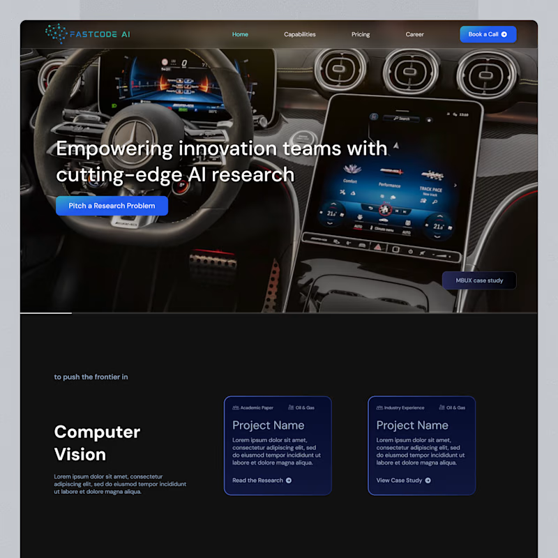
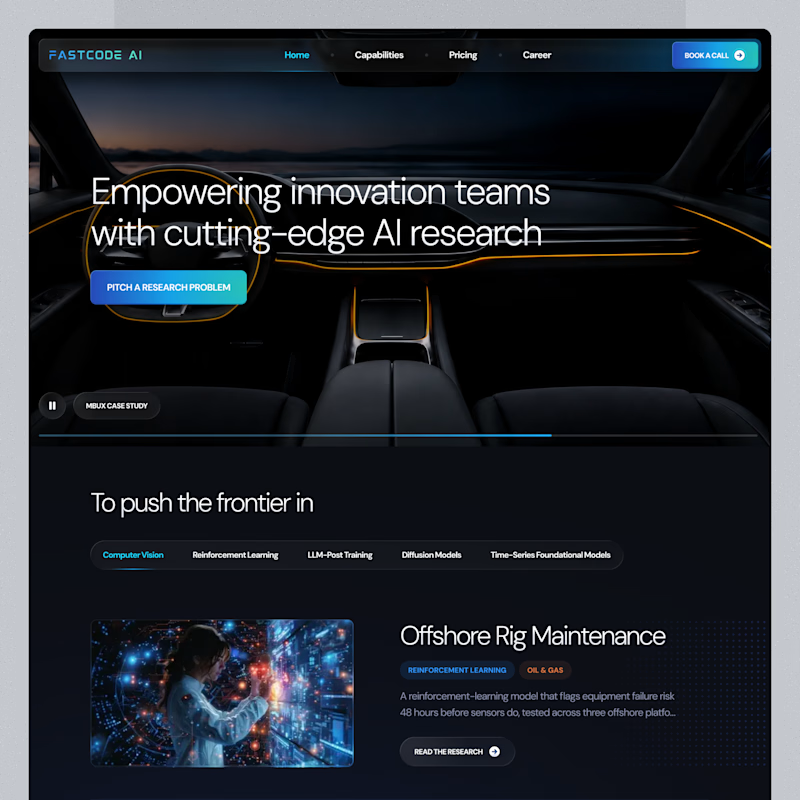
Same landing page, two passes on the surface.
Which one feels more finished?

6 voted
23%
20 voted
77%
26 votes
Closed

B is has more professional image 👍❤️

Same collection. Two different experiences.
Would you choose the bold, playful catalogue or the calm, architectural gallery?
Both complete websites are free to download — source code, assets and animations included.
Grab the kit: https://contra.com/products/FNrYmtZe-stillform-two-animated-landing-pages
10 voted
53%
9 voted
47%
19 votes
Closed


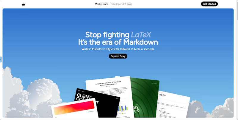
Which hero direction feels right for Doxy? 👀
Doxy is a PDF and report editor built to make PFE writing easier,from writing and diagrams to formatting and exporting a polished final report.
14 voted
64%
8 voted
36%
22 votes
Closed

immersive