The network for creativity
Join 1.25M professional creatives like you
Connect with clients, get discovered, and run your business 100% commission-free
Creatives on Contra have earned over $150M and we are just getting started
Back to feedPost
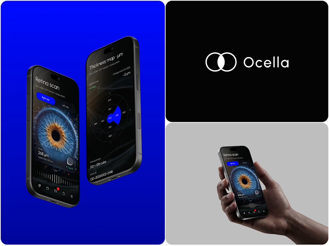
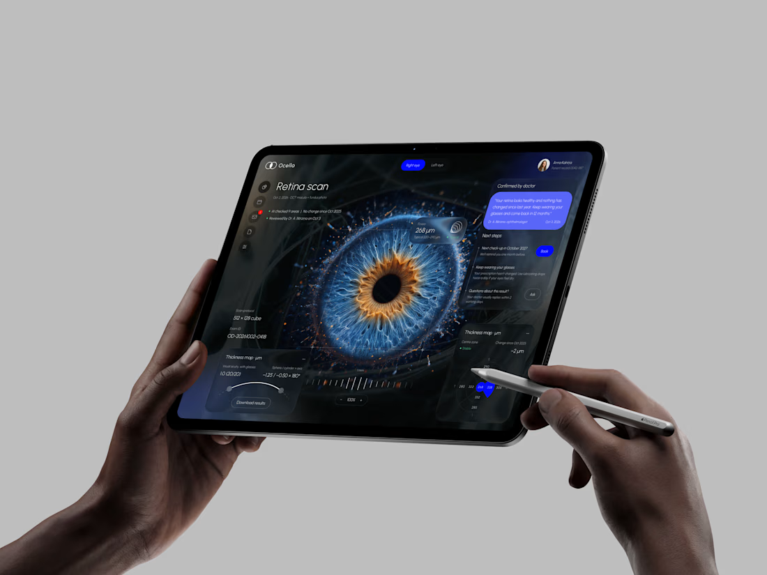
Ocella Eye Exam Results Portal
Clear results build trust. Patients know what their exam means and what to do next, and doctors spend less time explaining the same numbers.



I never see design like this before thats unique 🎉🎉🔥🔥


Thanks Mostafa
Pardon ❤️

Great work!!
Thanks, Celia!


results pages are usually scary, this one isn't
Thanks

Thanks, Alaa!

Making exam results understandable and pairing them with clear next steps is a strong UX direction. Nice focus on what patients actually need from the portal.
Thanks, Donny!

Amazing
Thanks, Noah!

Clean results layout
Thanks, Patrick!

Thank you! That was the goal from the start, a futuristic look that still stays clear and easy to use.

Thanks!

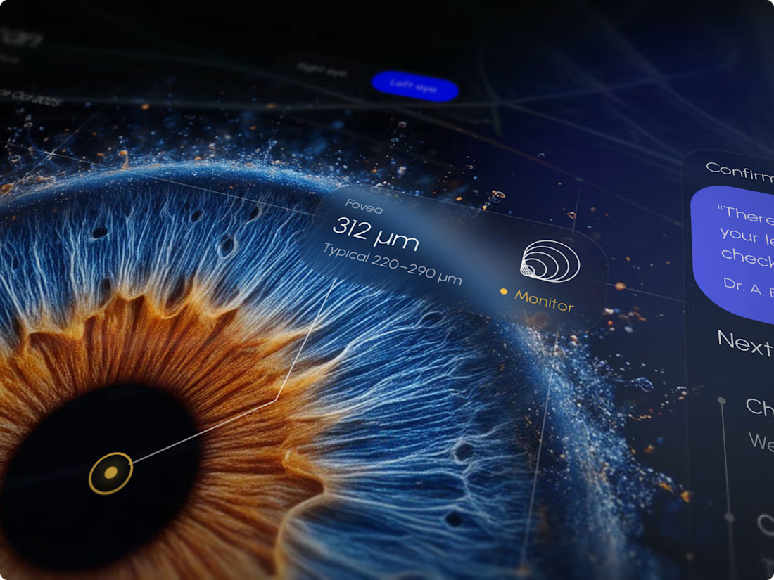
wow the iris detail tho. is that 3d render? super premium feel for a medical portal
Thank you! No render here, it's meant to be the actual retina scan taken during the exam, with AI doing the analysis on top.
oh got it! makes sense now, the AI analysis layer on top looks super clean. great execution!

Really impressive work, Artis! Making complex medical data understandable is a huge UX challenge. One thing I'd love to see is a simple visual comparison with previous exam results, so patients can instantly understand what's changed over time. Great concept and visual execution!
Thanks a lot, Nabeel! That's a really valuable suggestion. A timeline view where patients can scroll through past exams and see what changed would make the whole story much clearer.

results pages are where health products lose people, so leading with what it means and what to do next is the right call. is the next step one clear action, or does it change based on the result?
Thanks, Brady! Steps changes based on the results.
makes sense. as long as each result still leads to one main next step, nobody freezes on the harder ones.

Wow


That macro iris glowing against the deep cobalt UI is a striking hero, and it carries nicely onto the tablet
Thanks, Arek! 👌
The network for creativity
Join 1.25M professional creatives like you
Connect with clients, get discovered, and run your business 100% commission-free
Creatives on Contra have earned over $150M and we are just getting started



Related posts


How do you sell houses that are not built yet?
On kalotespusynas.lt people pick their home on a map.
Switch between 3D and a flat 2D plan, zoom in, show only the cottages. Green means free, orange means reserved. Some plots hold two homes, so they split into A and B, each with its own size and plot.
One map instead of a price list PDF. Buyers get it in seconds.

This is so much better than a price list PDF. I build PlotToBuild, a sales tool for real estate firms selling plots in Nigeria, and the free / reserved / sold status is exactly what buyers ask about first. Splitting plots into A and B is a smart touch.

New case study for the brand and digital work we did for Seeper Studios.
Go Check it out


Evolving a brand with almost 30 years of history is the hard version of brand work. You have to keep what people already trust while making it feel current. Nice job balancing both.