The network for creativity
Join 1.25M professional creatives like you
Connect with clients, get discovered, and run your business 100% commission-free
Creatives on Contra have earned over $150M and we are just getting started
Back to feedPost
Taste Test


The Organised Glass Hero or The Messy Reflective Footer?
45 voted
80%

11 voted
20%

56 votes
Closed

I would go with the header, primarily due to the position of the text and the background visual. The footer text over the visual is slightly hard to digest and may cause accessibility issues (color contrast).
That said, both lovely designs.

I REALLY WANNA BUILD SOME TYPE OF WEBSITE WITH THIS EXACT LAYOUT. MANN THATS ATTRACTIVE

Hero for this one!

looking good!

I'm leaning towards the hero, but I do think that the text is getting lost in both of them.


Love the Hero! The text placement is easier on the eye

If you add a bottom dark shade that slowly fades out the higher it goes, this could go up a level. (I'm talking about the hero)
The network for creativity
Join 1.25M professional creatives like you
Connect with clients, get discovered, and run your business 100% commission-free
Creatives on Contra have earned over $150M and we are just getting started











Related posts

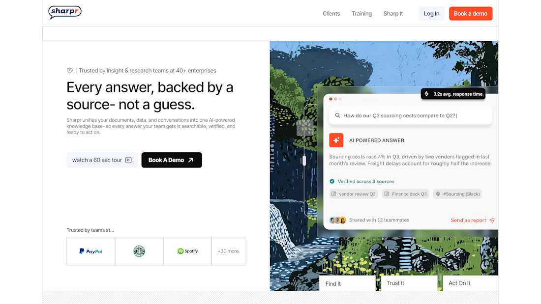
A fresh take on Sharpr’s hero section - same product, different first impression.




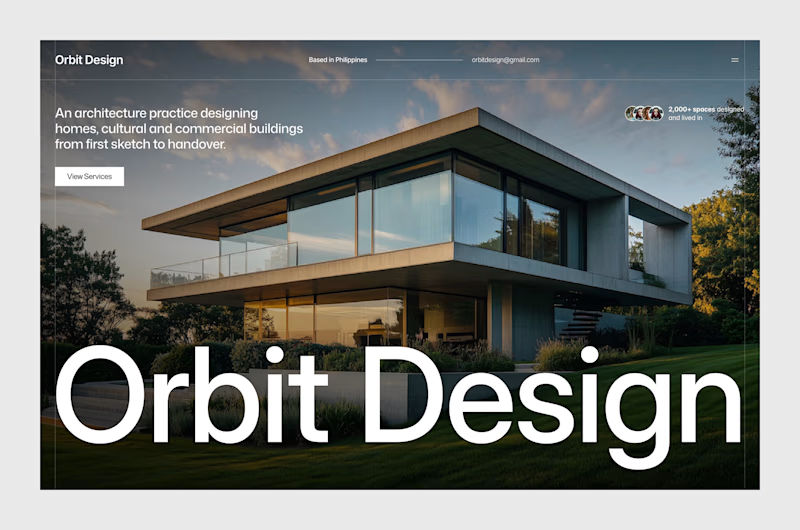
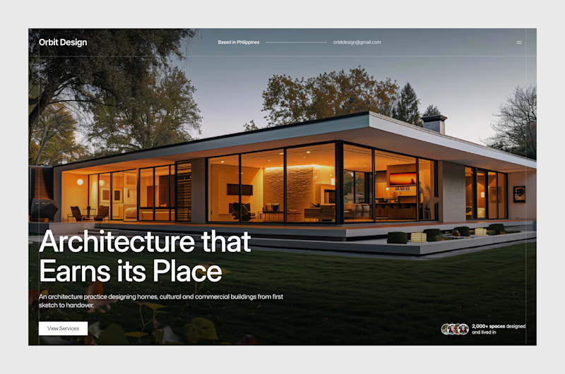
A new project! Done with hero section design exploration. Though some elements are subject to change during development. This is a new exploration after the old one, for some reason.
Which one is better?
Let me read your thoughts!


7 votes
Ends in 18h

Both explorations sound interesting! I voted option 2