The network for creativity
Join 1.25M professional creatives like you
Connect with clients, get discovered, and run your business 100% commission-free
Creatives on Contra have earned over $150M and we are just getting started
Back to feedPost

A visually stunning and fully responsive Weebly website built for a luxury vacation villa in Chania, Crete. The design focuses on showcasing the property's unique charm through high-quality imagery, while providing a seamless user experience to drive direct guest bookings and inquiries.


The network for creativity
Join 1.25M professional creatives like you
Connect with clients, get discovered, and run your business 100% commission-free
Creatives on Contra have earned over $150M and we are just getting started




Related posts

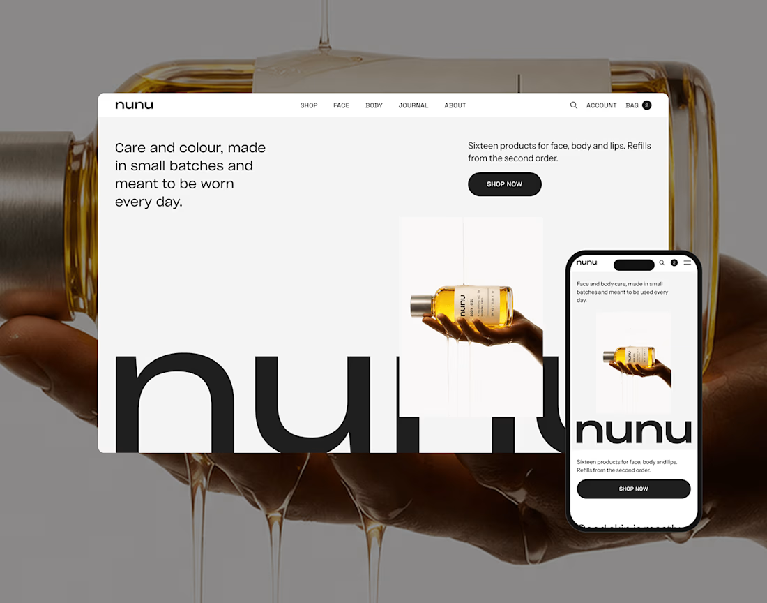
nunu is a self-initiated skincare and body care brand built from zero: naming, brand identity, art direction, product imagery and a responsive e-commerce websit


Nice work!

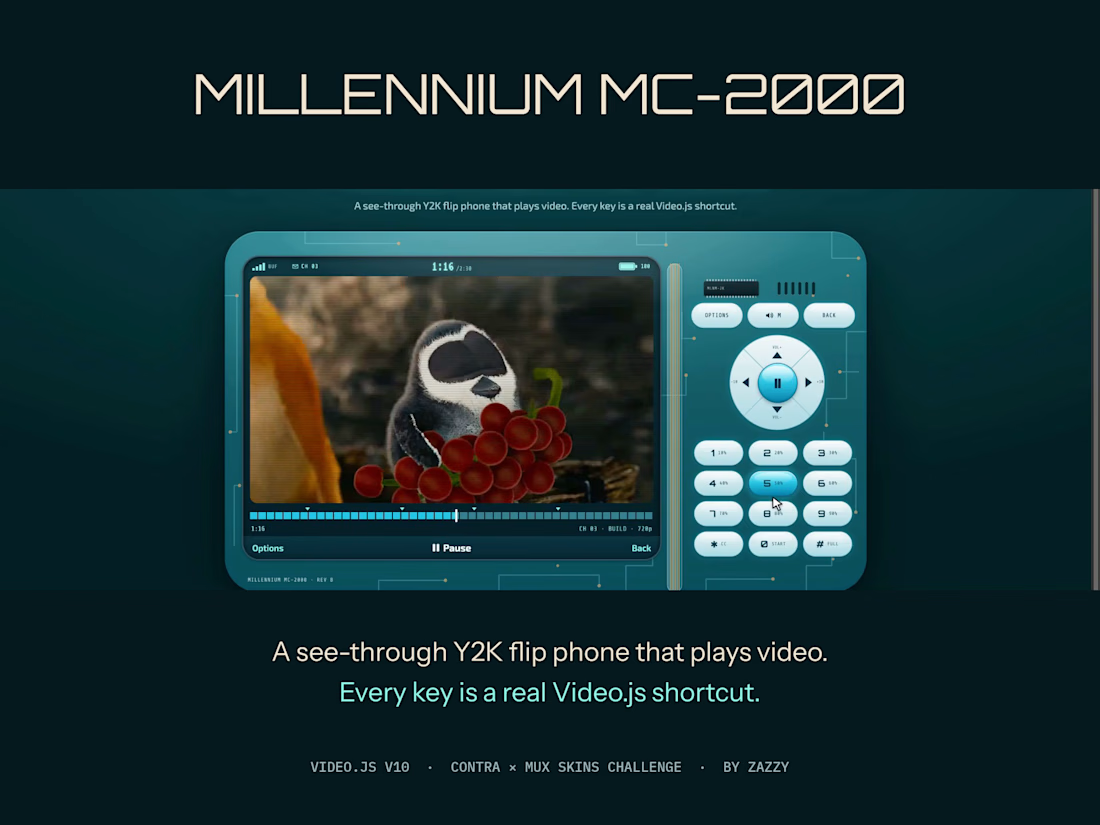
Millennium MC-2000 is a see-through Y2K flip phone that plays video. The keypad isn't decoration: every key is a real Video.js shortcut. 1–9 jump to 10–90%, OK plays, the D-pad seeks and sets volume, ✱ is captions, # is fullscreen.
The status bar is live player data: signal bars show the buffer, the battery shows volume, the clock shows time, and a ✉ arrives with each new chapter. Under 480px the lid closes and flips open on demand.
Every key is 44px and keyboard-reachable, and with reduced motion or transparency the shell turns solid and still.
It works with any video: millennium-mc2000.netlify.app/?media=plain
More explorations: two more skins I designed, switchable live on the same film, at zazzy-skins.netlify.app (House, built from videojs.org's own brand, and Darkroom, a film-developing player).
Film: "Caminandes 3: Llamigos" by Blender Foundation, CC BY 3.0.



Lovely work Zazzy


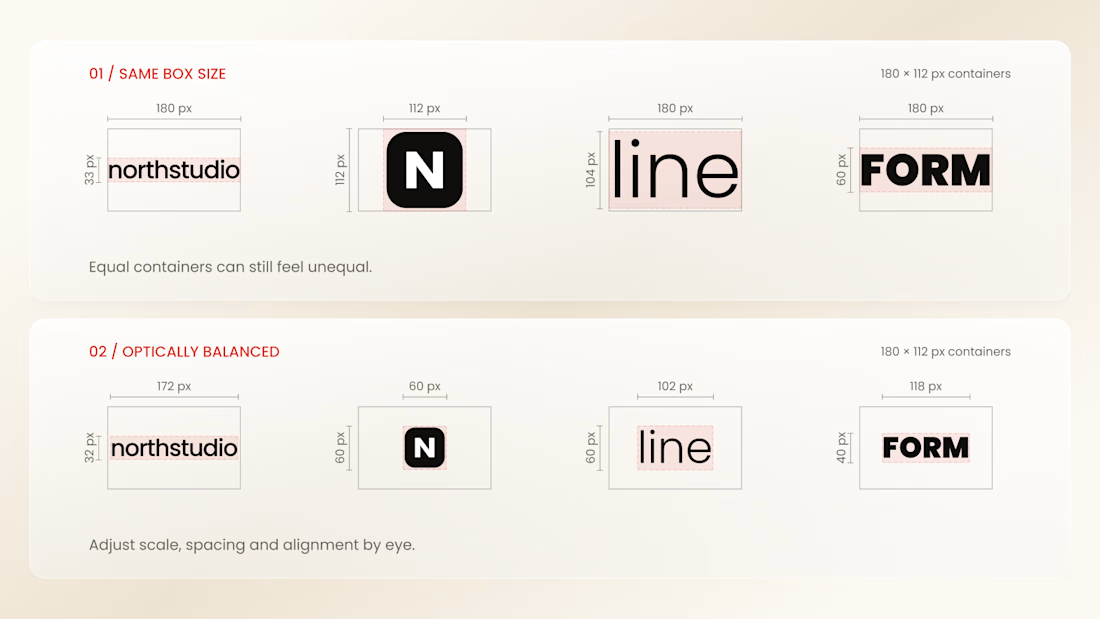
Why do logos look uneven even when they have the same size?
Every logo has a different shape, proportion, and visual weight. A wide wordmark can appear smaller than a compact symbol, while a bold logo may dominate a thinner one - even when their dimensions are technically identical.
That’s why logo sections shouldn’t be aligned by numbers alone.
Adjusting each logo optically, using a consistent visual area, balanced spacing, and a shared baseline helps every brand feel equally represented.
The goal isn’t to make every logo exactly the same size.
It’s to make them feel equally important.
Because visual consistency is based on perception, not just pixels.


Thanks for the information you shared