The network for creativity
Join 1.25M professional creatives like you
Connect with clients, get discovered, and run your business 100% commission-free
Creatives on Contra have earned over $150M and we are just getting started
Back to feedPost

"How can you represent a mental state using only a sphere? "
I had to create a UI that could tell the user, in <0.2s, how good their rest score was without relying on numbers or text.
A stable green orb = good sleep.
A chaotic red orb = poor sleep.
And everything else in between.
stack: @figma +@hiunicornstudio


Weldone, Gabor

Reading a rest score at a glance through color and motion instead of a number is a strong constraint to design around. Was the sub-0.2s response time a hard technical limit from Unicorn Studio, or more of a UX rule you set for yourself?
Hi Maty,
yes it was mainly the UX rule set by the client
The network for creativity
Join 1.25M professional creatives like you
Connect with clients, get discovered, and run your business 100% commission-free
Creatives on Contra have earned over $150M and we are just getting started

Challenges
View all


Related posts

Sometimes it’s hard to visualise data clearly without overwhelming users, but that’s what we aim for.
A snippet from daily design explorations using Magicpath and Figma.

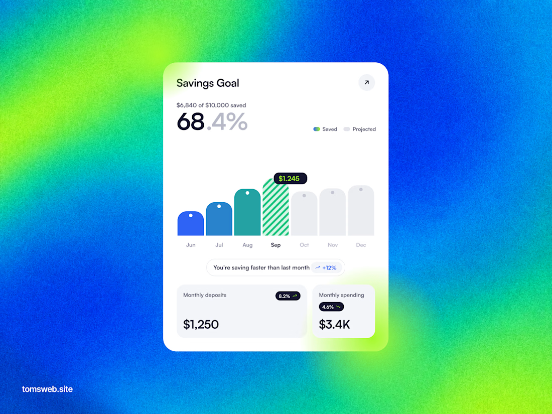

The chart keeps the progress story legible without turning the dashboard into a wall of metrics. The bright gradient is a bold backdrop, while the centered white card gives the key numbers a clear focal point.


👍

AI based memory rewinder app. Which design is better as Homescreen?
7 voted
88%
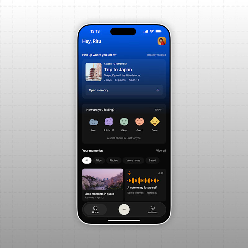
1 voted
12%
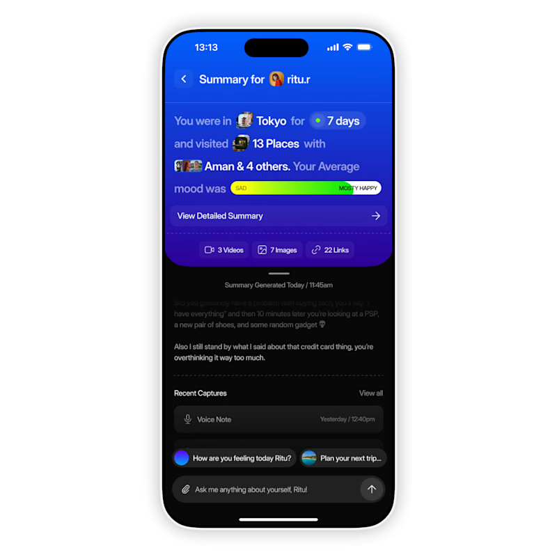
8 votes
Closed
The mood-capture direction feels more distinctive to me—the layered cards give the memory context real personality. I’d keep the summary drawer as a quick-glance fallback for returning users.