The network for creativity
Join 1.25M professional creatives like you
Connect with clients, get discovered, and run your business 100% commission-free
Creatives on Contra have earned over $150M and we are just getting started
Back to feedPost

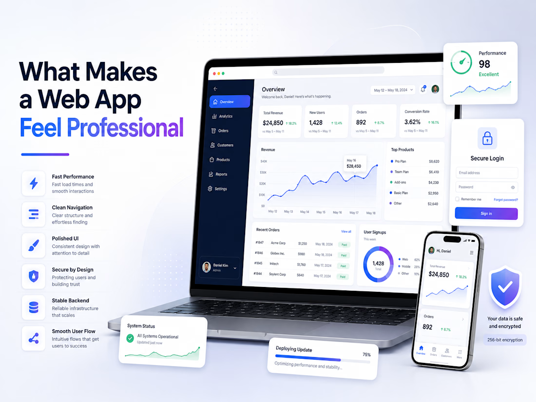
What Makes a Web App Feel Professional
A professional web app is not just about looking clean. It is about how smoothly everything works from the first click.
Users can feel the difference quickly. A professional app loads fast, has clear navigation, uses simple layouts, and does not make people think too much. Buttons are easy to find, forms are not confusing, and every screen has a clear purpose.
Good design matters, but performance matters just as much. If a page looks beautiful but takes too long to load, users lose trust. If the layout is modern but the app has bugs, the product feels unfinished. A strong web app needs both: polished design and reliable engineering.
Security is another big part. Login, payments, personal data, and admin tools should be handled carefully. Users may not always notice good security, but they will definitely notice when something feels unsafe or broken.
For me, a professional web app comes from the small details: clean UI, fast response time, mobile-friendly screens, clear error messages, stable backend logic, and smooth user flow.
The best apps do not feel complicated.
They feel simple, useful, and trustworthy.
The network for creativity
Join 1.25M professional creatives like you
Connect with clients, get discovered, and run your business 100% commission-free
Creatives on Contra have earned over $150M and we are just getting started





Related posts

I’ve always liked products that solve a very specific problem instead of trying to do everything.
So for the Lovable Challenge, I picked a simple question that event-tent rental businesses hear all the time:
“Can I book a tent for my wedding?”
The problem is… a tent can’t really be booked until you know if the whole event will work.
How many guests?
How much usable space?
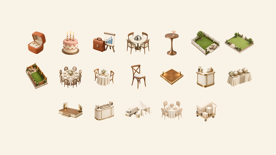
Tables? Dance floor? Bar? Stage?
Will the layout actually fit?
Can the crew set it up and pick it up on time?
Usually, the owner has to figure all of that out manually through messages, calls and calendar checking.
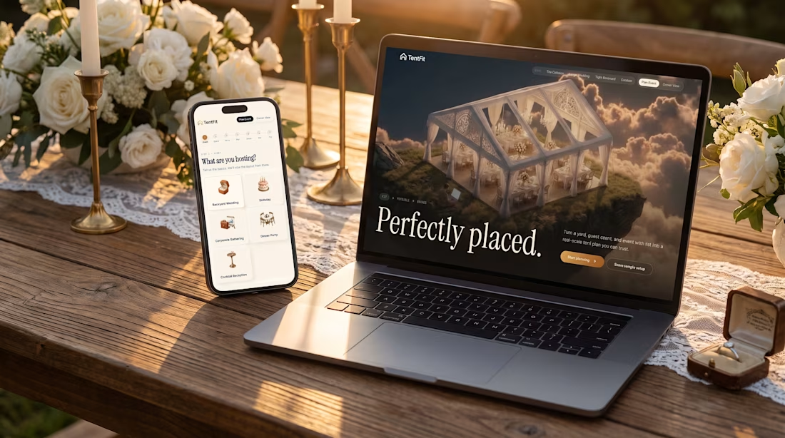
So I built TentFit — a spatial booking experience for event tent rentals.
The customer starts by planning the event, then maps out the space and everything they want inside it. TentFit checks the layout and highlights conflicts.
And instead of just saying “doesn’t fit,” it helps solve the problem:
Switch the tent. Move the layout. Remove an element.
Once everything works, TentFit checks the logistics and turns the final setup into a booking.
The goal was simple:
Make the customer’s decision easier, and make the owner’s job easier.
The flow is basically:
FIT → FEASIBLE → BOOKED
I had a lot of fun building the spatial planning part of this one.
X/Twitter post: https://x.com/brjanov/status/2105630218492731501?s=20
Built with @Lovable
#LovableChallenge #ProductDesign #UXDesign #NoCode #SaaS #WebDesign



Nice stuff!


Well done !


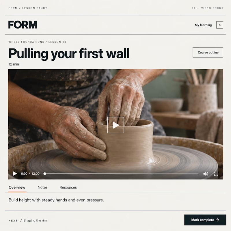
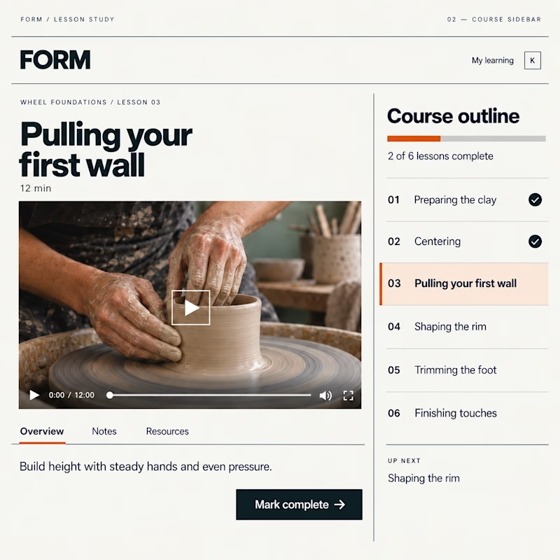
Which Kajabi lesson page would you rather learn in?
Same lesson. Two layouts: more room for the video, or the course outline always in view.
Vote below—what helps you stay focused?

19 voted
51%
18 voted
49%
37 votes
Closed

Course sidebar for me — when working through compliance training or technical documentation, seeing exactly where you are in the curriculum removes the mental overhead of 'how much is left?' The video focus layout makes more sense for story-driven content where you want the...