The network for creativity
Join 1.25M professional creatives like you
Connect with clients, get discovered, and run your business 100% commission-free
Creatives on Contra have earned over $150M and we are just getting started
Back to feedPost
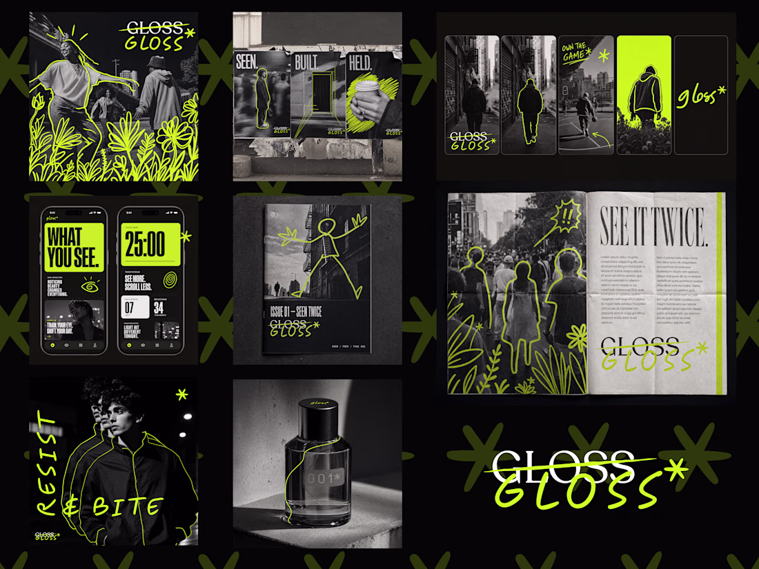
The best café brands don't introduce themselves. They just feel familiar from day one.
Most neighborhood café brands hide behind generic coffee cup icons, overused script fonts, and a color palette that could belong to a yoga studio or a juice bar or literally anything else. The logo promises character. The brand delivers nothing you'd remember by the time you reach the door.
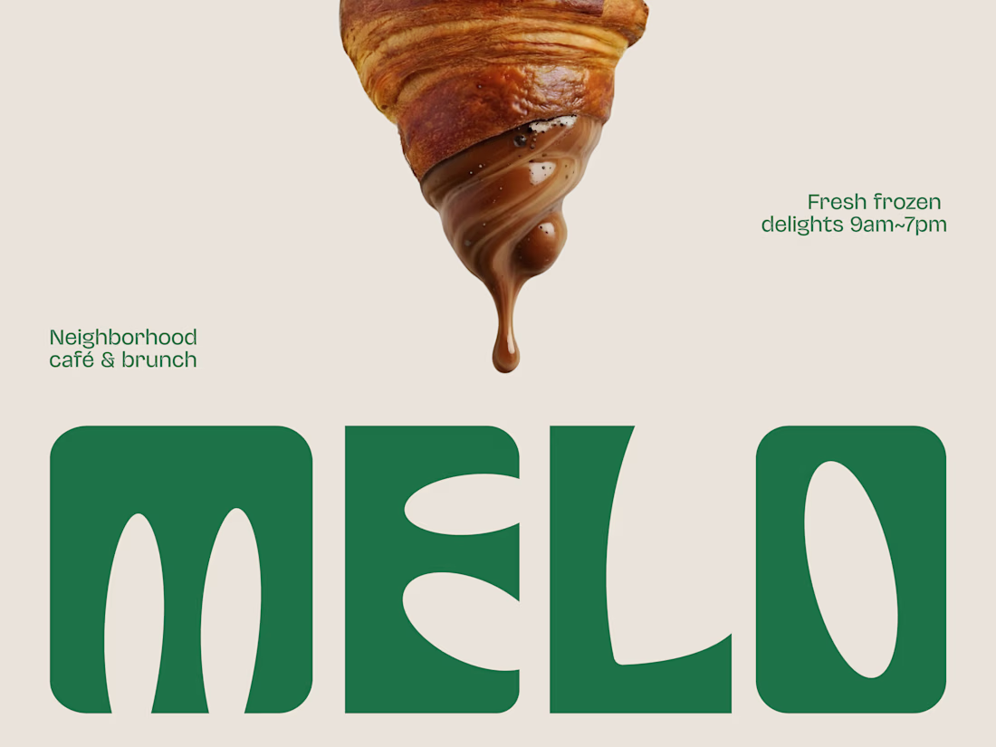
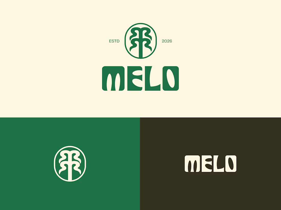
Melo made familiarity the whole brief.
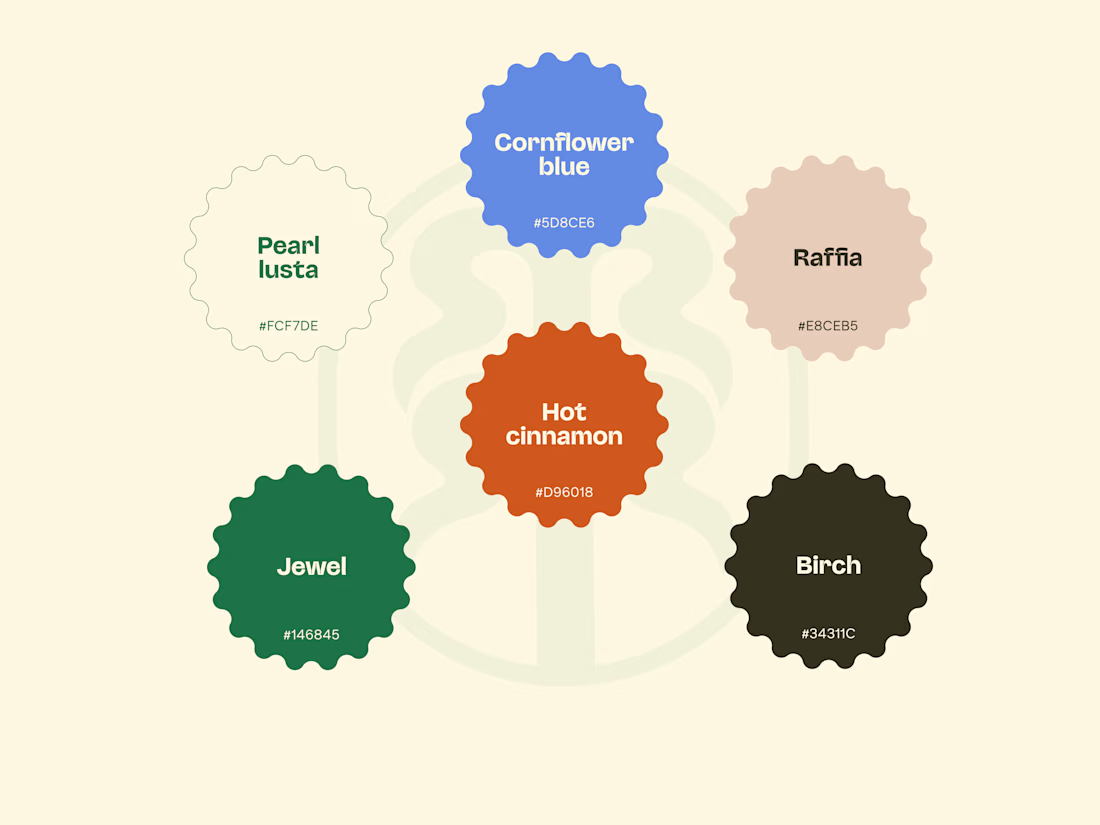
A custom palm tree emblem encircled in a clean oval, organic, architectural, impossible to mistake for anything else. Deep forest green across three environments: cream, burnt green, and dark olive, each one feeling as considered as the last. A rounded wordmark so confident it can fill an entire poster at display scale and still feel warm rather than loud. And right there on the campaign visual, a caramel-dripping croissant melted into the letterforms, like the food and the brand were always the same thing.
That's not just a logo system. That's a place people recognize before they even read the name.
Because a neighborhood spot that earns a place in someone's morning deserves a brand that feels just as inevitable.
What makes a café logo feel like it actually belongs to a place? 👇
Brilliant branding that creates instant familiarity!
Beautiful
The network for creativity
Join 1.25M professional creatives like you
Connect with clients, get discovered, and run your business 100% commission-free
Creatives on Contra have earned over $150M and we are just getting started
Related posts
was looking at a bunch of company logos (you know that ai logo meme) and couldn't tell what half of them even do.
and the branding's for some was actually cool. meanwhile these companies are genuinely good at what they do.
cover your logo, cover your hero line. still clear what you do? sometimes it should
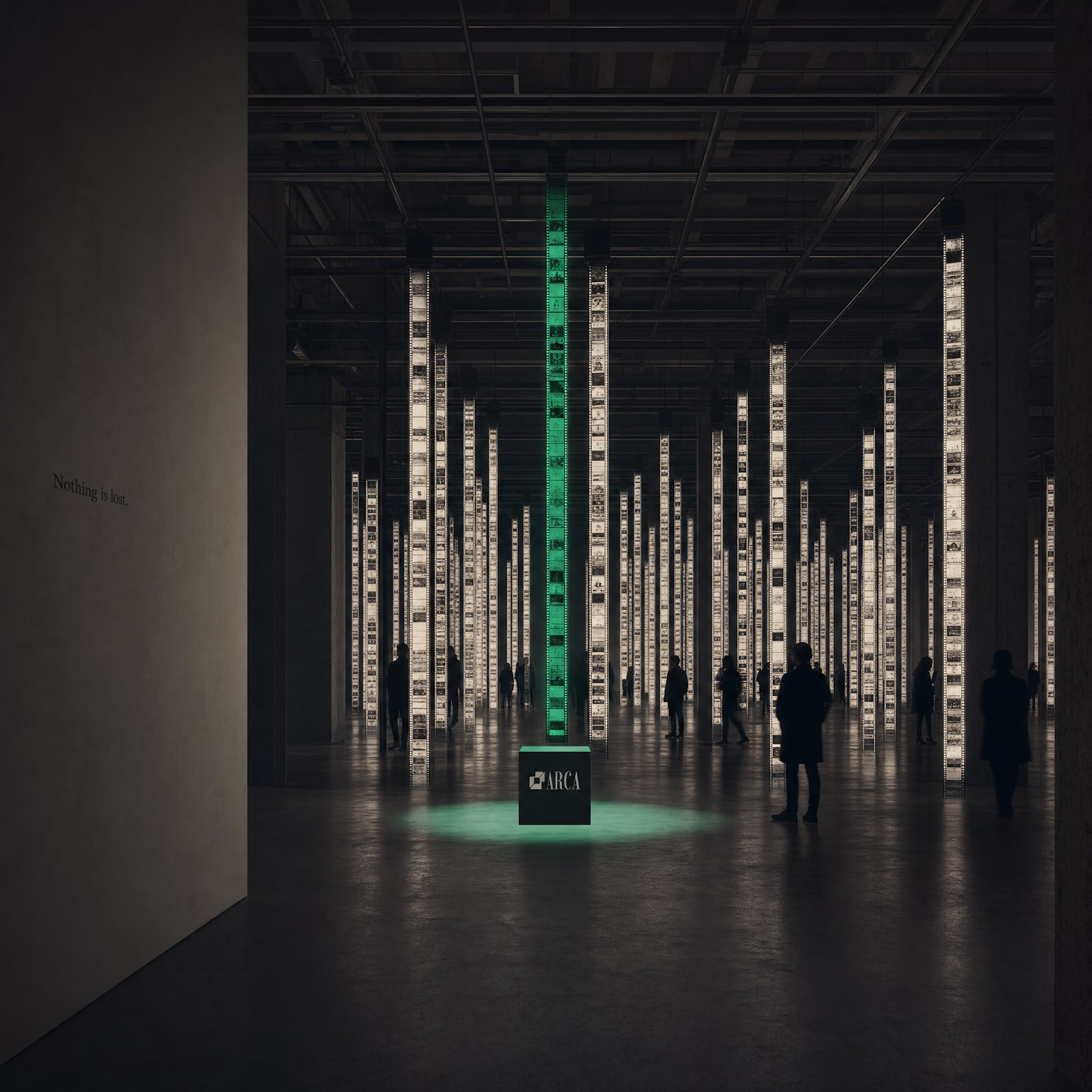
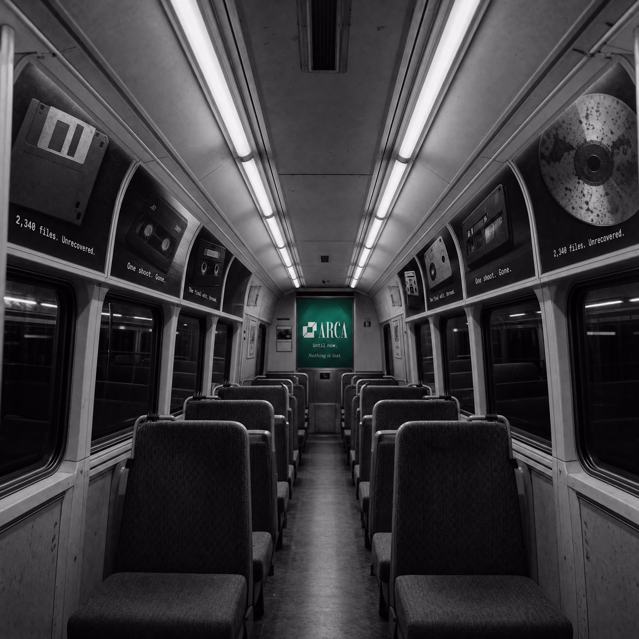
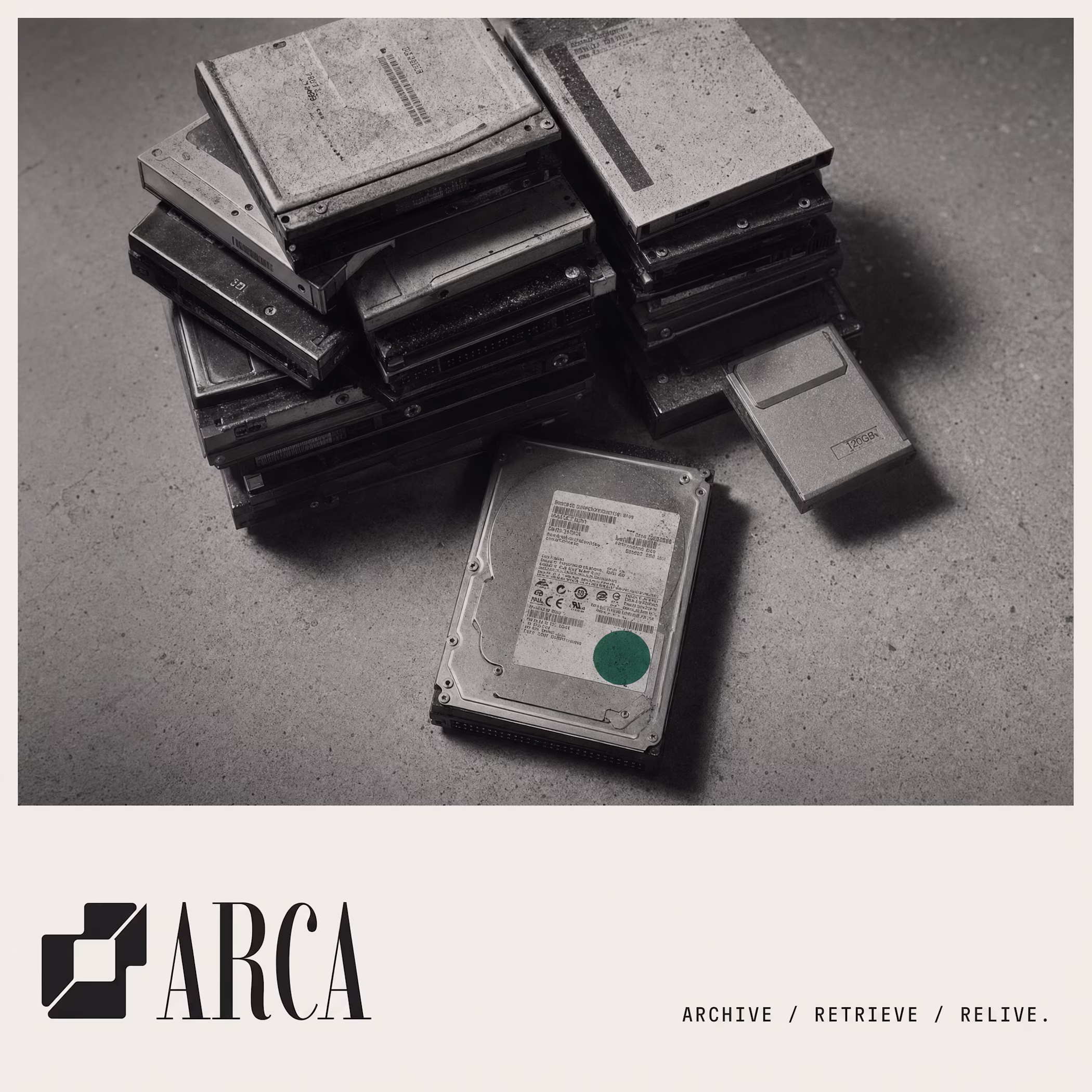
Another project, another set of brand guidelines, another brand recap.
Great work 🔥 The overall experience feels refined and very well considered.
Arca, a DAM platform brand for creative studios that didn't want to feel like software.
One rule: Smeral always marking the recovered moment.
Nothing else. Nothing is lost.
Cool work 🔥
Trending
Claude
Claude has entered the design space. How are you using Claude Design?
Contra University
Learn from expert creatives how to earn more using next-gen AI tools.
MagicPath
The canvas is infinite, and exploration is becoming the workflow. How are you using MagicPath?
creativeaiflow
Creative AI workflows are evolving. What tools do you use, and what are their strengths and weaknesses?
freelancerlife
Freelancer life is wins, pivots, and everything in between. What’s yours right now?