The network for creativity
Join 1.25M professional creatives like you
Connect with clients, get discovered, and run your business 100% commission-free
Creatives on Contra have earned over $150M and we are just getting started
Back to feedPost
Taste Test

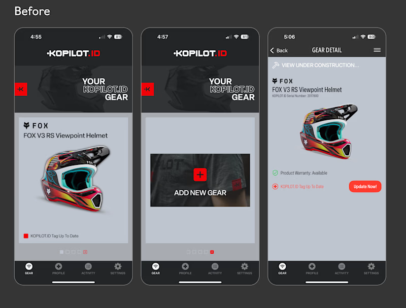
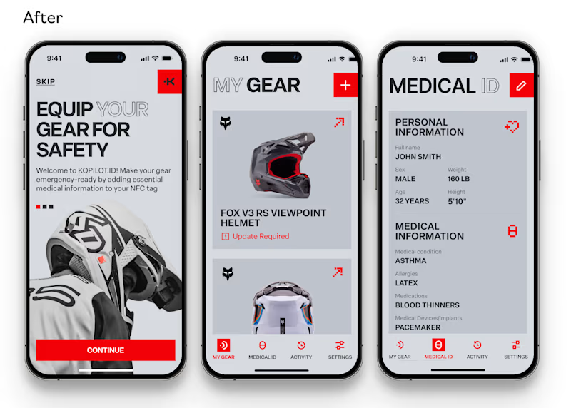
After seeing the current design, I couldn't imagine all the ways to improve it. This could be one
#ClaudeCode
3 voted
11%

25 voted
89%
28 votes
Closed

Definitely an upgrade
Well-done 👏
Thanks Timothy! That was the goal :)

Love this!

Nice work!


I love the redesign, it's way better

The redesign definitely looks more lively! One suggestion would be to keep the form at the bottom center, closer to original design alignment, then the logo could be centered, without the need for a black background.
Thanks for you suggestion, I'll try it Siddhesh


does look better

the upgrade is vivid, Great work Carol

The redesign is amazing! Love the vibe!
The network for creativity
Join 1.25M professional creatives like you
Connect with clients, get discovered, and run your business 100% commission-free
Creatives on Contra have earned over $150M and we are just getting started











Related posts

Created concept video and it went soo goated 🙌


My team and I recently redesigned the KOPILOT.ID app, which helps athletes keep their emergency medical information accessible through an NFC tag built into their gear.
Time for a little before & after 👀 Which version do you prefer - the original or our redesign?
7 votes
Ends in 21h

After. The light layout makes the medical info much easier to scan.

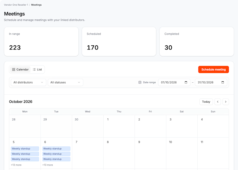
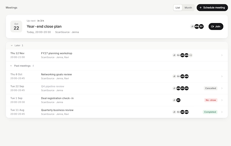
I have spent the last two months redesigning a dashboard for a multi-tenant company.
They were relying heavily on generic AI-generated content, which I am now replacing.
While I am working on several other pages, I can share this one.
3 votes
Ends in 23h

I voted for AI, analytics are more clear