The network for creativity
Join 1.25M professional creatives like you
Connect with clients, get discovered, and run your business 100% commission-free
Creatives on Contra have earned over $150M and we are just getting started
Back to feedPost
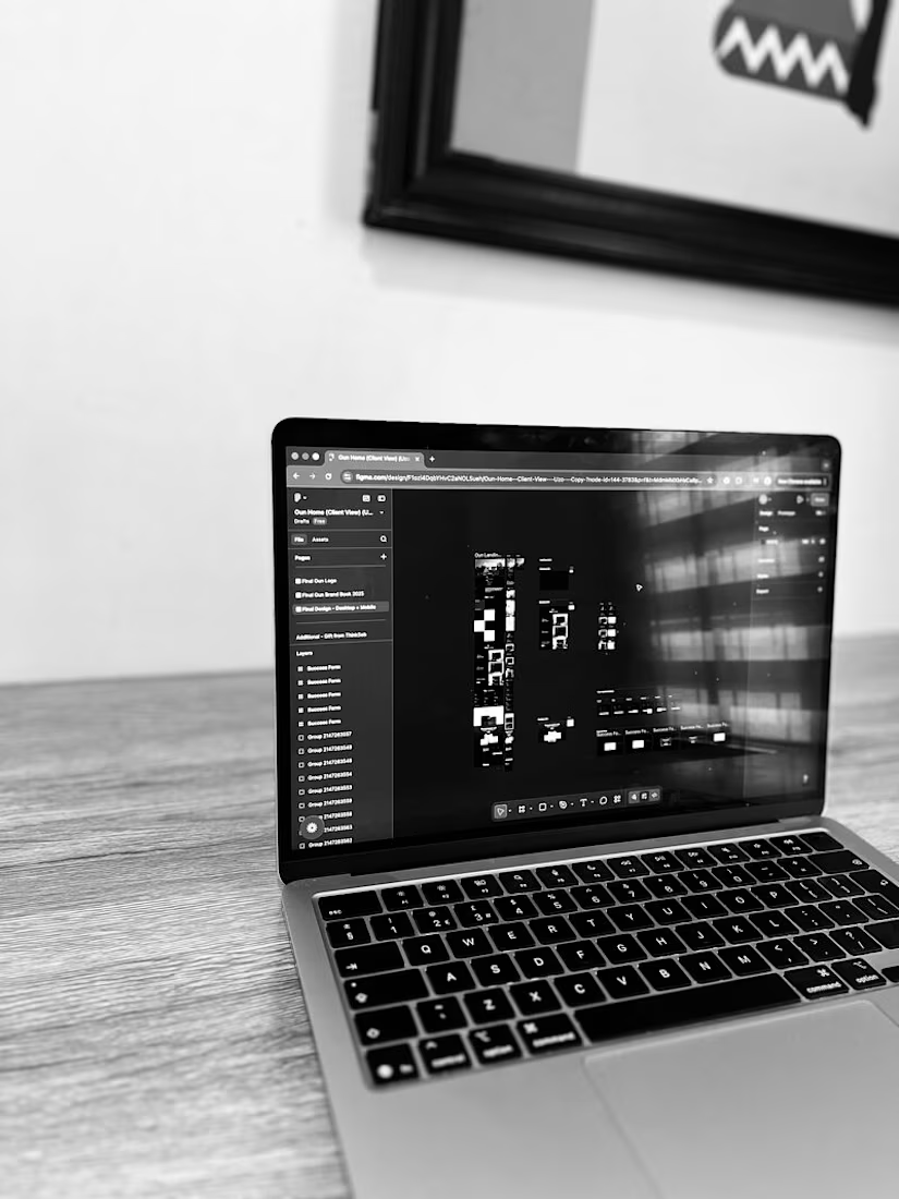
Designers love masonry grids.
Browsers rendering 400+ images hate them.
Recently, a design partner asked for a masonry layout for a massive launch gallery.
Aesthetically? It would look incredible.
Technically? It was a recipe for a frozen mobile browser.
When you load 400+ images, a masonry layout forces the browser to constantly recalculate the height and position of every single element. It causes "layout thrashing," which tanks performance.
Instead of blindly building a slow site, we talked it through and I proposed a uniform 4-column grid instead.
The result?
We kept the immersive, full-bleed feel.
We kept the clean aesthetic the brand wanted.
The scroll stays buttery smooth because the browser isn't doing complex math on every pixel.
Building high-end sites is usually a negotiation between the Figma file and the browser's limits.
Sometimes the best thing you can do for a project is suggest a simpler layout so the actual user experience doesn't suffer.
The network for creativity
Join 1.25M professional creatives like you
Connect with clients, get discovered, and run your business 100% commission-free
Creatives on Contra have earned over $150M and we are just getting started
Related posts
Still can't believe this is fully native.
With the Framer 3.0 update I rebuilt this viral landing page using Opus 4.8. The result is insane.
Edit every layer on the canvas or just ask Claude
Check it live https://lumio.framer.media/
How would you compare this to a website built using only claude code and pulling from something from say, the Figma MCP?
Amazing sites for UX/UI designers, part 11
1. Grainient Supply for static and animated color gradients
2. Supahero for hero section inspiration at one place
3. Freefaces Gallery for free fonts that stand out
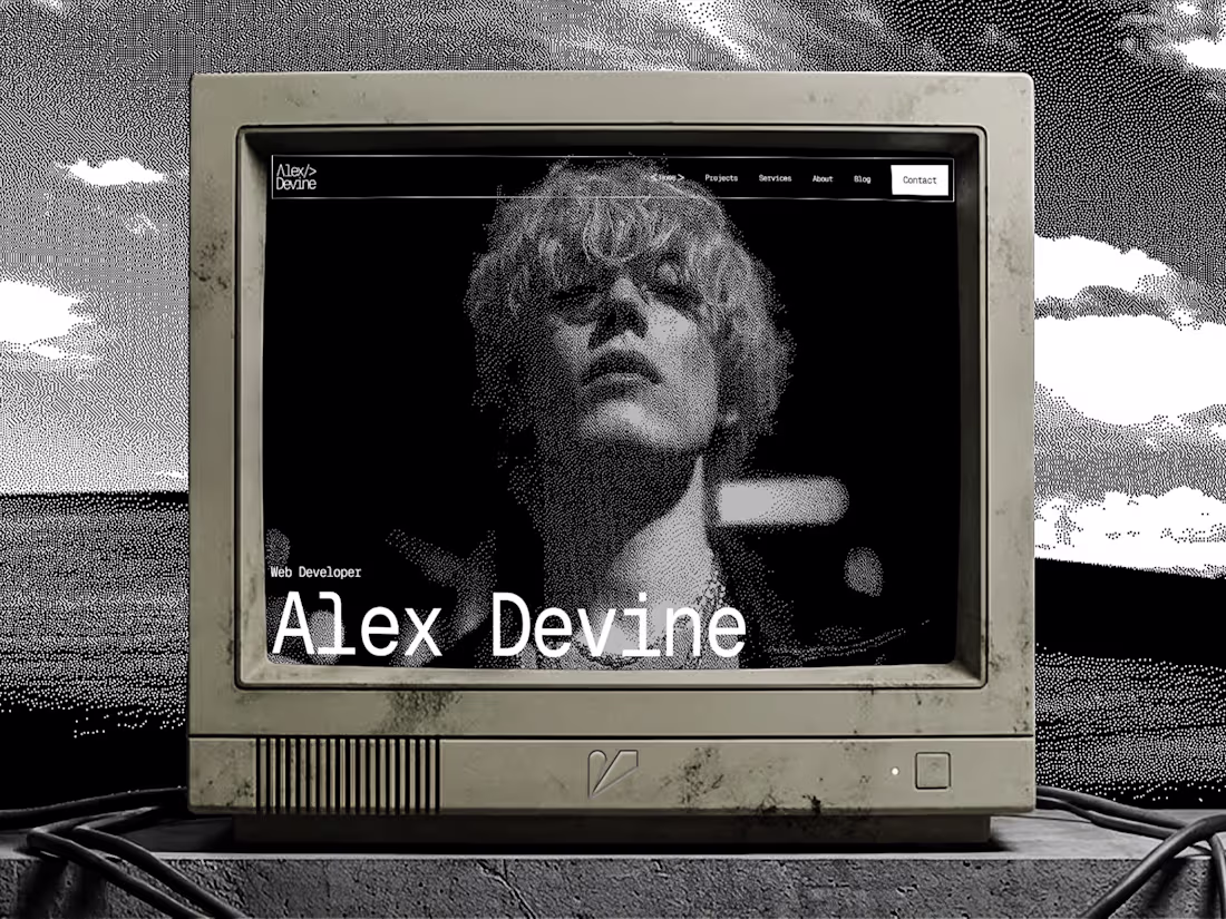
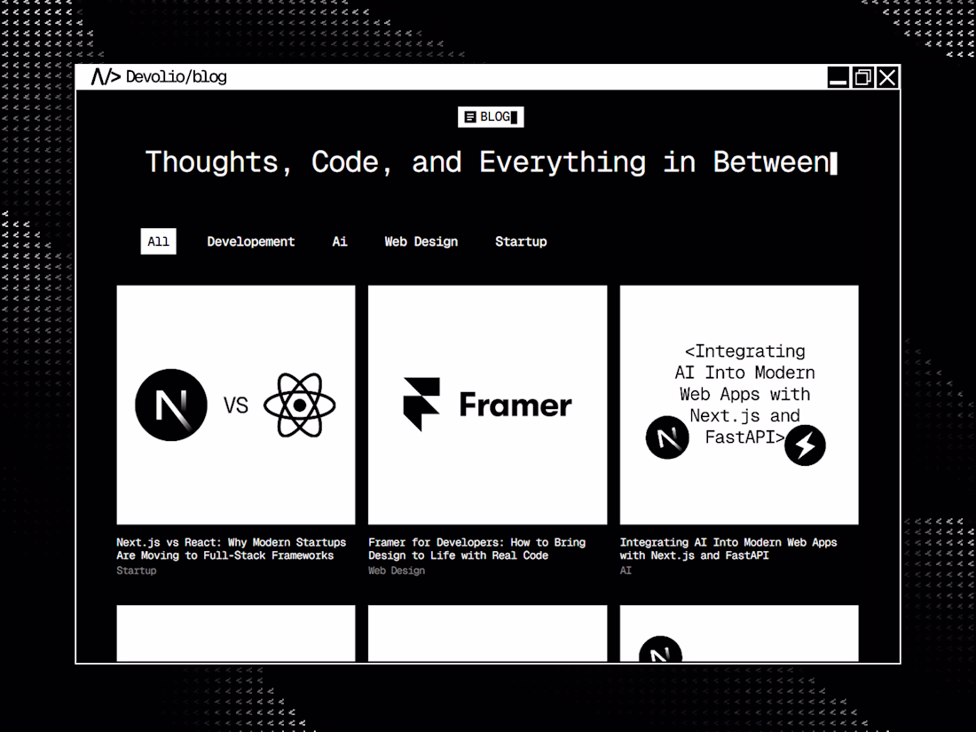
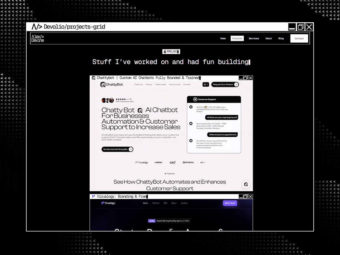
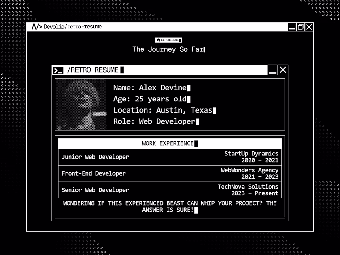
finally dropped Devolio on Framer Marketplace 🔥
A portfolio that feels like booting into your own OS, retro, brutalist, and actually alive. organized layers, clean assets, CMS ready.
Remix link in the comments if you want to make it yours !
Trending
Claude
Claude has entered the design space. How are you using Claude Design?
Contra University
Learn from expert creatives how to earn more using next-gen AI tools.
MagicPath
The canvas is infinite, and exploration is becoming the workflow. How are you using MagicPath?
creativeaiflow
Creative AI workflows are evolving. What tools do you use, and what are their strengths and weaknesses?
freelancerlife
Freelancer life is wins, pivots, and everything in between. What’s yours right now?